kage
kage
axari.ai
Design analysis
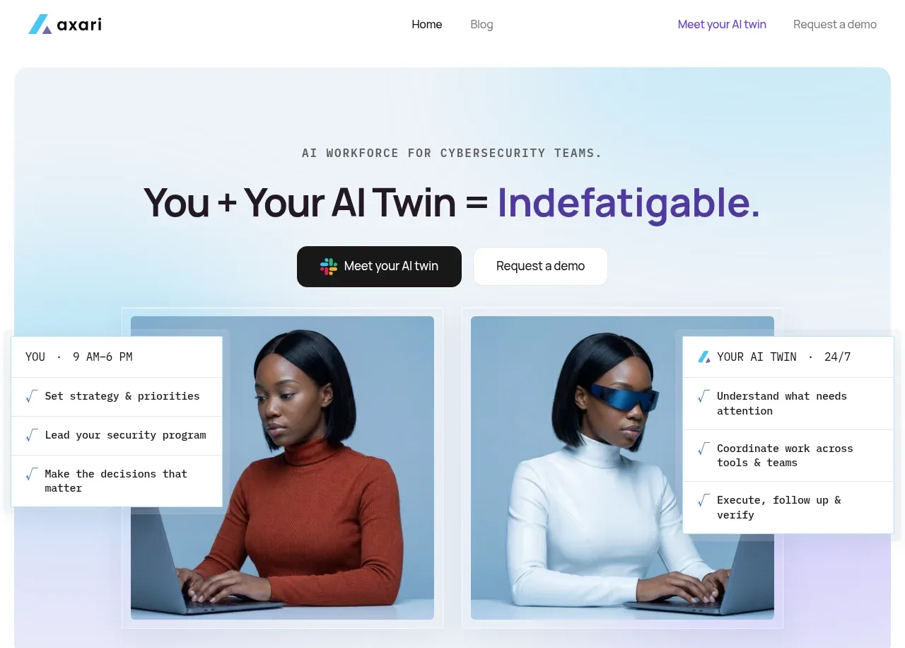
A soft gradient panel pairs a concise eyebrow and oversized equation-like headline with two CTAs and a visual comparison of a human worker and AI counterpart.
Prompt preview
## Reference images

Study these alongside the description below: hierarchy, rhythm, spacing, colour. Build for the product you are asked about, using this design language.

- Component: https://kage-design-assets.t3.tigrisfiles.io/components/axari/3e8824e7-9cff-44d5-8739-31a0e173005a-1789538687-1.webp
- Full page it was cut from: https://kage-design-assets.t3.tigrisfiles.io/screenshots/axari/3e8824e7-9cff-44d5-8739-31a0e173005a-1789538612563-full.webp
- Component on Kage: https://kage.design/component/axari-hero

## Before you start
Ask what the user's product does, who the hero should persuade, and what action matters most. Then create an original hero using these principles.

Use a large rounded hero panel beneath the navigation, with a pale blue-to-lavender gradient (`#eaf7fb` to `#eee9ff`), approximately 14–18px radius, and generous top/bottom padding. Center a small uppercase monospace eyebrow, followed by a large high-contrast headline with one phrase in the brand accent; keep the hierarchy clear at roughly 52–64px desktop and 34–42px mobile. Place a dark filled primary CTA beside a light outlined/filled secondary CTA. Below, show a wide visual proof area with two side-by-side cards and floating annotation panels; use realistic but original product-relevant imagery or UI, not stock imitation. Maintain a centered max-width around 1100px, strong alignment, and enough whitespace for the headline to breathe. Buttons should have 10–12px radius, 14–16px labels, and visible hover/focus transitions.

Never: copy logos, product names, copy, illustrations, or imagery from the reference.