 kage
kage
partners.axiom.co
Design analysis
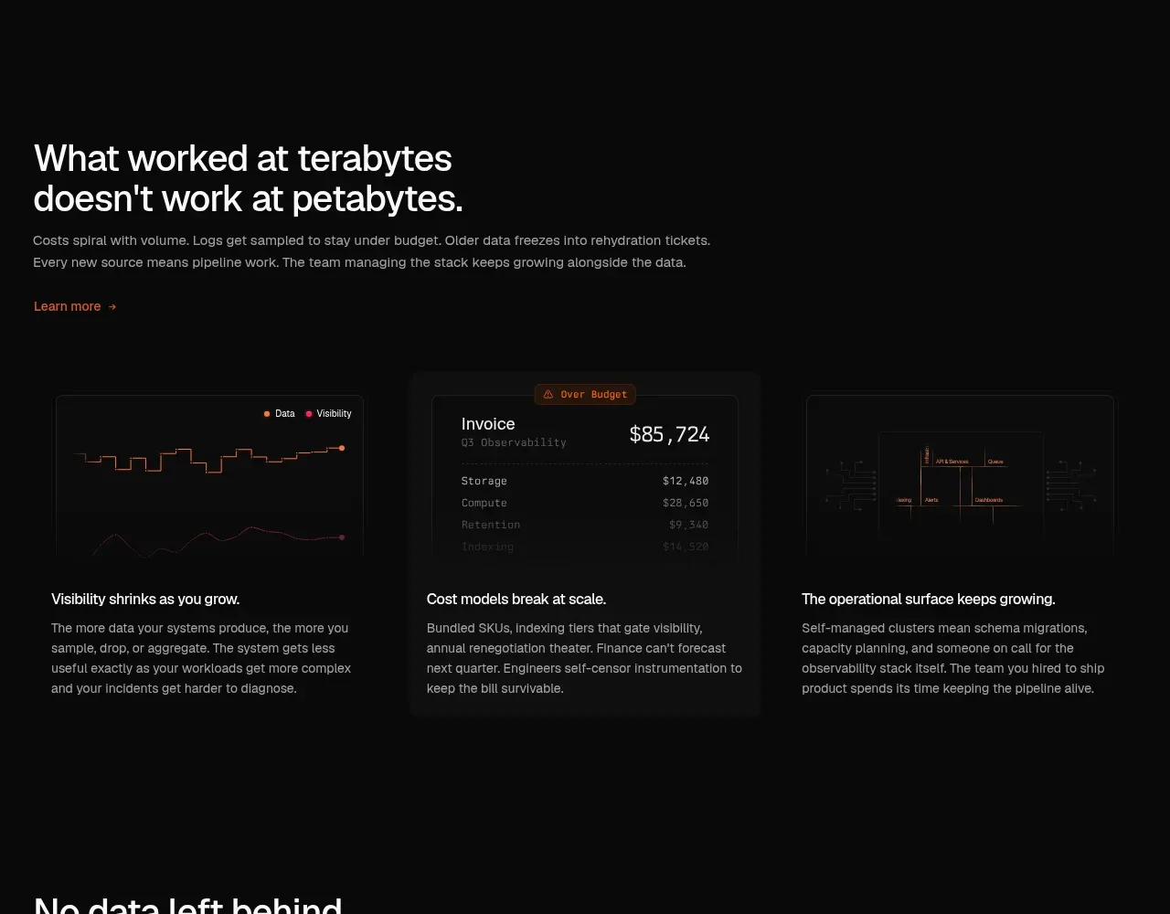
A short problem statement introduces three evenly weighted cards that explain why operational complexity grows with data volume.
Prompt preview
## Reference images

Study these alongside the description below: hierarchy, rhythm, spacing, colour. Build for the product you are asked about, using this design language.

- Component: https://kage-design-assets.t3.tigrisfiles.io/components/axiom/c8c1ccab-fdeb-4f51-a10a-de94b7cc1af3-1789711530-3.webp
- Full page it was cut from: https://kage-design-assets.t3.tigrisfiles.io/screenshots/axiom/c8c1ccab-fdeb-4f51-a10a-de94b7cc1af3-1789711409328-full.webp
- Component on Kage: https://kage.design/component/axiom-feature-grid

## Before you start
Ask what recurring customer problems the user's product solves and how many distinct ideas deserve their own card. Apply the following structure with original content.

Build a dark section with a left-aligned two-line heading, a concise explanatory paragraph, and a small text link. Below it, use three equal-width feature cards in a horizontal grid. Each card should have a restrained dark UI thumbnail or abstract data visualization above a short bold title and a compact paragraph. Use #080909 as the page background, #111212 cards, 1px #242424 borders, 8px radius, 24px internal padding, and 28–40px gaps. Headings use 28–34px off-white type; card titles use 14–16px; body text is 12–14px gray. Add a subtle hover border/accent transition, but keep the visual system quiet and technical. Stack cards vertically on narrow screens.

Never: copy logos, product names, copy, illustrations, or imagery from the reference.
More components

 AI-powered helpdesk feature section
intercom.com · Feature grid
AI-powered helpdesk feature section
intercom.com · Feature grid
 Integrations and ecosystem section
intercom.com · Feature grid
Integrations and ecosystem section
intercom.com · Feature grid
 AI agent capabilities section
intercom.com · Feature grid
AI agent capabilities section
intercom.com · Feature grid
 Unified support experience overview
intercom.com · Feature grid
Unified support experience overview
intercom.com · Feature grid

 Core invoicing capabilities
sendinvo.com · Feature grid
Core invoicing capabilities
sendinvo.com · Feature grid
 Audience and trade types
sendinvo.com · Feature grid
Audience and trade types
sendinvo.com · Feature grid