 kage
kage
partners.axiom.co
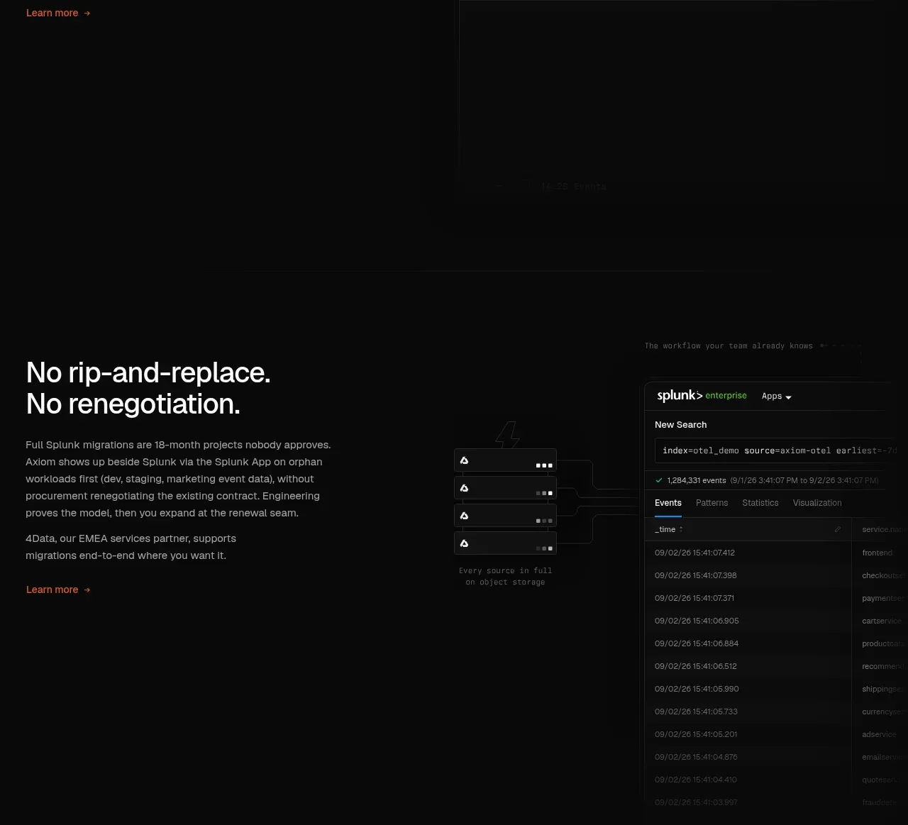
Design analysis
A split feature section explains the technical model on the left while a query/editor panel on the right turns the claim into a concrete interaction.
Prompt preview
## Reference images

Study these alongside the description below: hierarchy, rhythm, spacing, colour. Build for the product you are asked about, using this design language.

- Component: https://kage-design-assets.t3.tigrisfiles.io/components/axiom/c8c1ccab-fdeb-4f51-a10a-de94b7cc1af3-1789711532-7.webp
- Full page it was cut from: https://kage-design-assets.t3.tigrisfiles.io/screenshots/axiom/c8c1ccab-fdeb-4f51-a10a-de94b7cc1af3-1789711409328-full.webp
- Component on Kage: https://kage.design/component/axiom-feature-grid-3

## Before you start
Ask what technical architecture or workflow differentiates the user's product and what interface best demonstrates it. Create an original split section.

Build a two-column dark feature section with copy on the left and a large UI demonstration on the right. The left column has a 28–34px heading, two compact paragraphs, and an accent link. The right column is a framed editor or query panel with a toolbar, numbered monospace lines, a run control, and a quiet results area. Use a 1px #252525 border, 8px radius, #0d0e0e surface, warm-white text, gray metadata, and orange for the one important action or state. Align both columns to the same top edge, keep the copy measure around 360px, and allow the UI to crop gracefully rather than shrinking unreadably. Stack the columns on mobile.

Never: copy logos, product names, copy, illustrations, or imagery from the reference.
More components

 AI-powered helpdesk feature section
intercom.com · Feature grid
AI-powered helpdesk feature section
intercom.com · Feature grid
 Integrations and ecosystem section
intercom.com · Feature grid
Integrations and ecosystem section
intercom.com · Feature grid
 AI agent capabilities section
intercom.com · Feature grid
AI agent capabilities section
intercom.com · Feature grid
 Unified support experience overview
intercom.com · Feature grid
Unified support experience overview
intercom.com · Feature grid

 Core invoicing capabilities
sendinvo.com · Feature grid
Core invoicing capabilities
sendinvo.com · Feature grid
 Audience and trade types
sendinvo.com · Feature grid
Audience and trade types
sendinvo.com · Feature grid