 kage
kage
partners.axiom.co
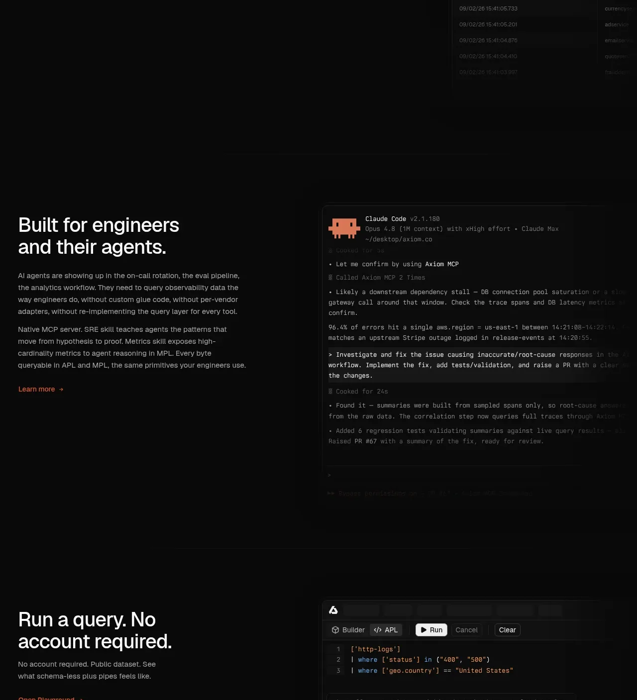
Design analysis
This section addresses adoption friction with a plain-language migration promise and a visual flow from source systems into a familiar destination interface.
Prompt preview
## Reference images

Study these alongside the description below: hierarchy, rhythm, spacing, colour. Build for the product you are asked about, using this design language.

- Component: https://kage-design-assets.t3.tigrisfiles.io/components/axiom/c8c1ccab-fdeb-4f51-a10a-de94b7cc1af3-1789711532-8.webp
- Full page it was cut from: https://kage-design-assets.t3.tigrisfiles.io/screenshots/axiom/c8c1ccab-fdeb-4f51-a10a-de94b7cc1af3-1789711409328-full.webp
- Component on Kage: https://kage.design/component/axiom-feature-grid-4

## Before you start
Ask what customers migrate from, what risk concerns them, and what migration path your product can credibly simplify. Turn that into an original section.

Use a wide dark split layout. On the left, place a strong two-line heading, several short explanatory paragraphs, and a small orange link. On the right, show an abstract migration workflow: stacked source cards, connector lines, and a destination application panel. Keep the illustration diagrammatic and product-specific to the user's domain, using dark surfaces (#101111), thin gray lines (#303030), off-white labels, and a restrained orange status accent. Use generous whitespace, 28–40px column gap, and a 1px border around any UI panel. Ensure the visual remains understandable without animation; optional hover states can illuminate the path. Stack on mobile.

Never: copy logos, product names, copy, illustrations, or imagery from the reference.
More components

 AI-powered helpdesk feature section
intercom.com · Feature grid
AI-powered helpdesk feature section
intercom.com · Feature grid
 Integrations and ecosystem section
intercom.com · Feature grid
Integrations and ecosystem section
intercom.com · Feature grid
 AI agent capabilities section
intercom.com · Feature grid
AI agent capabilities section
intercom.com · Feature grid
 Unified support experience overview
intercom.com · Feature grid
Unified support experience overview
intercom.com · Feature grid

 Core invoicing capabilities
sendinvo.com · Feature grid
Core invoicing capabilities
sendinvo.com · Feature grid
 Audience and trade types
sendinvo.com · Feature grid
Audience and trade types
sendinvo.com · Feature grid