 kage
kage
partners.axiom.co
Design analysis
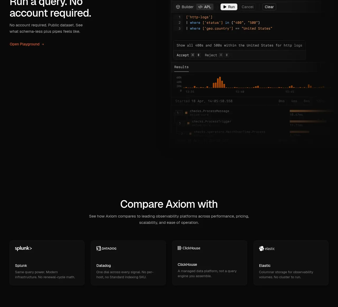
A developer-oriented split section combines an engineering-focused message with a realistic terminal or agent transcript to make the audience feel understood.
Prompt preview
## Reference images

Study these alongside the description below: hierarchy, rhythm, spacing, colour. Build for the product you are asked about, using this design language.

- Component: https://kage-design-assets.t3.tigrisfiles.io/components/axiom/c8c1ccab-fdeb-4f51-a10a-de94b7cc1af3-1789711532-9.webp
- Full page it was cut from: https://kage-design-assets.t3.tigrisfiles.io/screenshots/axiom/c8c1ccab-fdeb-4f51-a10a-de94b7cc1af3-1789711409328-full.webp
- Component on Kage: https://kage.design/component/axiom-feature-grid-5

## Before you start
Ask who develops with the user's product, what tools or agents they use, and what task the demo should show. Build a fresh developer feature section.

Create a two-column section with editorial copy on the left and a large terminal/agent transcript on the right. Use a clear 28–34px heading, 2–3 short paragraphs, and a small link. The terminal should have a dark elevated surface, a tiny colored status icon, monospace text, command/result hierarchy, and one or two highlighted lines. Use #0b0c0c, #1f2020 borders, #a8a8a1 metadata, #f0f0eb primary text, and orange sparingly. Keep line lengths readable, add subtle scan-line or gradient depth only if it does not reduce legibility, and make the transcript scrollable or collapsible on mobile.

Never: copy logos, product names, copy, illustrations, or imagery from the reference.
More components

 AI-powered helpdesk feature section
intercom.com · Feature grid
AI-powered helpdesk feature section
intercom.com · Feature grid
 Integrations and ecosystem section
intercom.com · Feature grid
Integrations and ecosystem section
intercom.com · Feature grid
 AI agent capabilities section
intercom.com · Feature grid
AI agent capabilities section
intercom.com · Feature grid
 Unified support experience overview
intercom.com · Feature grid
Unified support experience overview
intercom.com · Feature grid

 Core invoicing capabilities
sendinvo.com · Feature grid
Core invoicing capabilities
sendinvo.com · Feature grid
 Audience and trade types
sendinvo.com · Feature grid
Audience and trade types
sendinvo.com · Feature grid