kage
kage
partners.axiom.co

Design analysis
A large declarative headline and two CTAs lead into an expansive product-interface visual, making the product capability tangible before the next proof section.
Prompt preview
## Reference images

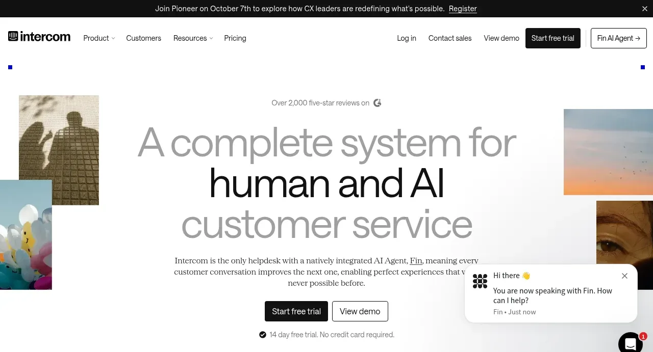
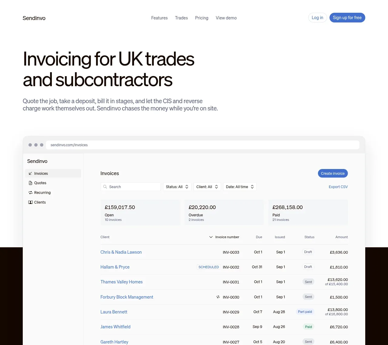
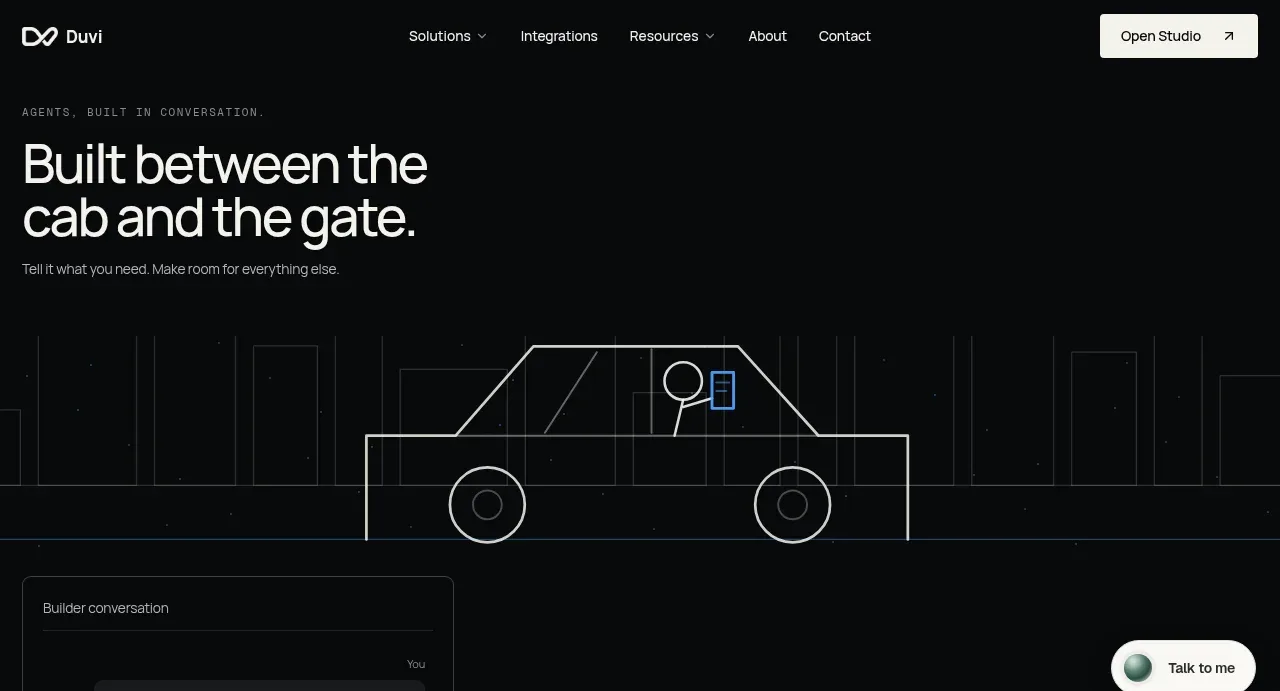
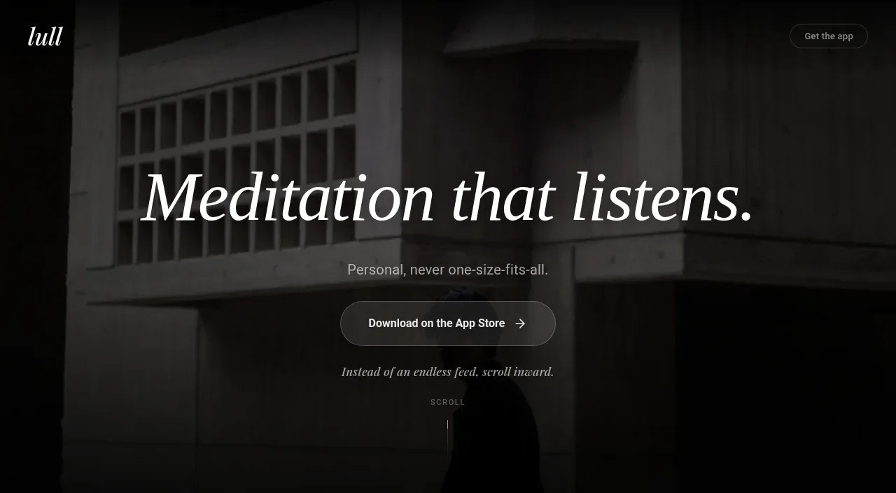
Study these alongside the description below: hierarchy, rhythm, spacing, colour. Build for the product you are asked about, using this design language.

- Component: https://kage-design-assets.t3.tigrisfiles.io/components/axiom/c8c1ccab-fdeb-4f51-a10a-de94b7cc1af3-1789711530-1.webp
- Full page it was cut from: https://kage-design-assets.t3.tigrisfiles.io/screenshots/axiom/c8c1ccab-fdeb-4f51-a10a-de94b7cc1af3-1789711409328-full.webp
- Component on Kage: https://kage.design/component/axiom-hero

## Before you start
Ask what the user's product does, what its strongest promise is, and what brand system it uses. Then create an original hero using these principles.

Use a near-black full-width canvas (#080909) with a narrow centered content rail. Place a large left-aligned headline near the upper third, with a concise muted supporting paragraph below and one orange primary CTA plus a dark secondary CTA. Use a bold 44–56px heading with tight line-height and off-white text; keep body copy 14–16px and gray (#9a9a96). Below the copy, reserve most of the hero height for a wide, edge-to-edge product UI mockup: dark panels, fine gray borders, monospace query text, tabs, a results area, and subtle orange highlights. Fade the lower edge into the page background so the visual feels integrated. Use 8px panel radii, 1px borders (#252525), and restrained shadows. On mobile, stack copy and reduce the UI visual rather than allowing horizontal overflow.

Never: copy logos, product names, copy, illustrations, or imagery from the reference.