 kage
kage
backdropagent.com
Design analysis
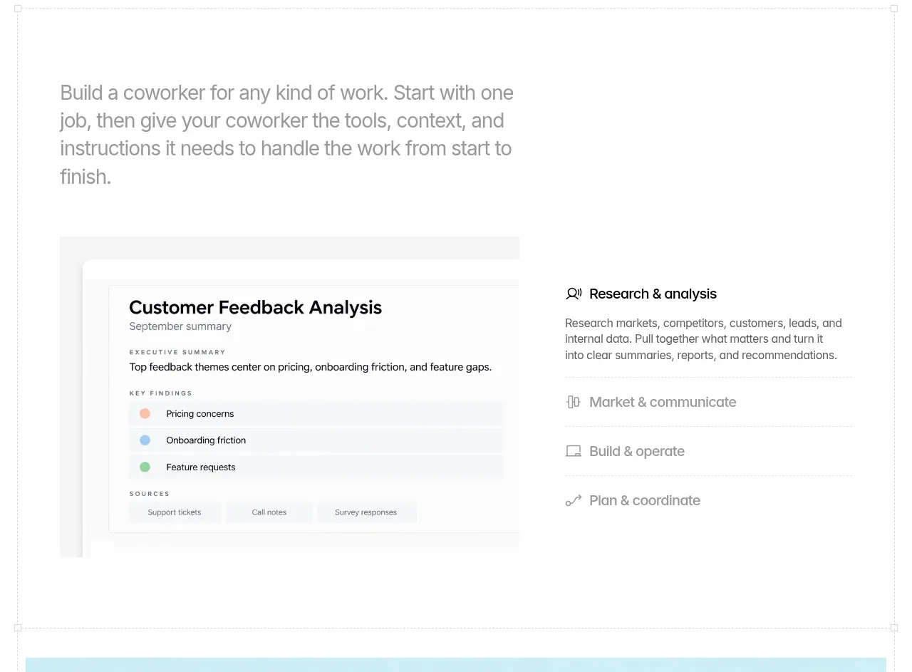
A short left-aligned explanation introduces the workflow, followed by a two-column product panel pairing a report-style artifact with expandable work categories.
Prompt preview
## Reference images

Study these alongside the description below: hierarchy, rhythm, spacing, colour. Build for the product you are asked about, using this design language.

- Component: https://kage-design-assets.t3.tigrisfiles.io/components/backdrop/a4be162f-a1b8-4e5c-8da7-09cb7d37c0e3-1792130679-2.webp
- Full page it was cut from: https://kage-design-assets.t3.tigrisfiles.io/screenshots/backdrop/a4be162f-a1b8-4e5c-8da7-09cb7d37c0e3-1792130585649-full.webp
- Component on Kage: https://kage.design/component/backdrop-feature-grid

## Before you start
Ask what kind of work the user's product helps with and what artifact best demonstrates it. Apply the structure to that domain and brand.

Create an introductory workflow feature section with generous top whitespace. Start with a large muted paragraph aligned to a max-width content column, then place a two-column demonstration beneath it. The left side should be a pale, bordered document/report card with a clear title, metadata, summary, rows, and source chips. The right side should be a vertical list of work categories with one emphasized row and several quieter rows separated by thin rules. Use a white background, #111111 headings, #707070 body text, very pale gray surfaces (#fafafa), 1px #ededed borders, and restrained 6–10px corner radii. Keep the visual hierarchy document-first and make category rows keyboard-accessible with hover/focus states.

### Never
- Never reuse the reference report title, labels, category names, or screenshots.
- Never use logos or copied product UI.
- Never turn every row into a loud card.
More components

 Data-to-action engine
Salience · Feature grid
Data-to-action engine
Salience · Feature grid
 Actionable alert workflow
Salience · Feature grid
Actionable alert workflow
Salience · Feature grid
 Trust proof and core outcomes
Salience · Feature grid
Trust proof and core outcomes
Salience · Feature grid
 Three-step implementation flow
Salience · Feature grid
Three-step implementation flow
Salience · Feature grid
 What analytics misses
Salience · Feature grid
What analytics misses
Salience · Feature grid

 Workflow features and capabilities
CrewTower Mod for Claude Code · Feature grid
Workflow features and capabilities
CrewTower Mod for Claude Code · Feature grid