 kage
kage
backdropagent.com
Design analysis
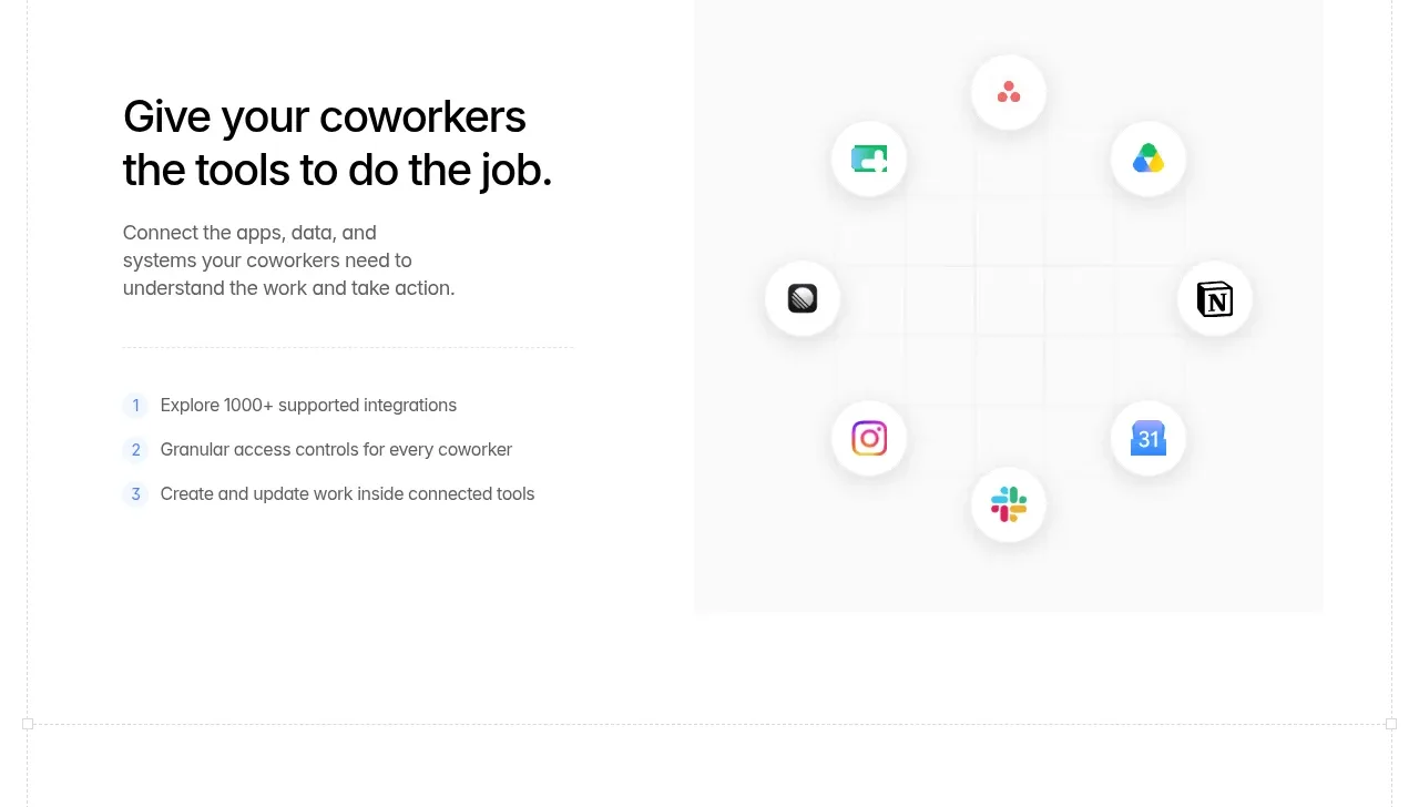
A split section pairs a concise headline and numbered benefits with a light integration constellation, communicating breadth without a dense logo wall.
Prompt preview
## Reference images

Study these alongside the description below: hierarchy, rhythm, spacing, colour. Build for the product you are asked about, using this design language.

- Component: https://kage-design-assets.t3.tigrisfiles.io/components/backdrop/a4be162f-a1b8-4e5c-8da7-09cb7d37c0e3-1792130679-4.webp
- Full page it was cut from: https://kage-design-assets.t3.tigrisfiles.io/screenshots/backdrop/a4be162f-a1b8-4e5c-8da7-09cb7d37c0e3-1792130585649-full.webp
- Component on Kage: https://kage.design/component/backdrop-feature-grid-2

## Before you start
Ask which systems the user's product connects to and which three integration benefits matter most. Use those answers to create an original section.

Build a two-column integrations feature. Put a strong two-line heading, short explanation, and three numbered benefit rows in the left column. In the right column, show a quiet pale panel containing a loose constellation or grid of generic app tiles connected by faint lines; use abstract symbols or user-provided assets, not recognizable reference marks. Use black typography, gray body text, a white-to-very-pale-gray surface, soft shadows, 12px tile radii, and a restrained accent color for numbers and connectors. Keep the diagram decorative but understandable and allow it to collapse below the copy on mobile.

### Never
- Never use the reference integration logos or names.
- Never reproduce the exact constellation layout.
- Never claim integrations that the user's product does not support.
More components

 Data-to-action engine
Salience · Feature grid
Data-to-action engine
Salience · Feature grid
 Actionable alert workflow
Salience · Feature grid
Actionable alert workflow
Salience · Feature grid
 Trust proof and core outcomes
Salience · Feature grid
Trust proof and core outcomes
Salience · Feature grid
 Three-step implementation flow
Salience · Feature grid
Three-step implementation flow
Salience · Feature grid
 What analytics misses
Salience · Feature grid
What analytics misses
Salience · Feature grid

 Workflow features and capabilities
CrewTower Mod for Claude Code · Feature grid
Workflow features and capabilities
CrewTower Mod for Claude Code · Feature grid