 kage
kage
backdropagent.com
Design analysis
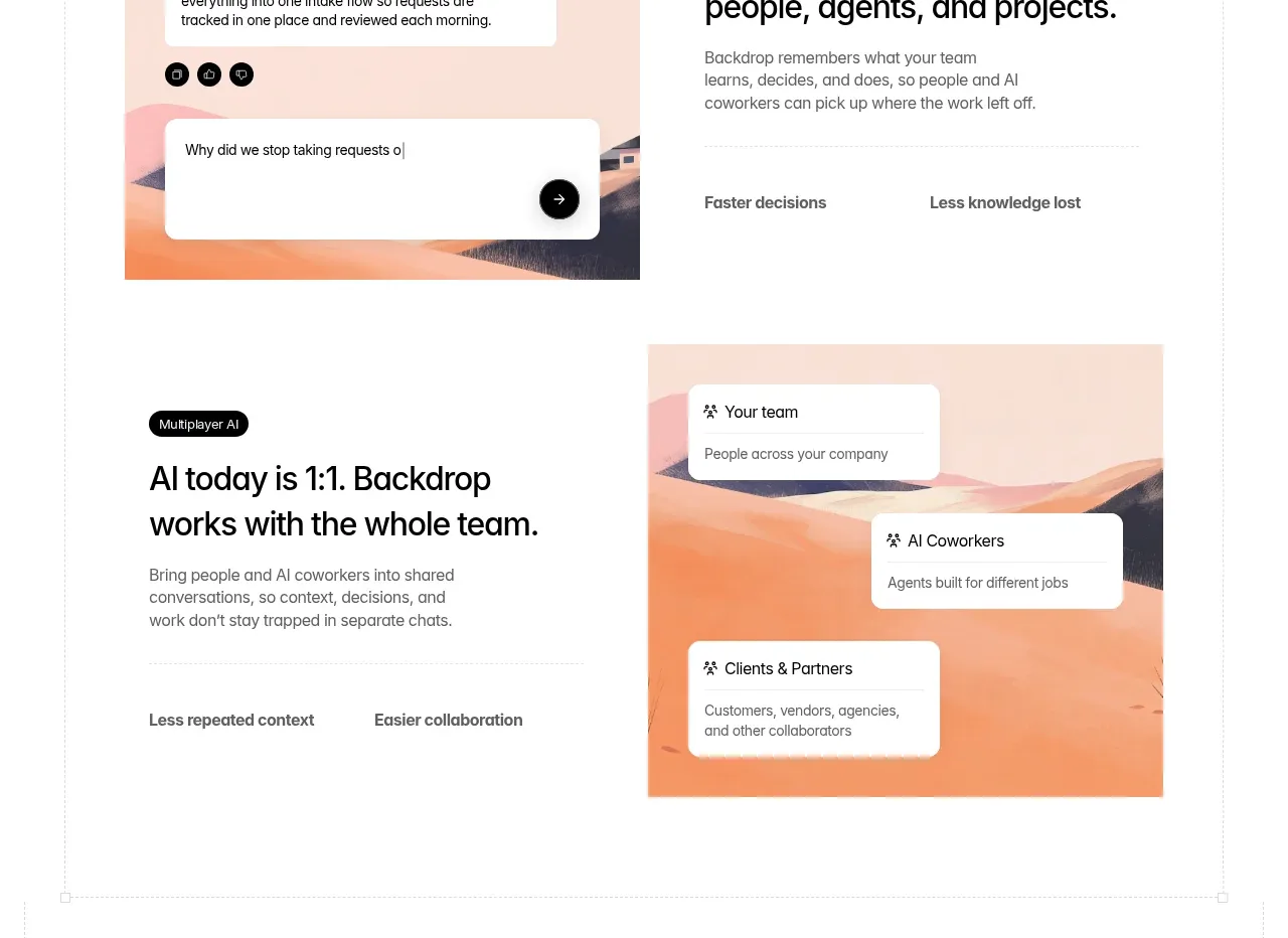
Two alternating feature rows explain shared organizational memory and multi-party collaboration, each pairing concise copy with a warm illustrated diagram.
Prompt preview
## Reference images

Study these alongside the description below: hierarchy, rhythm, spacing, colour. Build for the product you are asked about, using this design language.

- Component: https://kage-design-assets.t3.tigrisfiles.io/components/backdrop/a4be162f-a1b8-4e5c-8da7-09cb7d37c0e3-1792130680-6.webp
- Full page it was cut from: https://kage-design-assets.t3.tigrisfiles.io/screenshots/backdrop/a4be162f-a1b8-4e5c-8da7-09cb7d37c0e3-1792130585649-full.webp
- Component on Kage: https://kage.design/component/backdrop-feature-grid-3

## Before you start
Ask what knowledge should be shared in the user's product and which people, agents, or systems collaborate. Apply this pattern with the user's own language and visual identity.

Build two alternating feature rows. Each row should pair a compact eyebrow, bold two-line heading, short supporting paragraph, and two small benefit labels with a warm diagram panel on the opposite side. Use generous vertical spacing and switch the text/image order between rows to create rhythm. Diagrams should use simple cards, connectors, and abstract avatars or entities on a soft branded gradient. Keep cards white with 10–14px radius, 1px translucent borders, and subtle shadow. Use #111111 headings, #666666 body text, and a restrained warm accent palette. On mobile, stack text before visual and preserve the semantic order.

### Never
- Never use the reference phrases, illustrations, people, or exact diagrams.
- Never present decorative cards as real data without labels.
- Never overcrowd the explanatory copy.
More components

 Data-to-action engine
Salience · Feature grid
Data-to-action engine
Salience · Feature grid
 Actionable alert workflow
Salience · Feature grid
Actionable alert workflow
Salience · Feature grid
 Trust proof and core outcomes
Salience · Feature grid
Trust proof and core outcomes
Salience · Feature grid
 Three-step implementation flow
Salience · Feature grid
Three-step implementation flow
Salience · Feature grid
 What analytics misses
Salience · Feature grid
What analytics misses
Salience · Feature grid

 Workflow features and capabilities
CrewTower Mod for Claude Code · Feature grid
Workflow features and capabilities
CrewTower Mod for Claude Code · Feature grid