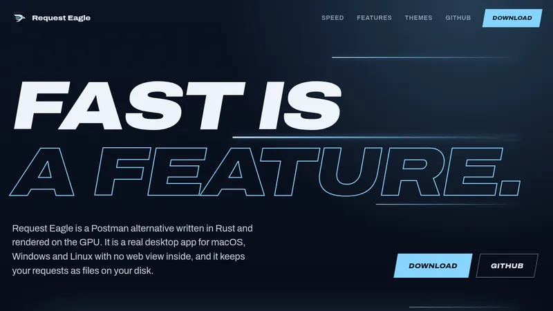
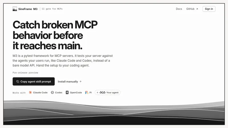
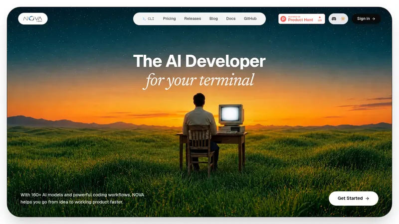
kage
kage
base44.com

Design analysis
A long-form product page uses a pale dotted-grid field, oversized black sans-serif headlines, and orange/blue accents to frame a browser-based collaborative coding workflow. The hero is spacious and screenshot-led; below it, the rhythm shifts into a gray demo panel, a four-step process grid, an image-and-accordion section, a textured checklist card, FAQ rows, a saturated blue CTA, and a dense multi-column footer.
Prompt preview
## Reference images

Study these alongside the description below: hierarchy, rhythm, spacing, colour. Build for the product you are asked about, using this design language.

- Full page: https://kage-design-assets.t3.tigrisfiles.io/screenshots/base-code/bec5af88-964e-4f0a-90b9-76aa2444b6f5-1791871315791-full.webp
- Above the fold: https://kage-design-assets.t3.tigrisfiles.io/screenshots/base-code/bec5af88-964e-4f0a-90b9-76aa2444b6f5-1791871311460.webp
- Design on Kage: https://kage.design/designs/base-code-landing-page

## Before you start
Ask the user what they are building, who it is for, and what brand assets they already have, including the product name, colours, type choices, logo, imagery, and icons. Wait for their answers before designing. Apply the reference's layout and interaction principles to that product rather than copying the reference brand.

## Page structure
1. **Header:** Place a compact logo area at the upper left, a dark rounded primary action near the upper right, and a simple menu icon at the far right over the pale patterned background.
2. **Hero:** Center a very large two-line headline, followed by a short explanatory paragraph and a bright orange rounded CTA. Keep the hero airy, then anchor it with a wide product/workflow screenshot that overlaps the lower portion.
3. **Intro statement:** Add a small eyebrow, then a two-column text block: a large declarative statement on the left and a narrower explanatory paragraph on the right.
4. **Demo feature panel:** Change the background to a soft gray section. Use a large headline at the top, supporting copy and an outlined button on the left, and a large product screenshot aligned to the right/lower half.
5. **Four-step workflow:** Return to the pale dotted background. Introduce the section with a large heading, then show four equal-width cards in one row. Each card has a colourful thumbnail, a numbered label, a short title, and compact explanatory copy.
6. **Team contribution section:** Use a two-column layout with a bold heading on the left, a cropped team photograph beneath it, and an accordion list on the right. Give the first accordion item an expanded description and keep the remaining roles collapsed with circular arrow controls.
7. **Engineering control panel:** Place a large white content card over a softly blurred, grainy orange/green photographic or abstract background. Use a strong two-line heading and two columns of checklist rows separated by thin black rules.
8. **FAQ:** On a clean white background, put a large heading in the left column and a vertically stacked accordion in the right column. Use thin horizontal dividers, bold questions, and circular up/down controls; show one answer expanded.
9. **Final CTA:** Create a saturated blue, lightly textured banner with a centered light headline, a horizontal strip of small image tiles, and a large underlined action with an arrow icon.
10. **Footer:** Finish with a white footer. Place the brand lockup and short description/social icons in the first column, then organize many text links into Company, Product, Resources, and Legal columns, with a copyright line at the bottom.

## Design language
- Build hierarchy through a very large, tightly set sans-serif display scale for section headlines, medium-weight subheads, and small utilitarian labels/body copy.
- Keep the upper page open and spacious, then increase information density below the hero through four-card workflows, accordions, checklists, FAQs, and link columns.
- Use a pale warm-gray canvas around `#f4f4f2` with a subtle fine dotted grid; switch to clean white for FAQ/footer, mid-gray for the demo panel, and vivid blue around `#314be8` for the closing CTA.
- Reserve a hot orange around `#ff6b16` for primary buttons, numbered or thumbnail accents, and small brand signals. Keep most text near-black around `#151515`; use colour as an accent rather than a broad gradient treatment.
- Pair a geometric modern sans-serif with generous but controlled line-height. Use oversized headlines with compact line spacing, short paragraphs at readable widths, and small eyebrow labels to establish section context.
- Use thin black rules extensively in accordions, checklists, and footer groupings. Keep cards mostly flat with modest or no shadows, small-to-medium corner radii, and outlined buttons with dark borders.
- Let imagery be functional: product UI captures demonstrate the workflow, while occasional cropped photography and abstract texture break up the interface-heavy sections. Align screenshots to the grid and allow some overlap for depth.
- Keep interaction simple and legible: accordions open with circular arrow controls, primary actions are high-contrast rounded buttons or underlined text links, and navigation remains minimal. Use restrained fades or upward reveals on section entry, not elaborate motion.
- Maintain strong horizontal alignment and generous outer margins on desktop; collapse the multi-column workflow, team layout, FAQ, and footer into readable vertical stacks on small screens.

## Never
Do not use the reference product's logos, wordmarks, product names, copy, screenshots, illustrations, photography, or icon set. Do not present the result as Base44 or Base Code. Create new content, brand assets, imagery, and interface examples for the user's product while preserving only the transferable layout and design language.
Components from this page
All components
 Minimal product navigation
Base Code · Navigation
Minimal product navigation
Base Code · Navigation
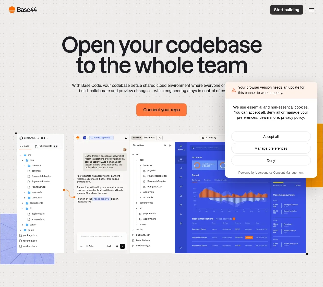 Codebase collaboration hero
Base Code · Hero
Codebase collaboration hero
Base Code · Hero
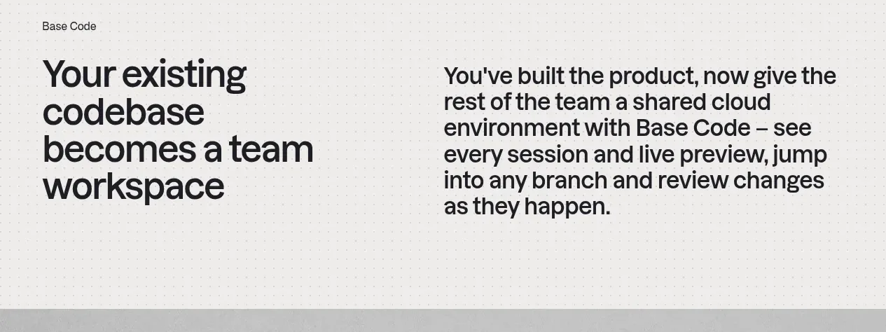 From codebase to team workspace
Base Code · Feature grid
From codebase to team workspace
Base Code · Feature grid
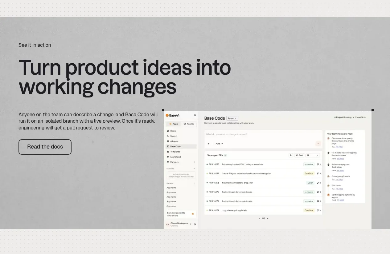 Product workflow demonstration
Base Code · Feature grid
Product workflow demonstration
Base Code · Feature grid
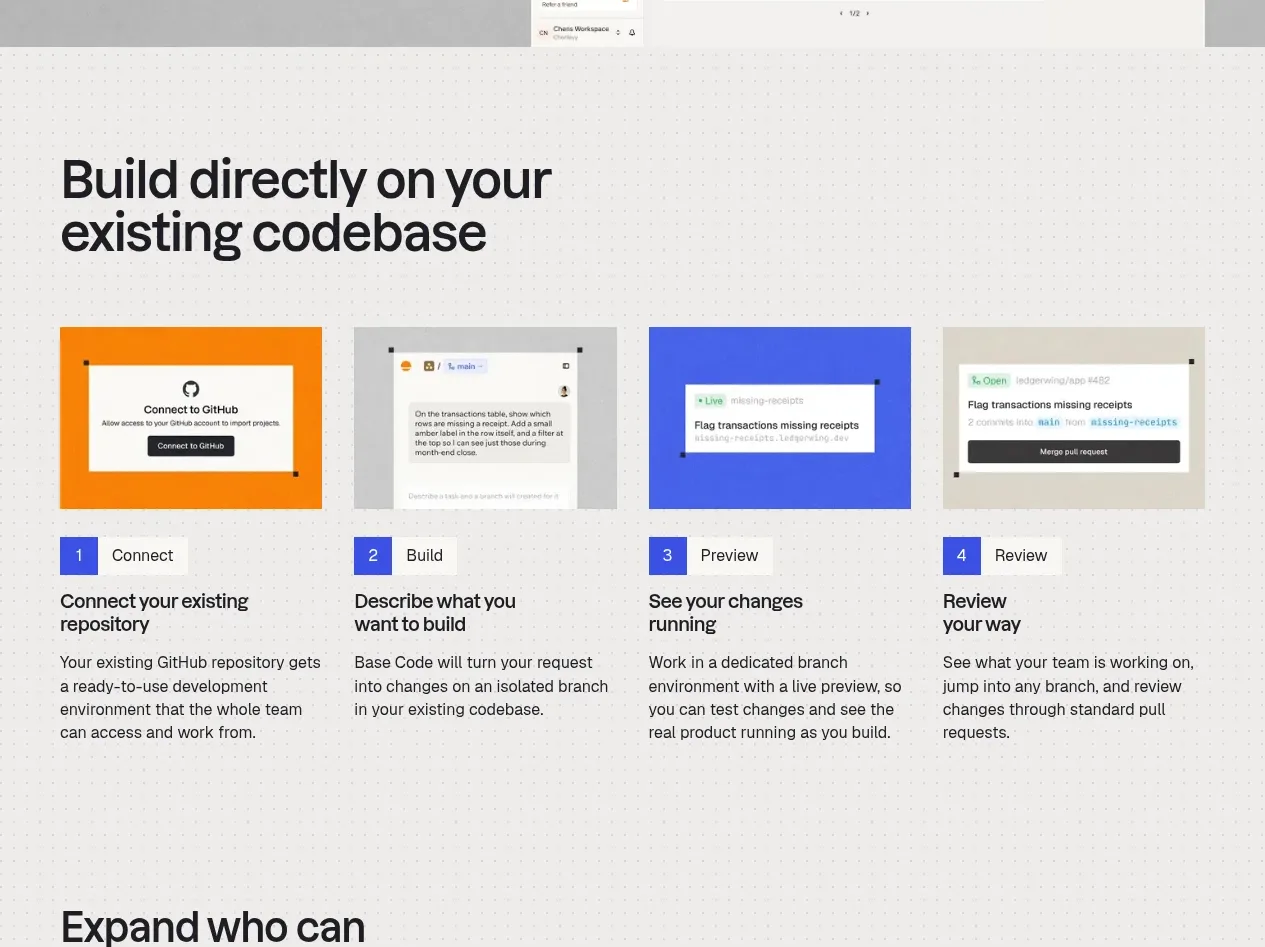 Four-step build workflow
Base Code · Feature grid
Four-step build workflow
Base Code · Feature grid
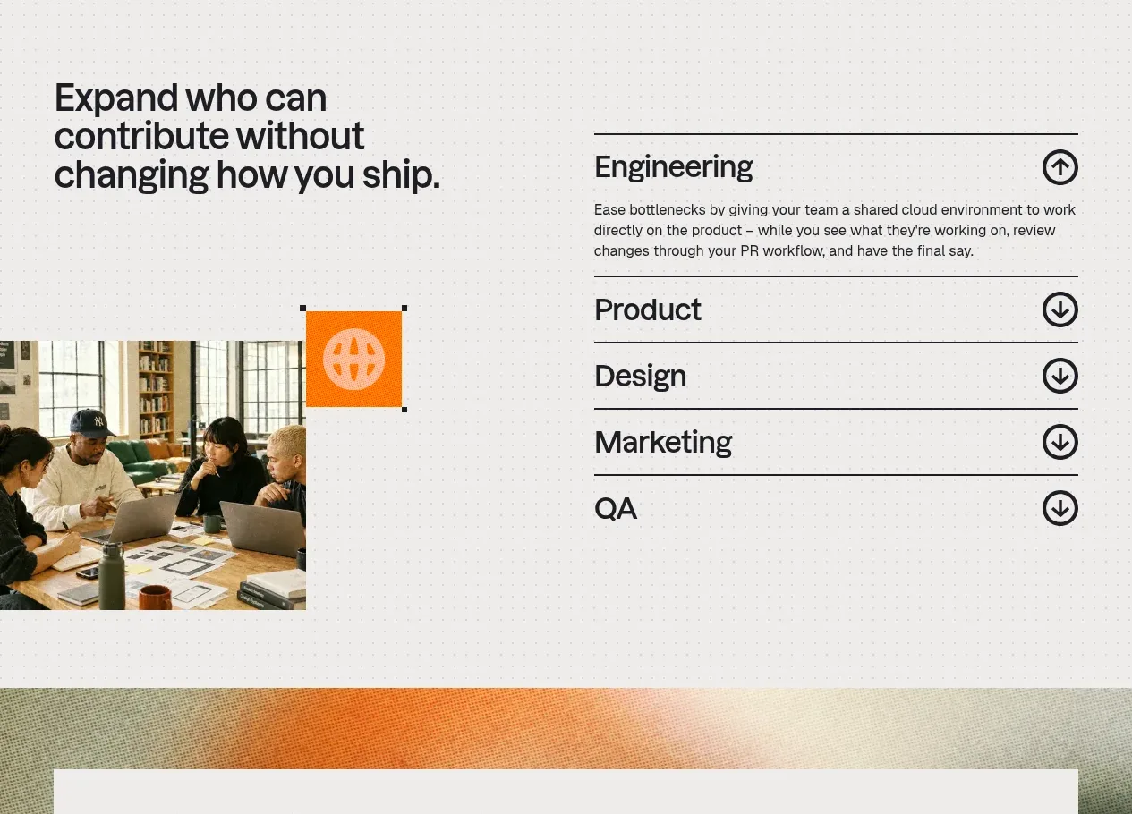 Cross-functional collaboration accordion
Base Code · Feature grid
Cross-functional collaboration accordion
Base Code · Feature grid
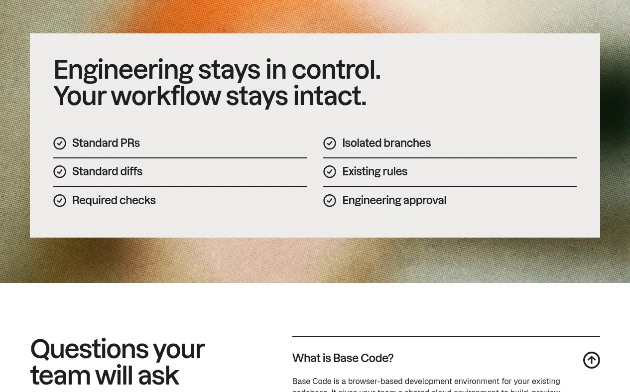 Engineering control checklist
Base Code · Card
Engineering control checklist
Base Code · Card
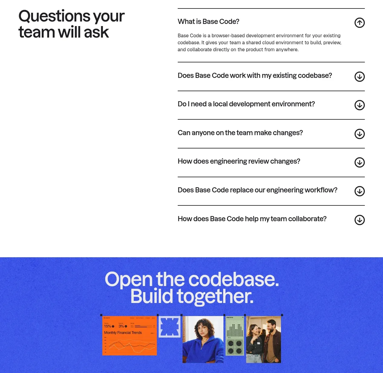 Frequently asked questions
Base Code · FAQ
Frequently asked questions
Base Code · FAQ
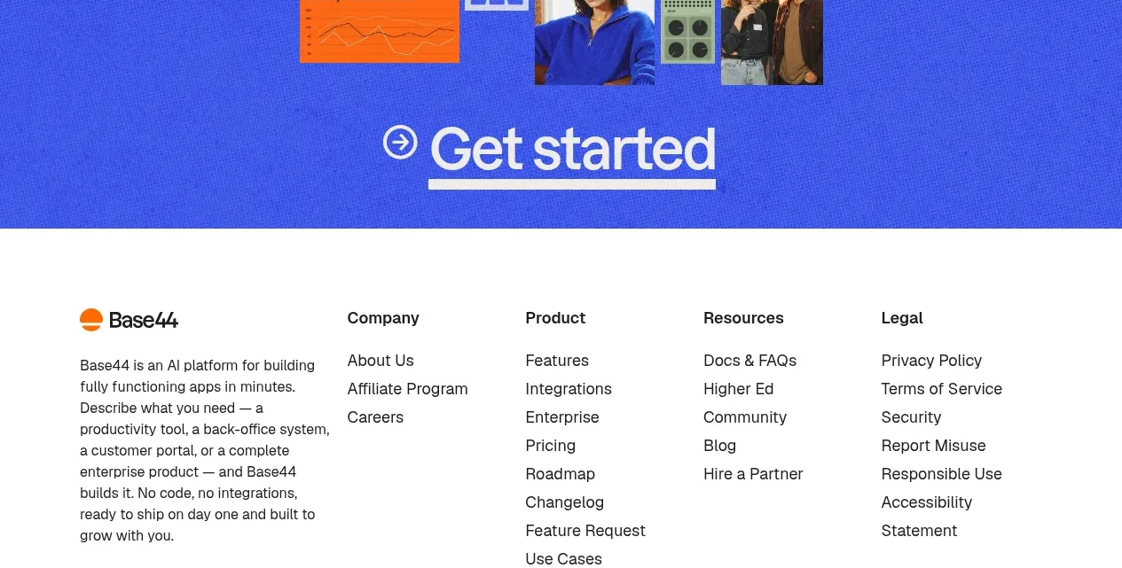 Bright closing call to action
Base Code · Call to action
Bright closing call to action
Base Code · Call to action
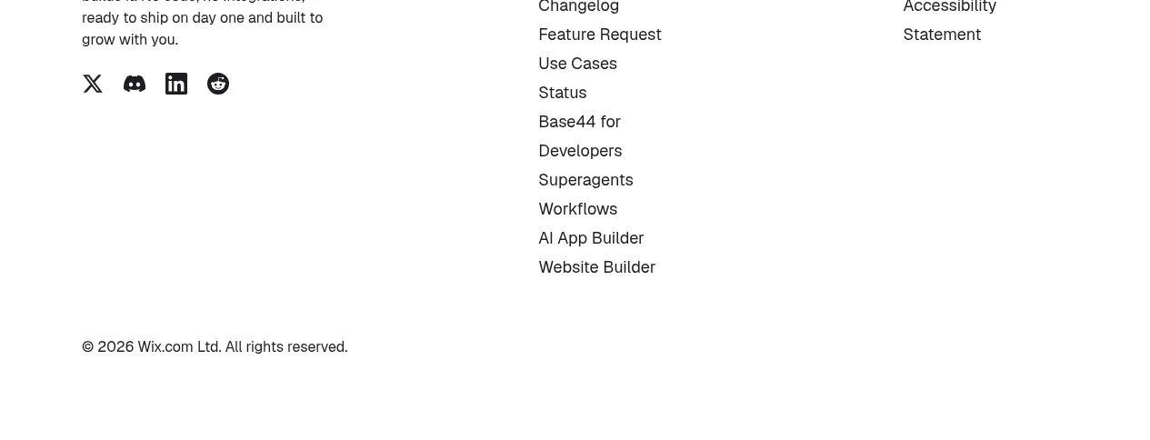 Multi-column site footer
Base Code · Footer
Multi-column site footer
Base Code · Footer