 kage
kage
base44.com
Design analysis
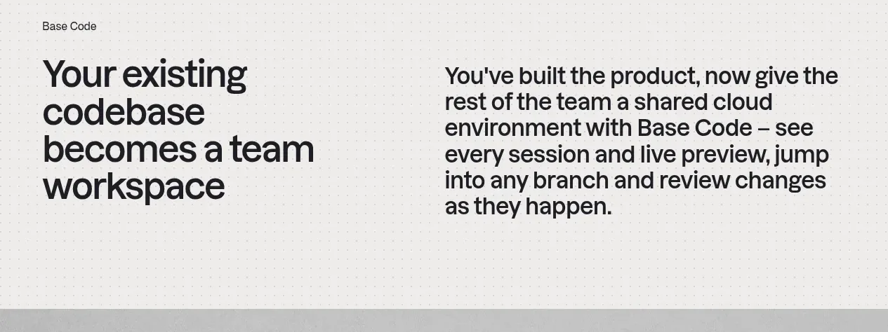
A short section contrasts a bold left statement with a more explanatory right column, translating the product into a clear team-level benefit.
Prompt preview
## Reference images

Study these alongside the description below: hierarchy, rhythm, spacing, colour. Build for the product you are asked about, using this design language.

- Component: https://kage-design-assets.t3.tigrisfiles.io/components/base-code/bec5af88-964e-4f0a-90b9-76aa2444b6f5-1791871470-2.webp
- Full page it was cut from: https://kage-design-assets.t3.tigrisfiles.io/screenshots/base-code/bec5af88-964e-4f0a-90b9-76aa2444b6f5-1791871315791-full.webp
- Component on Kage: https://kage.design/component/base-code-feature-grid

## Before you start
Ask what the user's product does, what team benefit matters most, and which brand rules to follow. Then create an original version using those answers.

Build a two-column value statement section on a lightly patterned off-white background. Put a large, decisive outcome headline in the left column and supporting explanation in the right column. Align both columns to a shared top baseline, keep the copy widths narrow enough to scan, and use strong typographic contrast rather than extra decoration. Use near-black text, spacious vertical padding, a subtle dot texture, and no heavy card borders. On narrow screens stack the columns with the headline first. The section should feel like a bridge from the hero into proof of how the product works.

Never use logos, product names, copy, illustrations, or imagery from the reference.
More components
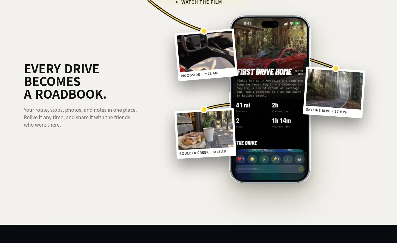
 Roadbook feature story
Milepost · Feature grid
Roadbook feature story
Milepost · Feature grid
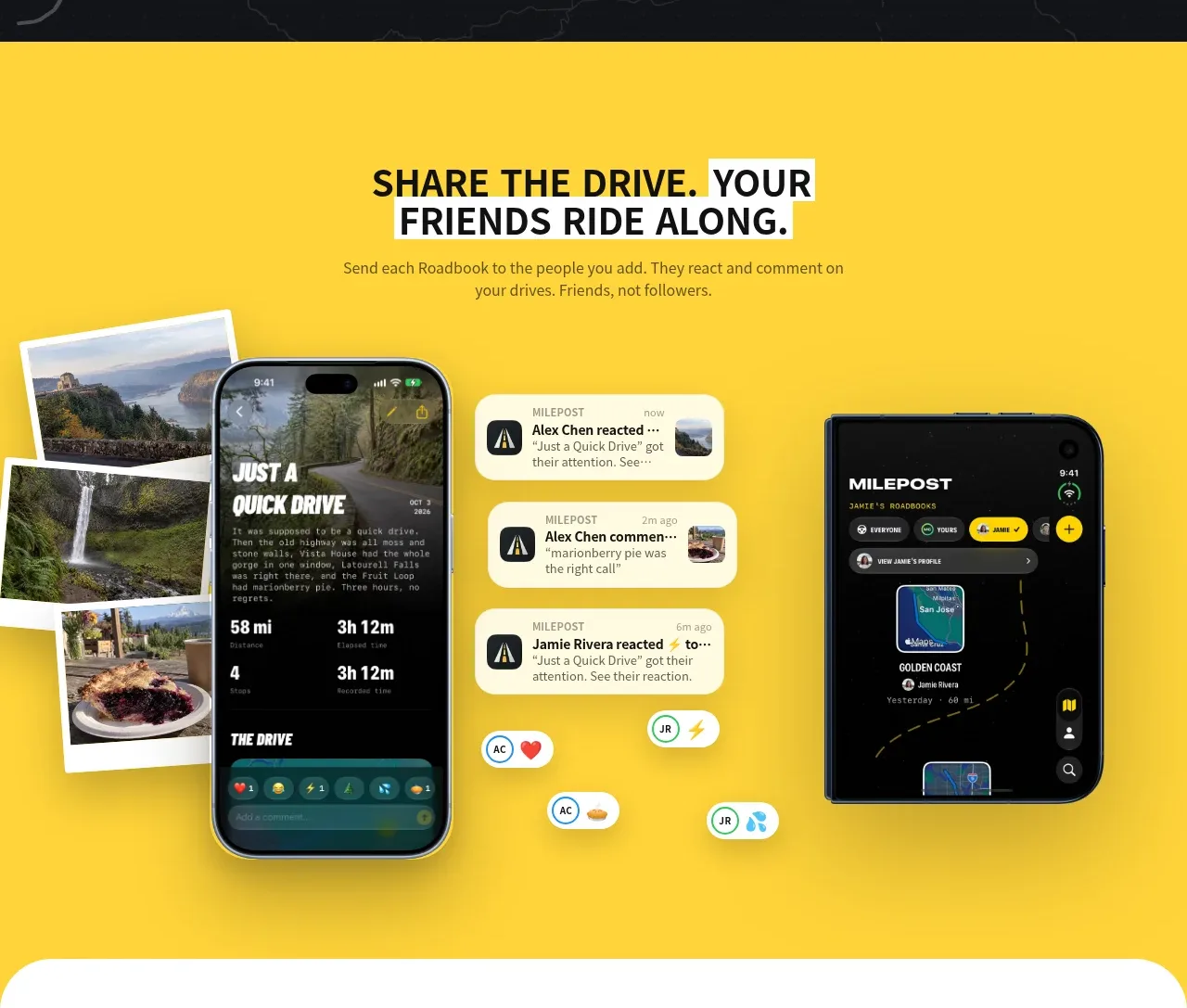 Shared drive feature
Milepost · Feature grid
Shared drive feature
Milepost · Feature grid
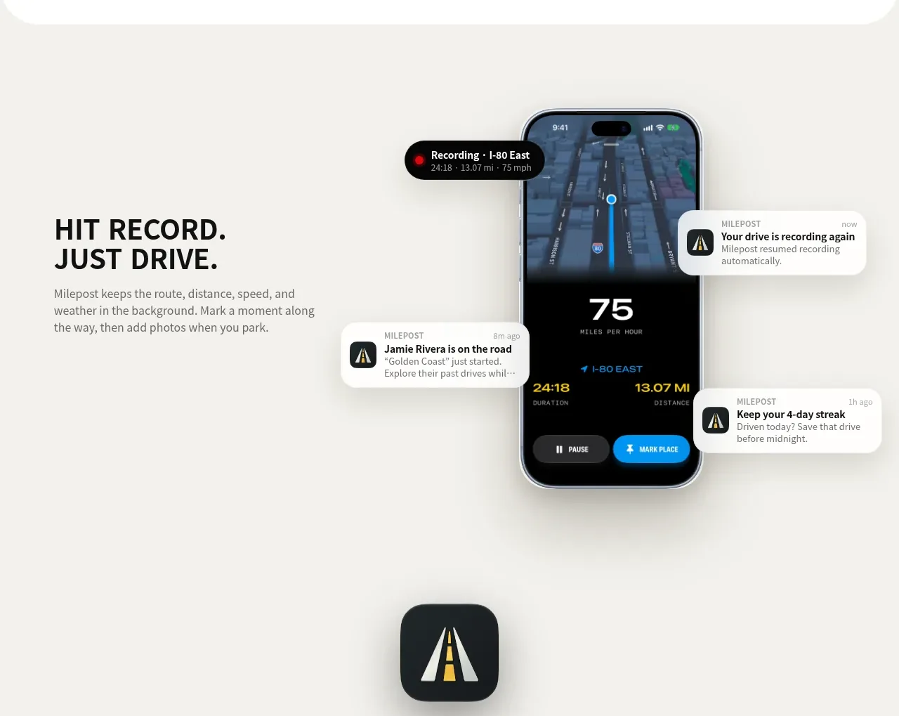 Automatic recording feature
Milepost · Feature grid
Automatic recording feature
Milepost · Feature grid
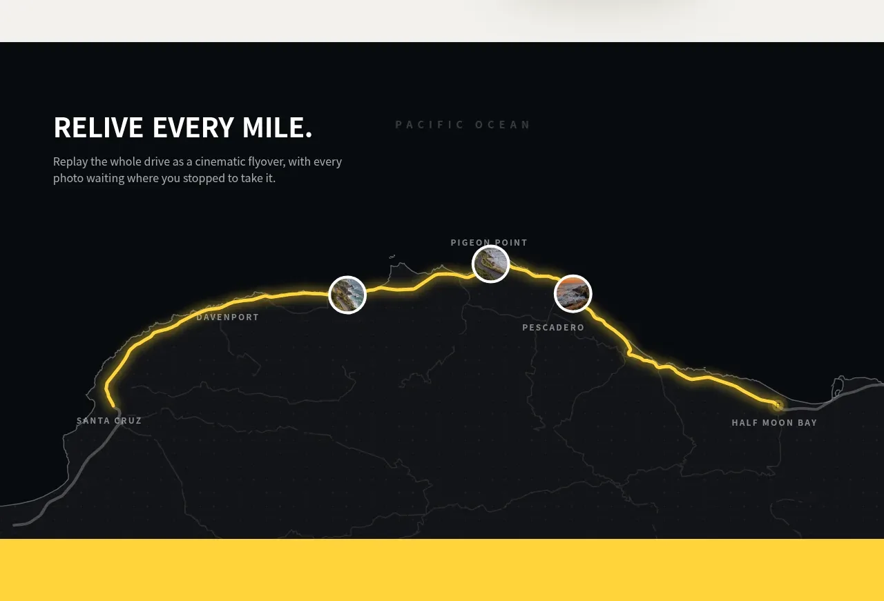 Route replay map feature
Milepost · Feature grid
Route replay map feature
Milepost · Feature grid
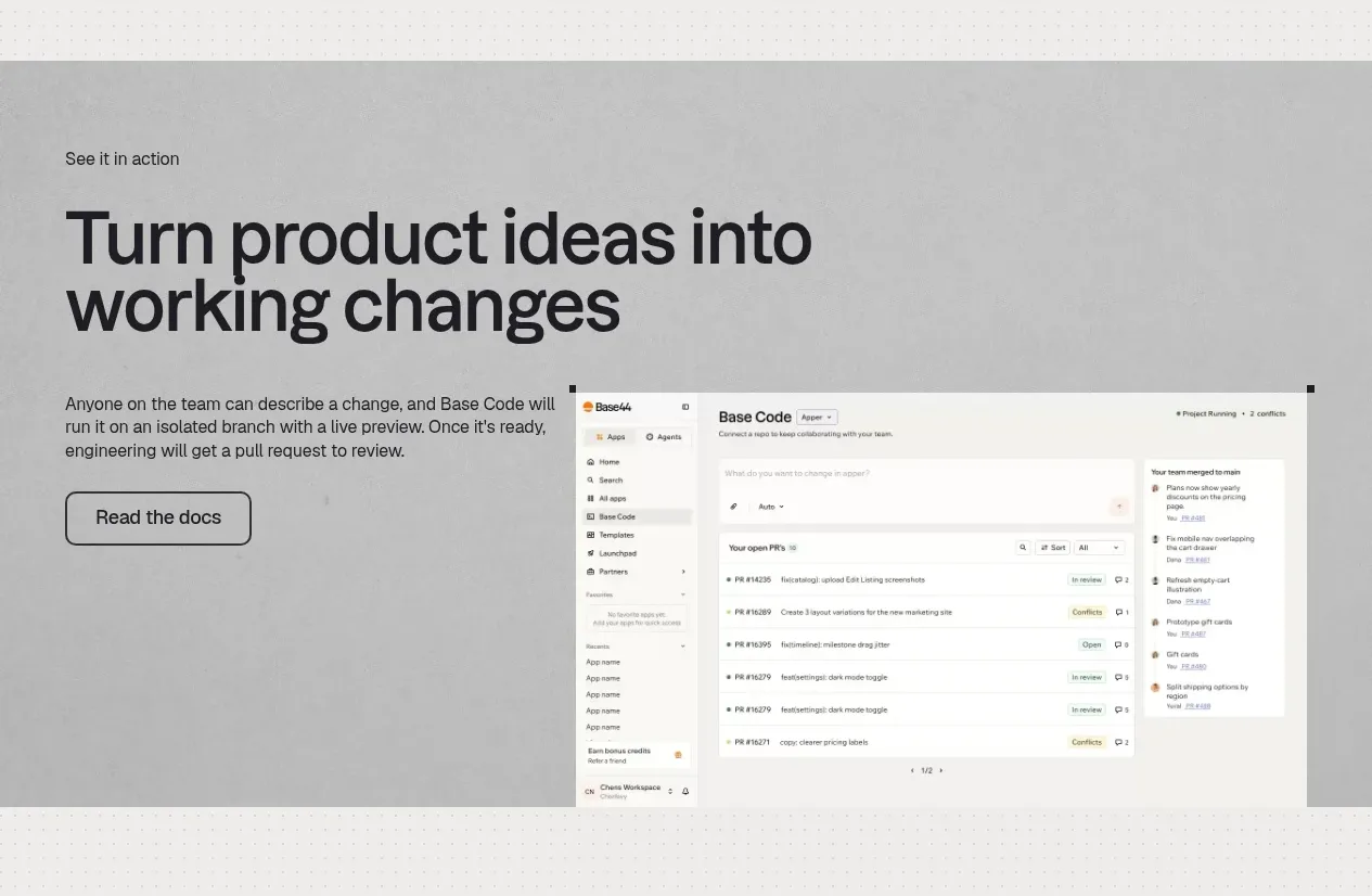
 Product workflow demonstration
Base Code · Feature grid
Product workflow demonstration
Base Code · Feature grid
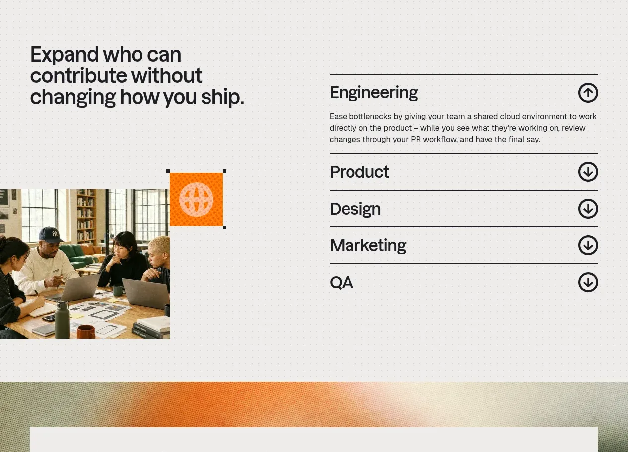 Cross-functional collaboration accordion
Base Code · Feature grid
Cross-functional collaboration accordion
Base Code · Feature grid