 kage
basedash.com
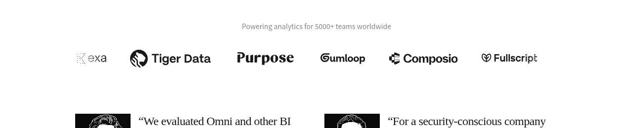
Design analysis
A short credibility band pairs a quiet statement with a single row of customer marks, keeping social proof understated and easy to scan.
Prompt preview
## Reference images

Study these alongside the description below: hierarchy, rhythm, spacing, colour. Build for the product you are asked about, using this design language.

- Component: https://kage-design-assets.t3.tigrisfiles.io/components/basedash-view-only-members/6dbd0b50-cdba-4977-b7dc-6a7ba68a352e-1793253917-2.webp
- Full page it was cut from: https://kage-design-assets.t3.tigrisfiles.io/screenshots/basedash-view-only-members/6dbd0b50-cdba-4977-b7dc-6a7ba68a352e-1793253800610-full.webp
- Component on Kage: https://kage.design/component/basedash-view-only-members-logo-cloud

## Before you start
Ask what the user's product, customer segment, and brand system are. Adapt this social-proof pattern to those answers.

Build a compact customer-proof section with a centered muted sentence above a horizontal row of five or six customer marks. Use generous vertical breathing room, no card backgrounds, and monochrome or low-saturation marks so the product remains primary. Use 13–14px gray #8a8a8a for the statement and logos in #222 or a restrained gray. Keep the row evenly distributed inside a max-width 700–760px container, with responsive horizontal scrolling or wrapping on small screens. Add subtle opacity changes on hover only if marks are links.

Never: use logos, product names, copy, illustrations, or imagery from the reference.
More components
 Customer logo wall
Open For sales · Logo cloud
 Trusted by cloud teams
CloudKnife · Logo cloud
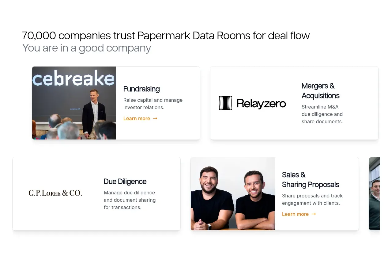
 Customer proof and use-case cards
Papermark Data Rooms · Logo cloud
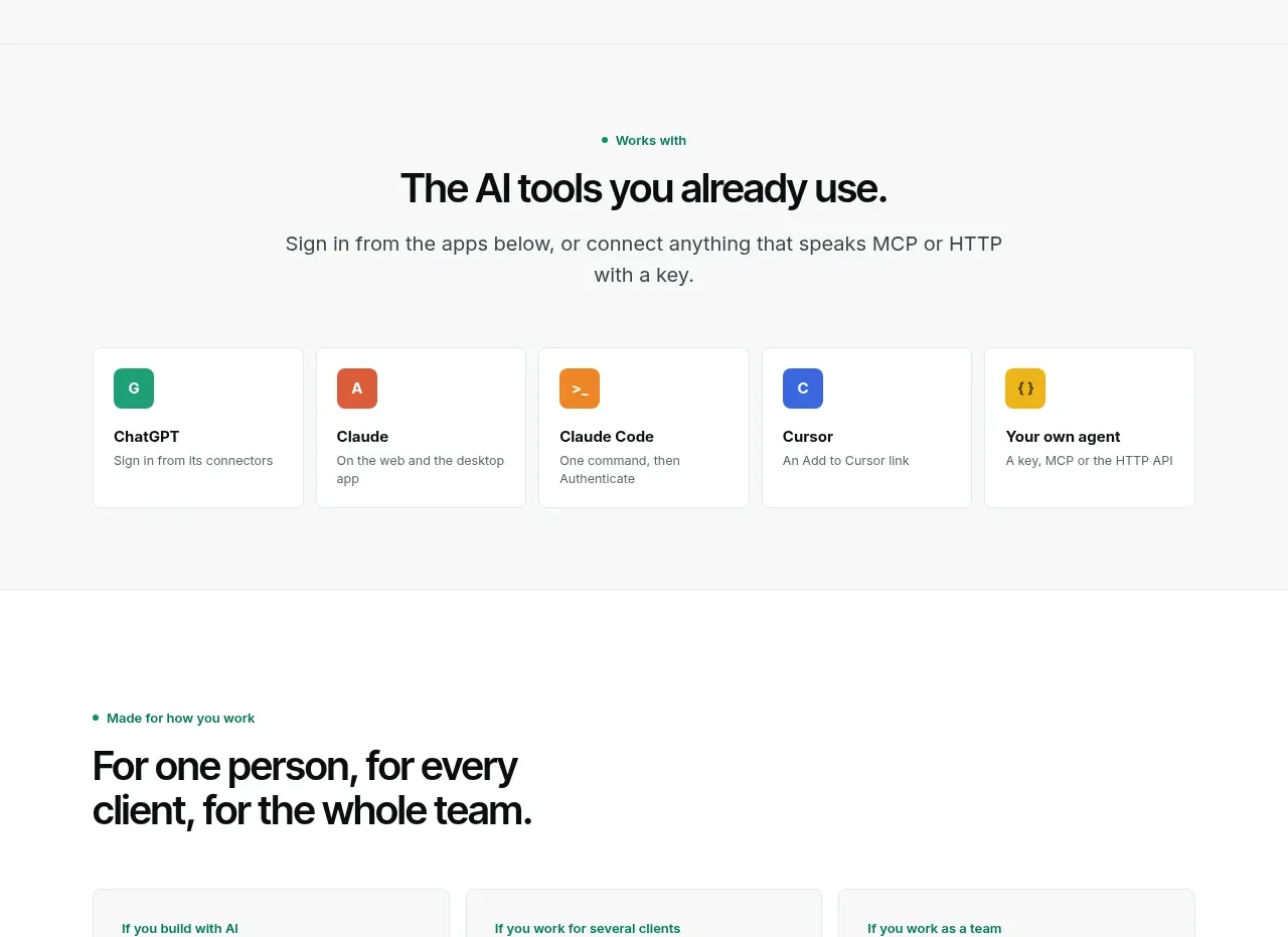
 Compatible tools grid
Context Engine · Logo cloud

M
AI model compatibility strip
MOVO AI · Logo cloud

 Customer logo strip
Inflight · Logo cloud