 kage
cloudknife.com
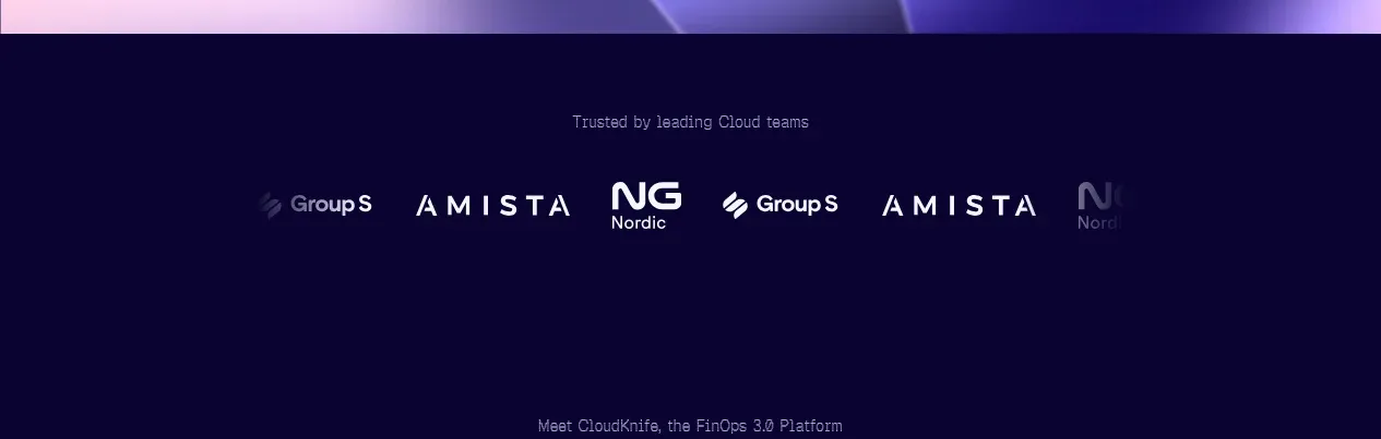
Design analysis
A restrained trust band separates the hero from the product story with a small credibility label and a horizontal row of monochrome customer marks.
Prompt preview
## Reference images

Study these alongside the description below: hierarchy, rhythm, spacing, colour. Build for the product you are asked about, using this design language.

- Component: https://kage-design-assets.t3.tigrisfiles.io/components/cloudknife/9dafaa08-16c6-4721-8c78-296bafbb7abc-1793081089-2.webp
- Full page it was cut from: https://kage-design-assets.t3.tigrisfiles.io/screenshots/cloudknife/9dafaa08-16c6-4721-8c78-296bafbb7abc-1793080968695-full.webp
- Component on Kage: https://kage.design/component/cloudknife-logo-cloud

## Before you start
Ask what the user's product is, who it serves, and what their brand personality and visual identity are. Apply the following principles to that product rather than copying the reference.

Build a dark trust strip below the hero. Center a small muted label above a single horizontal row of partner or customer wordmarks. Keep the band spacious and quiet: deep navy background #0b0630, 12px uppercase or sentence-case label in #817b9f, and logos in low-contrast white or lavender at 65–85% opacity. Use even spacing, consistent optical height, and responsive horizontal scrolling or wrapping on narrow screens. Do not overstate the logos; the purpose is reassurance, not visual competition with the hero.

Never: use logos, product names, copy, illustrations, or imagery from the reference.
More components
 Customer logo strip
Basedash View-only members · Logo cloud
 Customer logo wall
Open For sales · Logo cloud
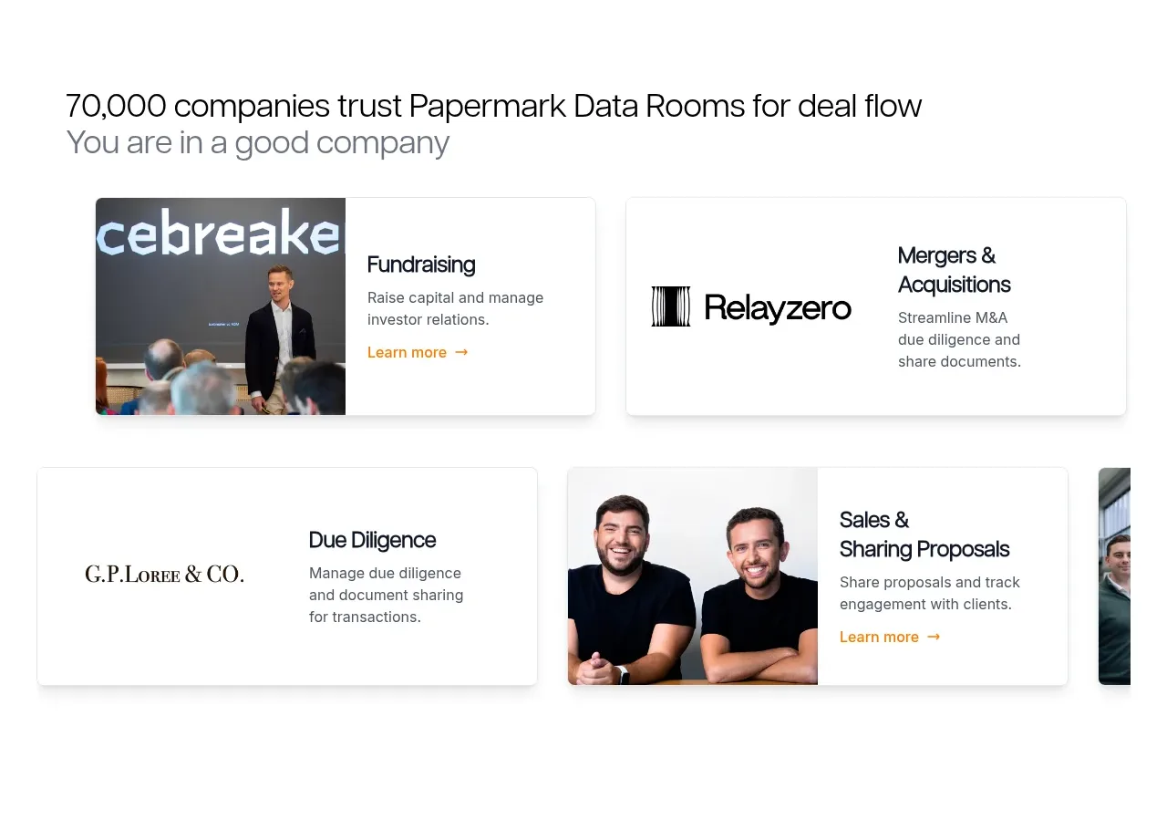
 Customer proof and use-case cards
Papermark Data Rooms · Logo cloud
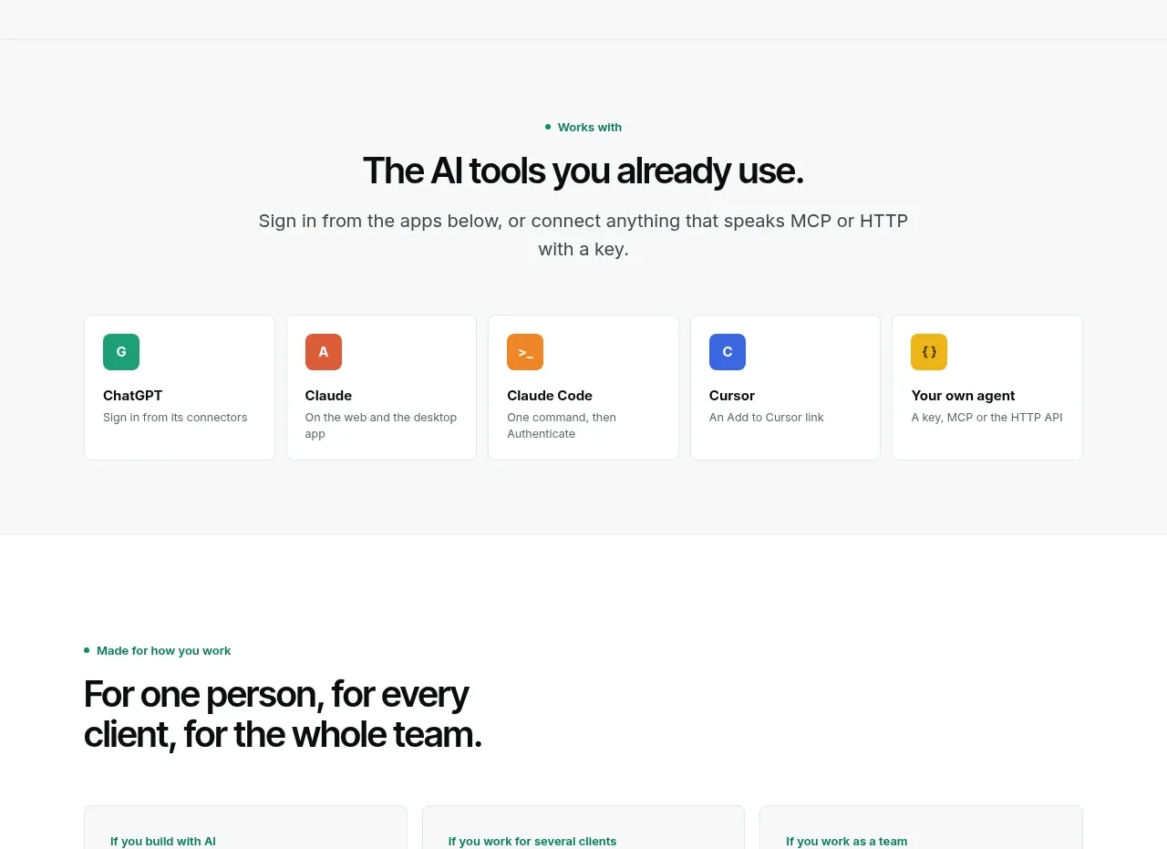
 Compatible tools grid
Context Engine · Logo cloud

M
AI model compatibility strip
MOVO AI · Logo cloud

 Customer logo strip
Inflight · Logo cloud