 kage
open.cx
Design analysis
A short social-proof heading introduces a regular grid of softly tinted logo tiles, providing credibility without competing with the product story.
Prompt preview
## Reference images

Study these alongside the description below: hierarchy, rhythm, spacing, colour. Build for the product you are asked about, using this design language.

- Component: https://kage-design-assets.t3.tigrisfiles.io/components/open-for-sales/9a311215-a6aa-4eac-b69d-0b0434feabcf-1793253812-2.webp
- Full page it was cut from: https://kage-design-assets.t3.tigrisfiles.io/screenshots/open-for-sales/9a311215-a6aa-4eac-b69d-0b0434feabcf-1793253735957-full.webp
- Component on Kage: https://kage.design/component/open-for-sales-logo-cloud

## Before you start
Ask which customer types, partners, or proof points the user's product can honestly show. Adapt the logo wall to those assets and the user's visual identity.

Create a social-proof section with a centered heading around 17–19px, followed by a responsive grid of logo tiles. Use six columns on wide screens and two or three on mobile, with consistent 10–12px gaps. Tiles should be warm off-white (#f2f1ec) against a near-white page (#fafafa), with 12–16px radius, approximately 72px height, and centered monochrome or low-saturation marks. Keep logos visually balanced using max-width constraints and object-fit containment. Add generous top and bottom whitespace so the section reads as a pause between hero and product details. If logos are unavailable, use neutral text-based customer names or omit the section rather than inventing proof.

Never: use the reference companies, logos, names, exact heading, product copy, imagery, or fabricated customer claims.
More components
 Customer logo strip
Basedash View-only members · Logo cloud
 Trusted by cloud teams
CloudKnife · Logo cloud
 Customer proof and use-case cards
Papermark Data Rooms · Logo cloud
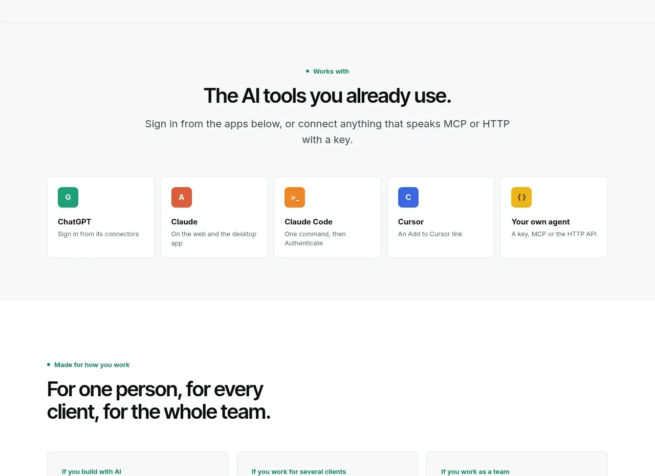
 Compatible tools grid
Context Engine · Logo cloud

M
AI model compatibility strip
MOVO AI · Logo cloud

 Customer logo strip
Inflight · Logo cloud