 kage
basedash.com
Design analysis
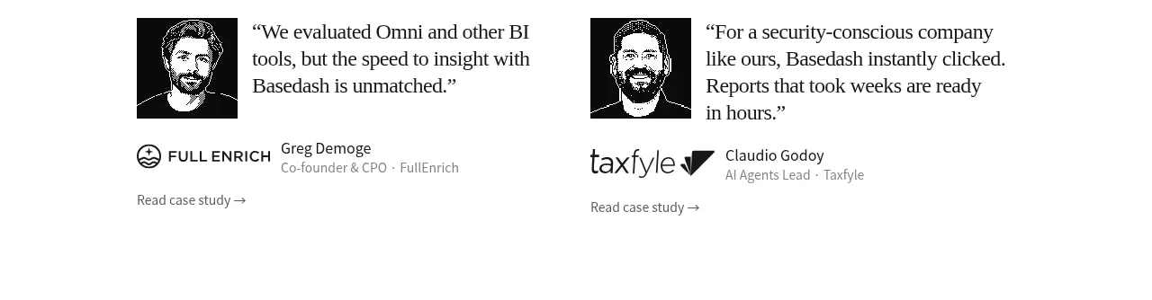
Two editorial testimonial blocks sit side by side with portrait tiles, quoted outcomes, customer identity, and case-study links.
Prompt preview
## Reference images

Study these alongside the description below: hierarchy, rhythm, spacing, colour. Build for the product you are asked about, using this design language.

- Component: https://kage-design-assets.t3.tigrisfiles.io/components/basedash-view-only-members/6dbd0b50-cdba-4977-b7dc-6a7ba68a352e-1793253917-3.webp
- Full page it was cut from: https://kage-design-assets.t3.tigrisfiles.io/screenshots/basedash-view-only-members/6dbd0b50-cdba-4977-b7dc-6a7ba68a352e-1793253800610-full.webp
- Component on Kage: https://kage.design/component/basedash-view-only-members-testimonials

## Before you start
Ask what the user's product is, which customers are credible, and what outcomes should be emphasized. Apply the structure to that product and brand.

Create a two-column testimonial section with generous whitespace and no heavy enclosing card. Each item should have a compact square portrait or abstract customer avatar, a large serif or editorial-feeling quote, a company/person attribution row, and a small case-study link. Keep quote text around 17–20px with 1.35 line-height and body metadata 12–14px in muted gray #777. Use black text #1b1b1b on white, subtle spacing rather than visible borders, and align the two stories to a consistent top baseline. On mobile, stack the stories and preserve the quote-to-attribution hierarchy.

Never: use logos, product names, copy, illustrations, or imagery from the reference.
More components
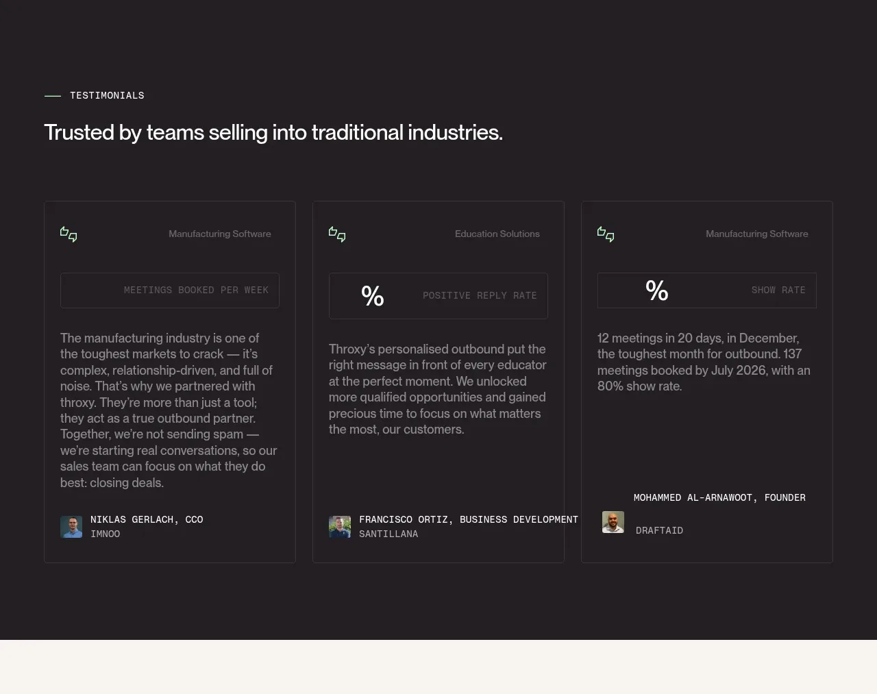
 Industry trust testimonials
throxy · Testimonials
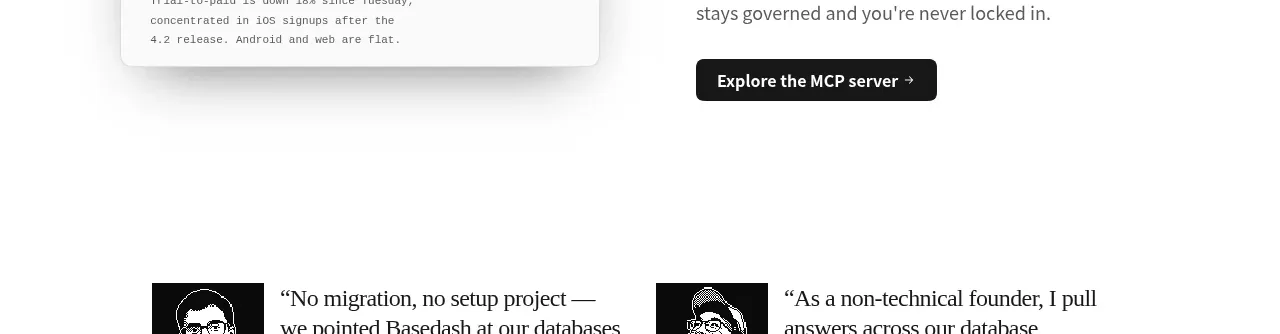
 Additional customer stories
Basedash View-only members · Testimonials
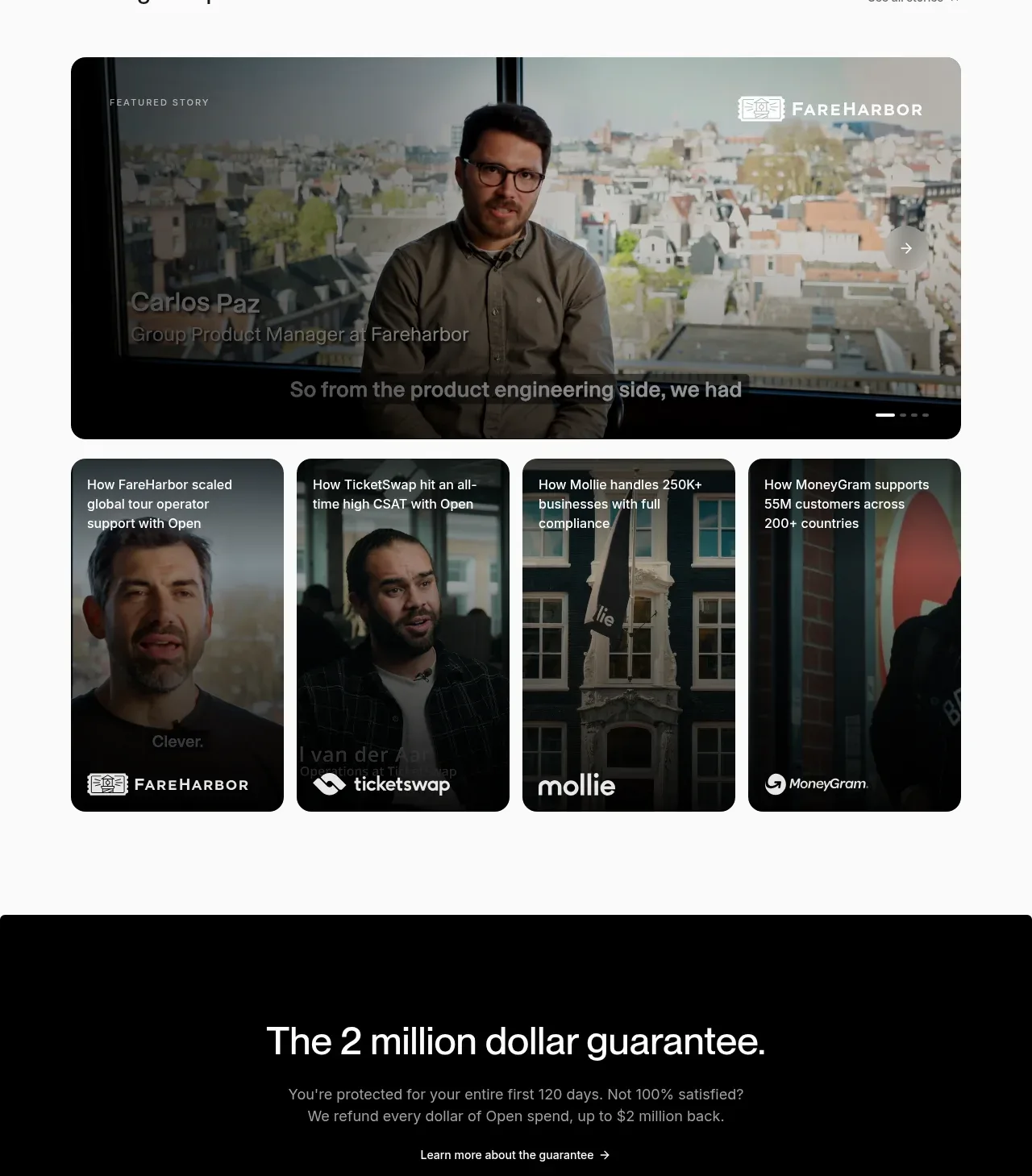
 Customer stories carousel
Open For sales · Testimonials
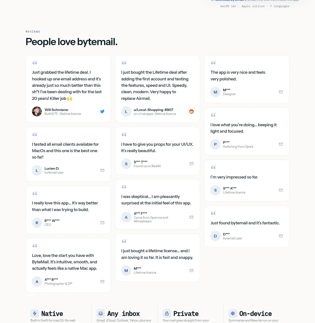
 Customer love masonry testimonials
bytemail · Testimonials
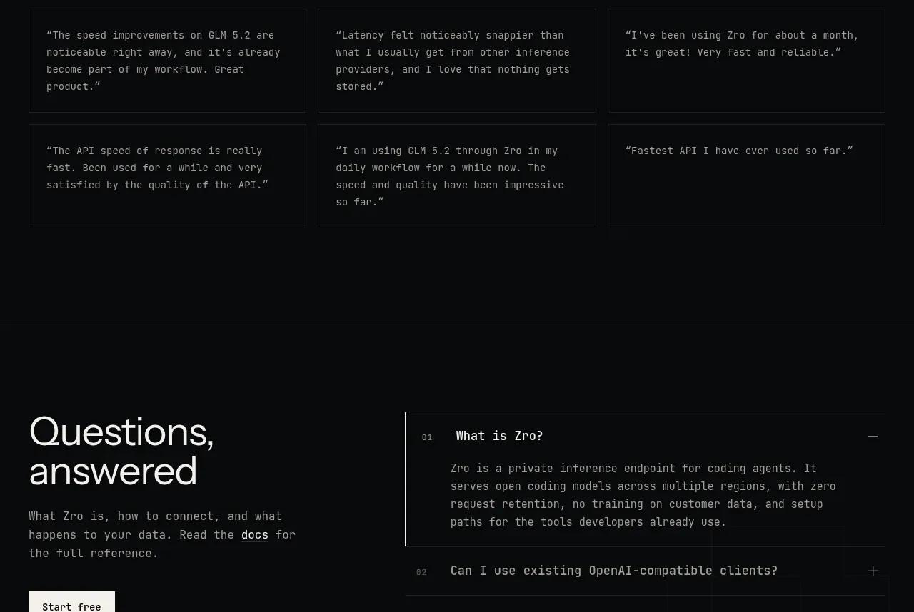
 Developer testimonials
Zro: Uncensored Security Models · Testimonials
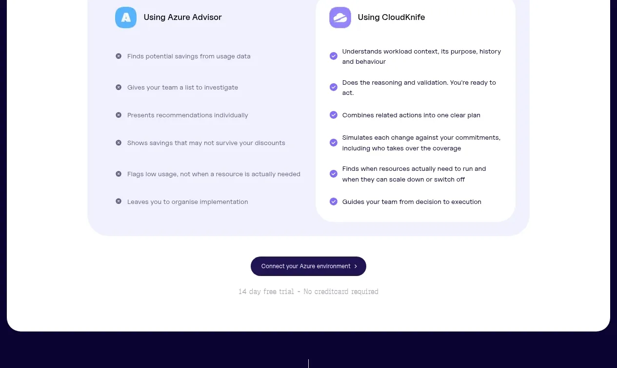
 Customer proof carousel
CloudKnife · Testimonials