 kage
cloudknife.com
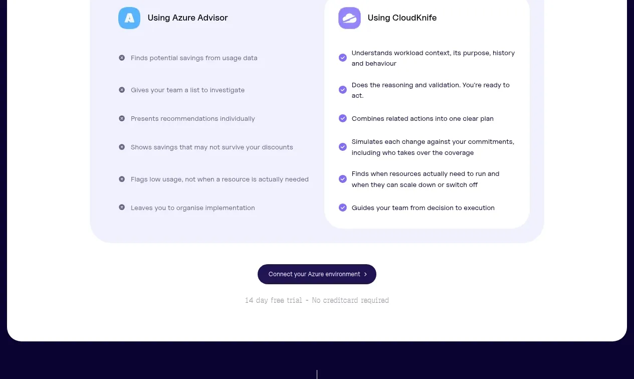
Design analysis
A lavender gradient testimonial panel uses a split quote-and-portrait card with a small carousel position indicator to make social proof feel editorial and premium.
Prompt preview
## Reference images

Study these alongside the description below: hierarchy, rhythm, spacing, colour. Build for the product you are asked about, using this design language.

- Component: https://kage-design-assets.t3.tigrisfiles.io/components/cloudknife/9dafaa08-16c6-4721-8c78-296bafbb7abc-1793081091-6.webp
- Full page it was cut from: https://kage-design-assets.t3.tigrisfiles.io/screenshots/cloudknife/9dafaa08-16c6-4721-8c78-296bafbb7abc-1793080968695-full.webp
- Component on Kage: https://kage.design/component/cloudknife-testimonials

## Before you start
Ask what the user's product is, who it serves, and what their brand personality and visual identity are. Apply the following principles to that product rather than copying the reference.

Create a full-width testimonial section inside a rounded gradient panel. Place a small eyebrow and centered heading above a large white testimonial card. Split the card into a text area with customer category, bold outcome-led quote, and attribution, and a portrait or brand image area with its own rounded frame. Use a subtle carousel indicator below; support keyboard controls, touch swiping, and pause behavior if auto-rotating. Use a pale lavender-to-peach gradient around #d9c8ff, #f2eaff, and #ffc3b0, a white card, 24px radius, dark indigo text, and a restrained shadow. Keep the quote legible and let the proof point lead rather than the portrait.

Never: use logos, product names, copy, illustrations, or imagery from the reference.
More components
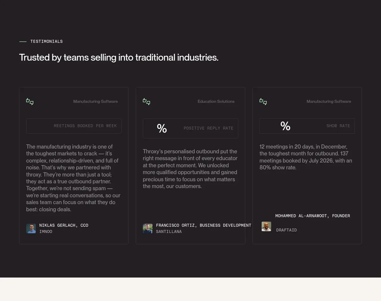
 Industry trust testimonials
throxy · Testimonials
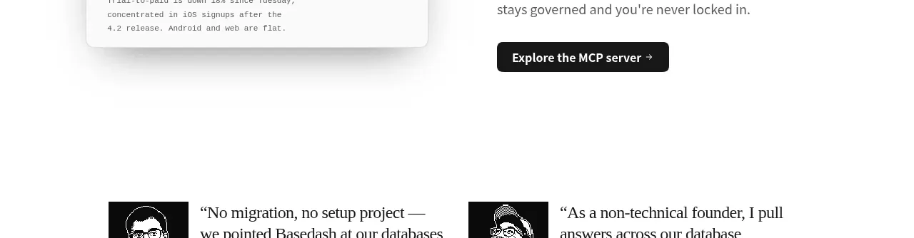
 Additional customer stories
Basedash View-only members · Testimonials
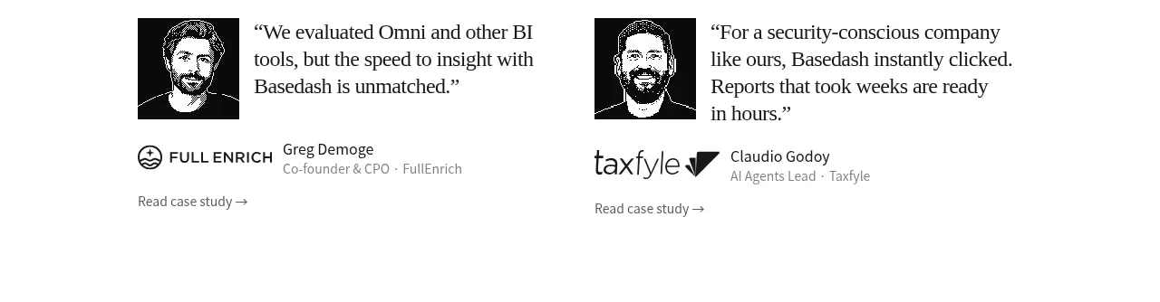 Early customer proof
Basedash View-only members · Testimonials
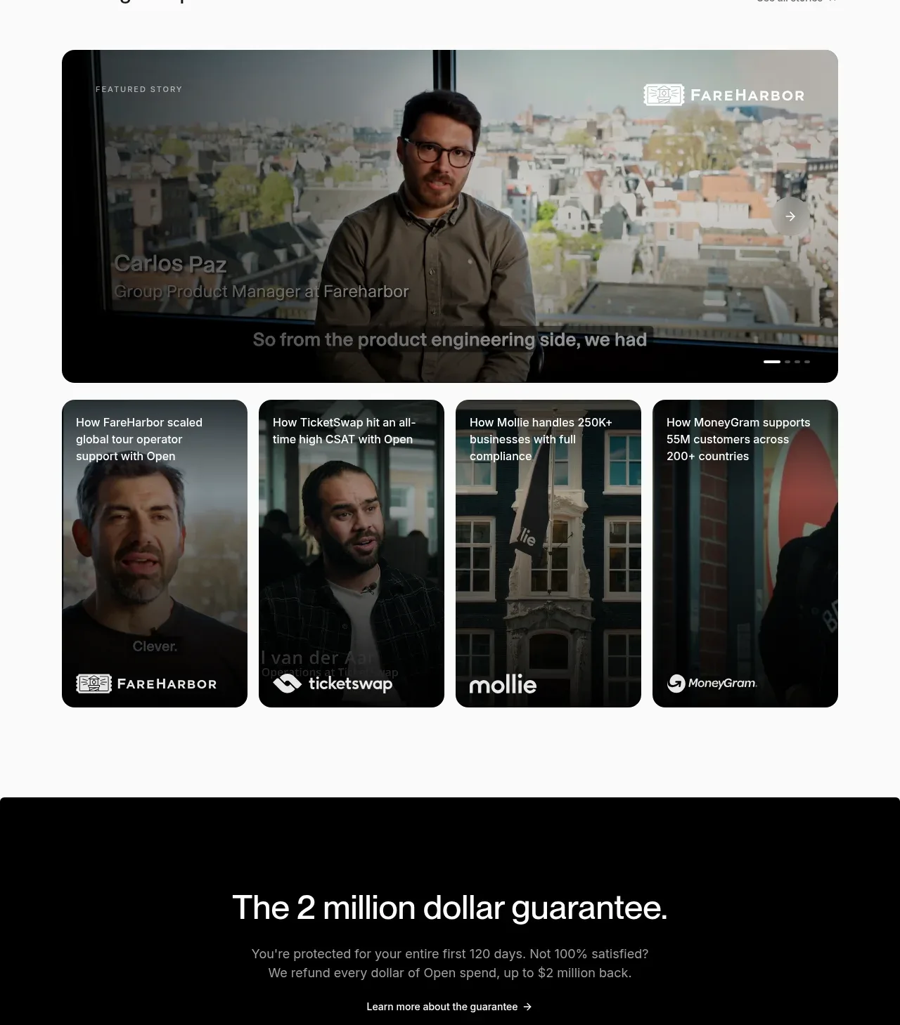
 Customer stories carousel
Open For sales · Testimonials
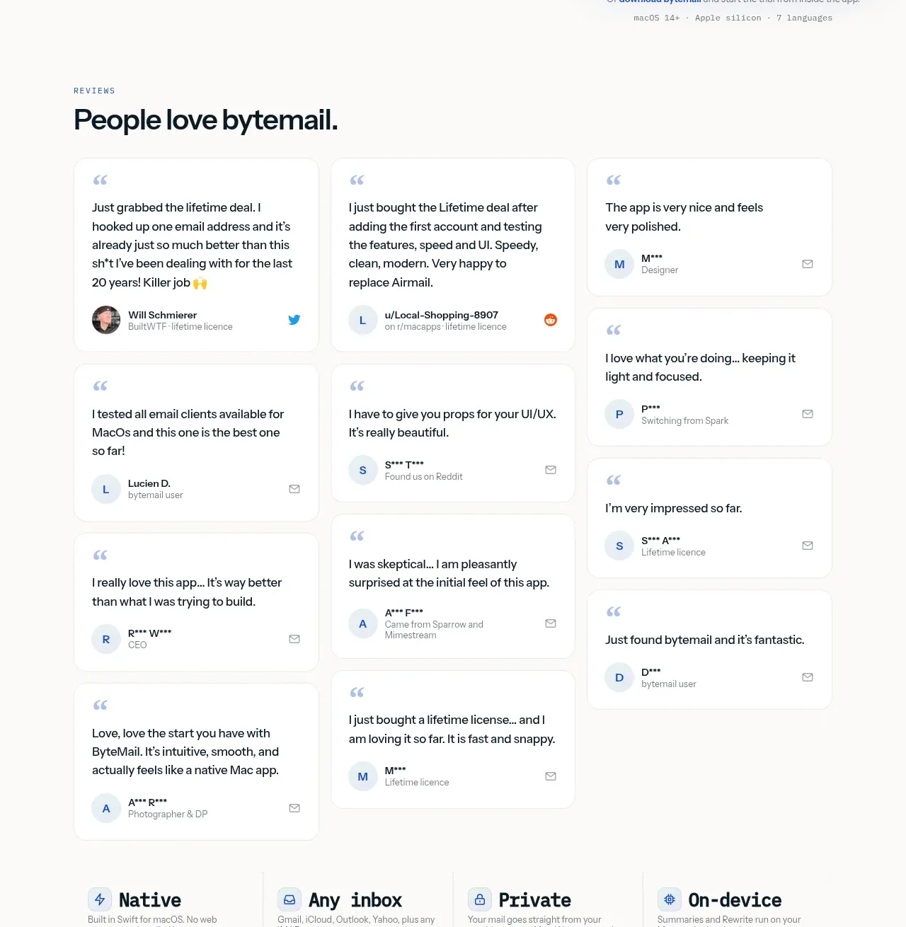
 Customer love masonry testimonials
bytemail · Testimonials
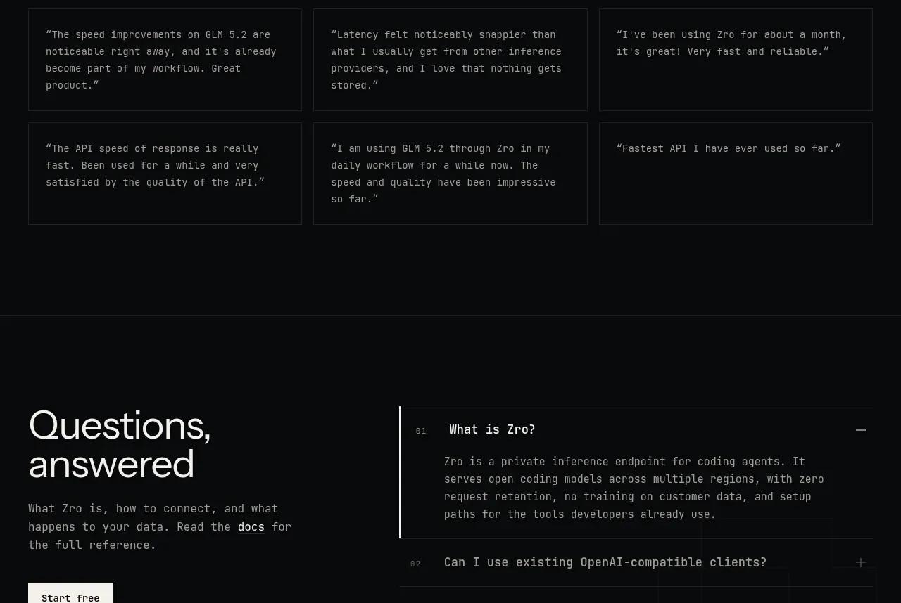
 Developer testimonials
Zro: Uncensored Security Models · Testimonials