 kage
bytemailapp.com
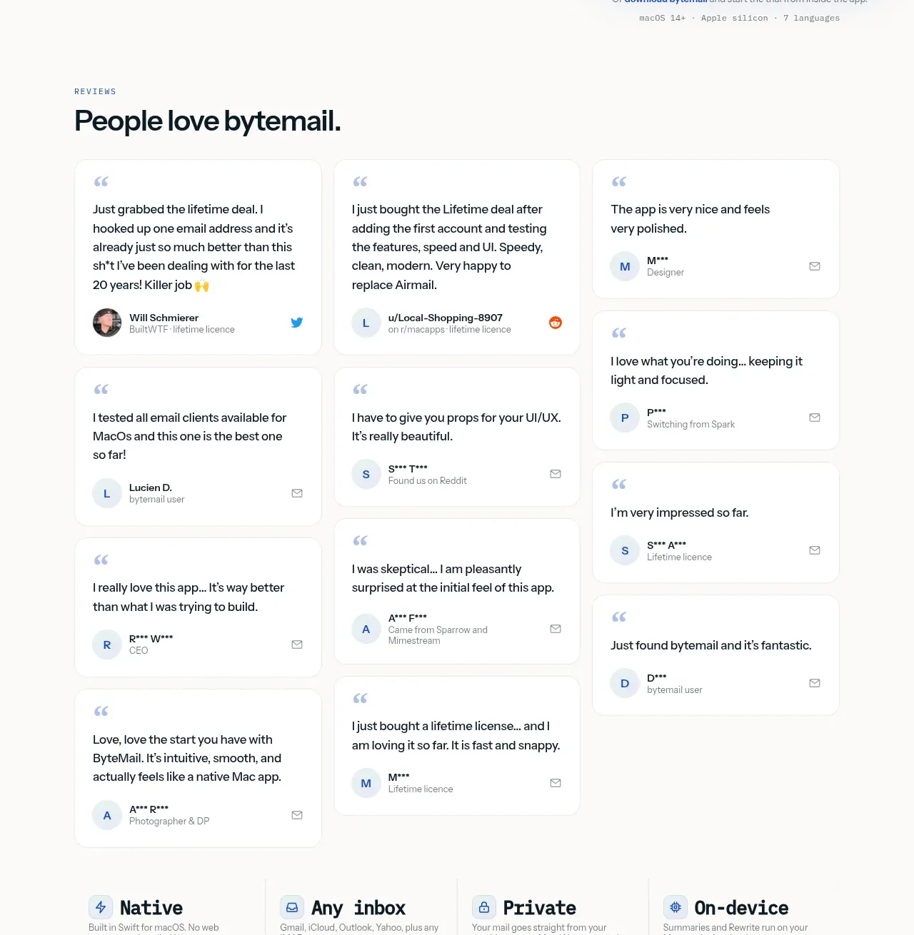
Design analysis
A clear section label and strong heading introduce a masonry-like set of short testimonial cards. Varied card heights and small identity details create social proof that feels collected rather than overly engineered.
Prompt preview
## Reference images

Study these alongside the description below: hierarchy, rhythm, spacing, colour. Build for the product you are asked about, using this design language.

- Component: https://kage-design-assets.t3.tigrisfiles.io/components/bytemail/045a2cef-1fc1-40ba-865c-126b992dab68-1793253733-2.webp
- Full page it was cut from: https://kage-design-assets.t3.tigrisfiles.io/screenshots/bytemail/045a2cef-1fc1-40ba-865c-126b992dab68-1793253665308-full.webp
- Component on Kage: https://kage.design/component/bytemail-testimonials

## Before you start
Ask who the user's customers are, what evidence is available, and what tone the brand should use. Apply the principles below to that product.

Build a testimonial section with a small uppercase eyebrow, a strong heading, and a responsive multi-column masonry or staggered grid. Keep each quote short, use believable attribution metadata, and let card heights vary naturally while maintaining aligned column gutters. Use white cards on #fbfbf8, 1px borders around #eceeea, 12–16px corners, subtle shadows, charcoal #10191c text, and pale blue-gray quote accents. Use 14–16px quote text and 11–12px metadata. On small screens, collapse to one column and prioritize the strongest 3–5 quotes. Avoid carousels unless the testimonial volume genuinely requires one.

Never use logos, product names, copy, illustrations, or imagery from the reference.
More components
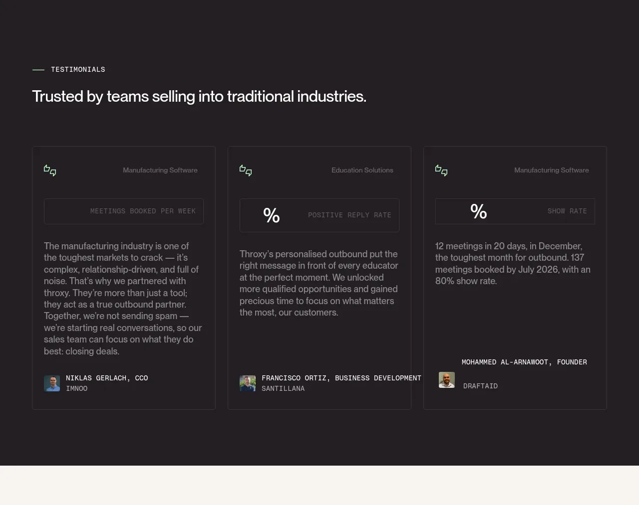
 Industry trust testimonials
throxy · Testimonials
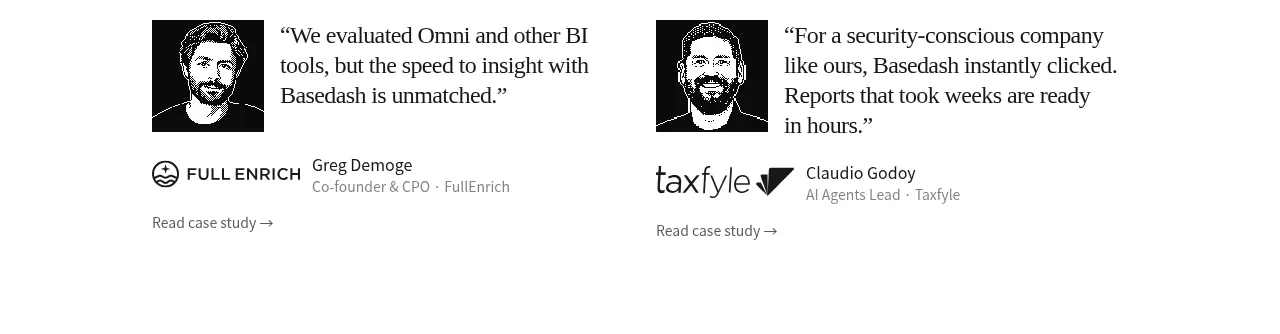
 Early customer proof
Basedash View-only members · Testimonials
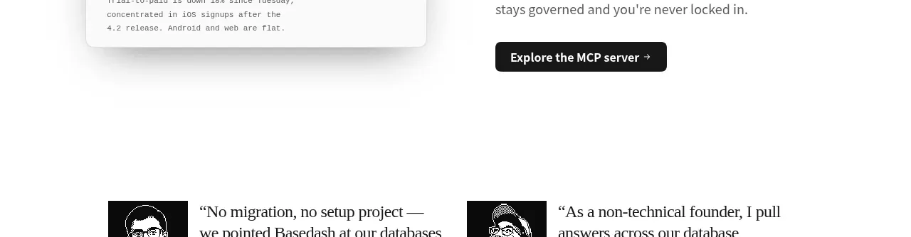 Additional customer stories
Basedash View-only members · Testimonials
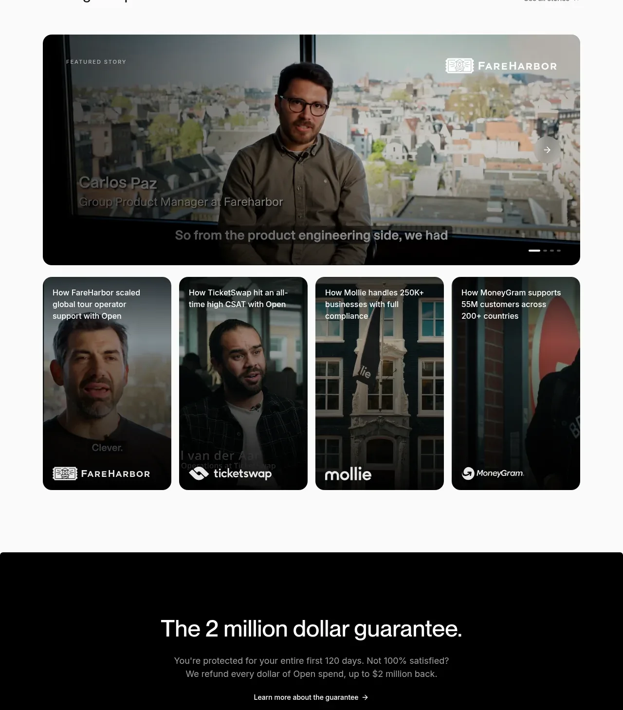
 Customer stories carousel
Open For sales · Testimonials
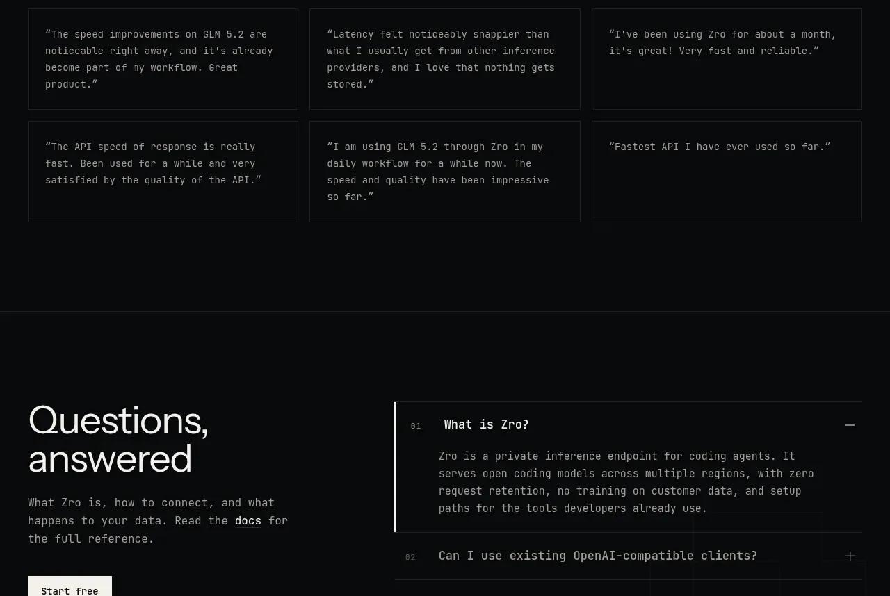
 Developer testimonials
Zro: Uncensored Security Models · Testimonials

 Customer proof carousel
CloudKnife · Testimonials