 kage
basedash.com
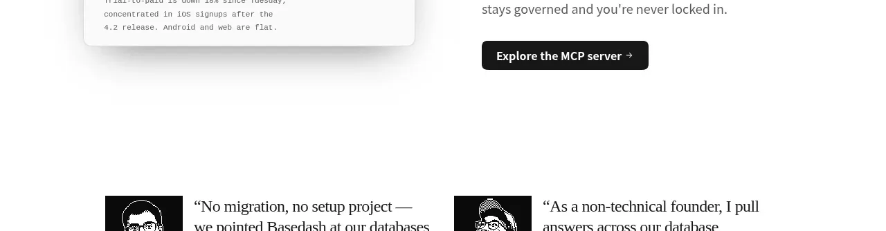
Design analysis
A second pair of testimonial stories resets the page with more customer evidence before the data-stack section.
Prompt preview
## Reference images

Study these alongside the description below: hierarchy, rhythm, spacing, colour. Build for the product you are asked about, using this design language.

- Component: https://kage-design-assets.t3.tigrisfiles.io/components/basedash-view-only-members/6dbd0b50-cdba-4977-b7dc-6a7ba68a352e-1793253919-6.webp
- Full page it was cut from: https://kage-design-assets.t3.tigrisfiles.io/screenshots/basedash-view-only-members/6dbd0b50-cdba-4977-b7dc-6a7ba68a352e-1793253800610-full.webp
- Component on Kage: https://kage.design/component/basedash-view-only-members-testimonials-2

## Before you start
Ask what the user's product is, which customer stories are authentic, and what proof points matter. Use those answers in the component.

Build a second two-column customer-story band with editorial quotes, compact square avatars, customer name and role, company attribution, and a small case-study link. Keep the treatment airy and borderless, with 17–20px quote text, 12–14px metadata, black text, and muted gray secondary text. Use consistent image dimensions and align each attribution beneath its quote. Stack cleanly on mobile.

Never: use logos, product names, copy, illustrations, or imagery from the reference.
More components
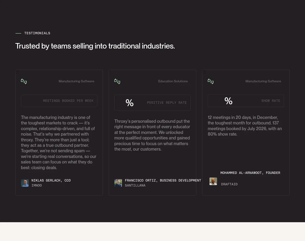
 Industry trust testimonials
throxy · Testimonials
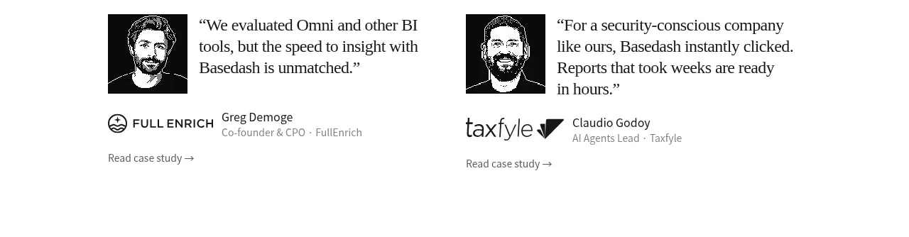
 Early customer proof
Basedash View-only members · Testimonials
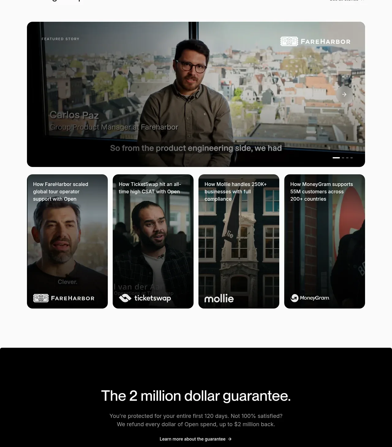
 Customer stories carousel
Open For sales · Testimonials
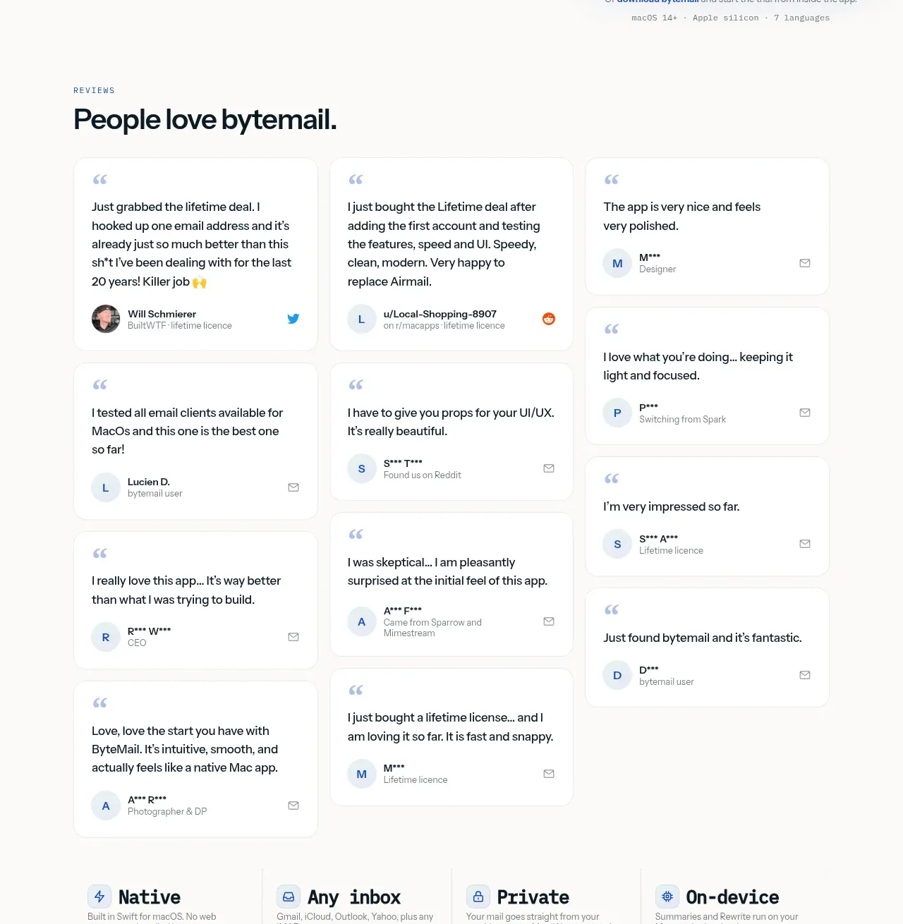
 Customer love masonry testimonials
bytemail · Testimonials
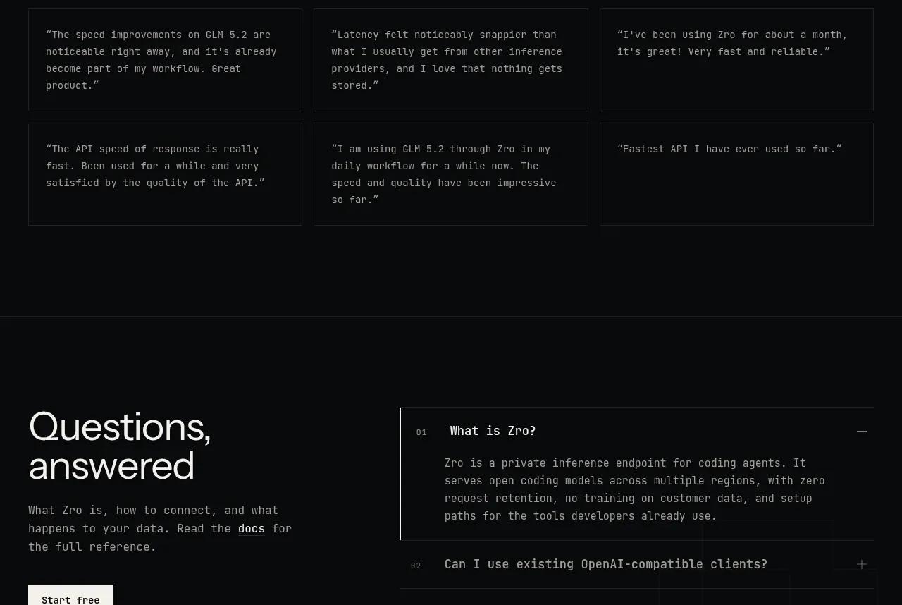
 Developer testimonials
Zro: Uncensored Security Models · Testimonials
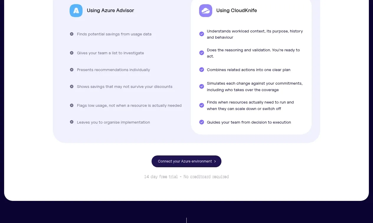
 Customer proof carousel
CloudKnife · Testimonials