 kage
throxy.com
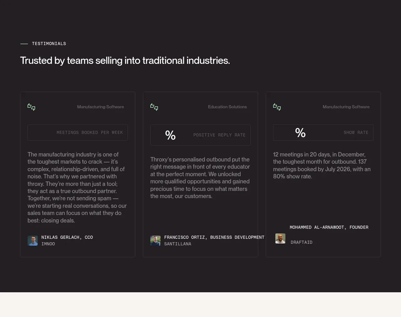
Design analysis
A dark testimonial band introduces industry trust and presents three tall quote cards with role labels, outcome callouts, body copy, and author metadata.
Prompt preview
## Reference images

Study these alongside the description below: hierarchy, rhythm, spacing, colour. Build for the product you are asked about, using this design language.

- Component: https://kage-design-assets.t3.tigrisfiles.io/components/throxy/4d577be3-3944-4c06-b2f6-094c0e693ab7-1793253969-4.webp
- Full page it was cut from: https://kage-design-assets.t3.tigrisfiles.io/screenshots/throxy/4d577be3-3944-4c06-b2f6-094c0e693ab7-1793253814515-full.webp
- Component on Kage: https://kage.design/component/throxy-testimonials

### Before you start
Ask what the user's product, audience, and brand are, then apply these principles to that product.

Design a dark testimonial section with a small eyebrow, a clear section heading, and three equal testimonial cards. Give each card a thin low-contrast border, generous internal padding, a compact outcome/stat row near the top, a longer quote in the middle, and an author name plus role at the bottom. Use a 3-column grid on desktop and a horizontal or stacked layout on mobile. Typography should be 12–14px metadata, 16px quote text, and a 26–32px section heading; use #211D20, #F4F1EA, #8E8890, and restrained mint/lavender accents. Keep credibility factual and avoid oversized portraits.

Never: use logos, product names, copy, illustrations, or imagery from the reference.
More components
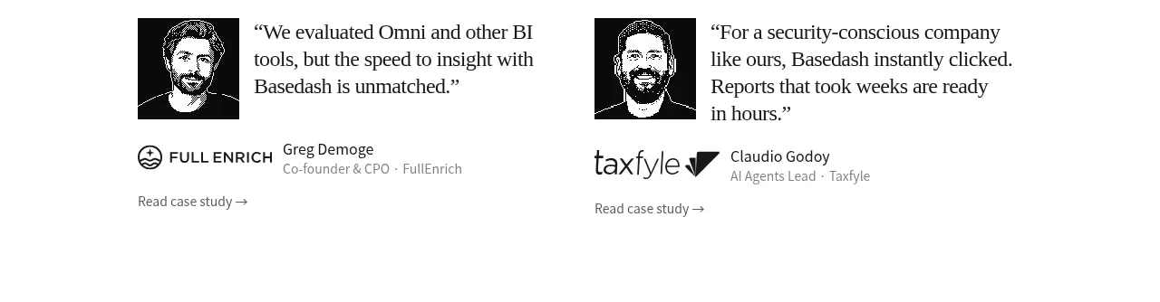
 Early customer proof
Basedash View-only members · Testimonials
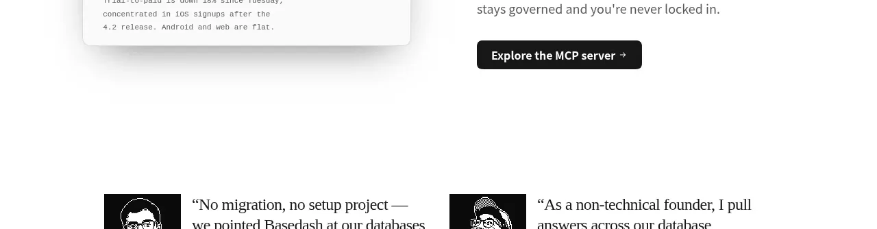 Additional customer stories
Basedash View-only members · Testimonials
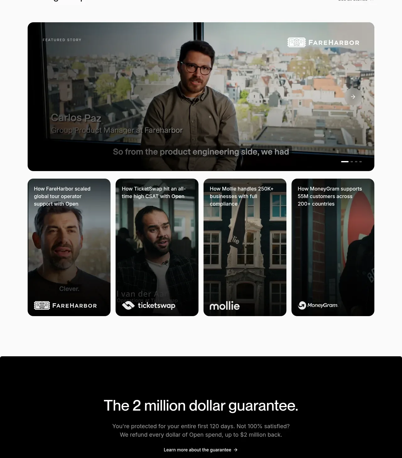
 Customer stories carousel
Open For sales · Testimonials
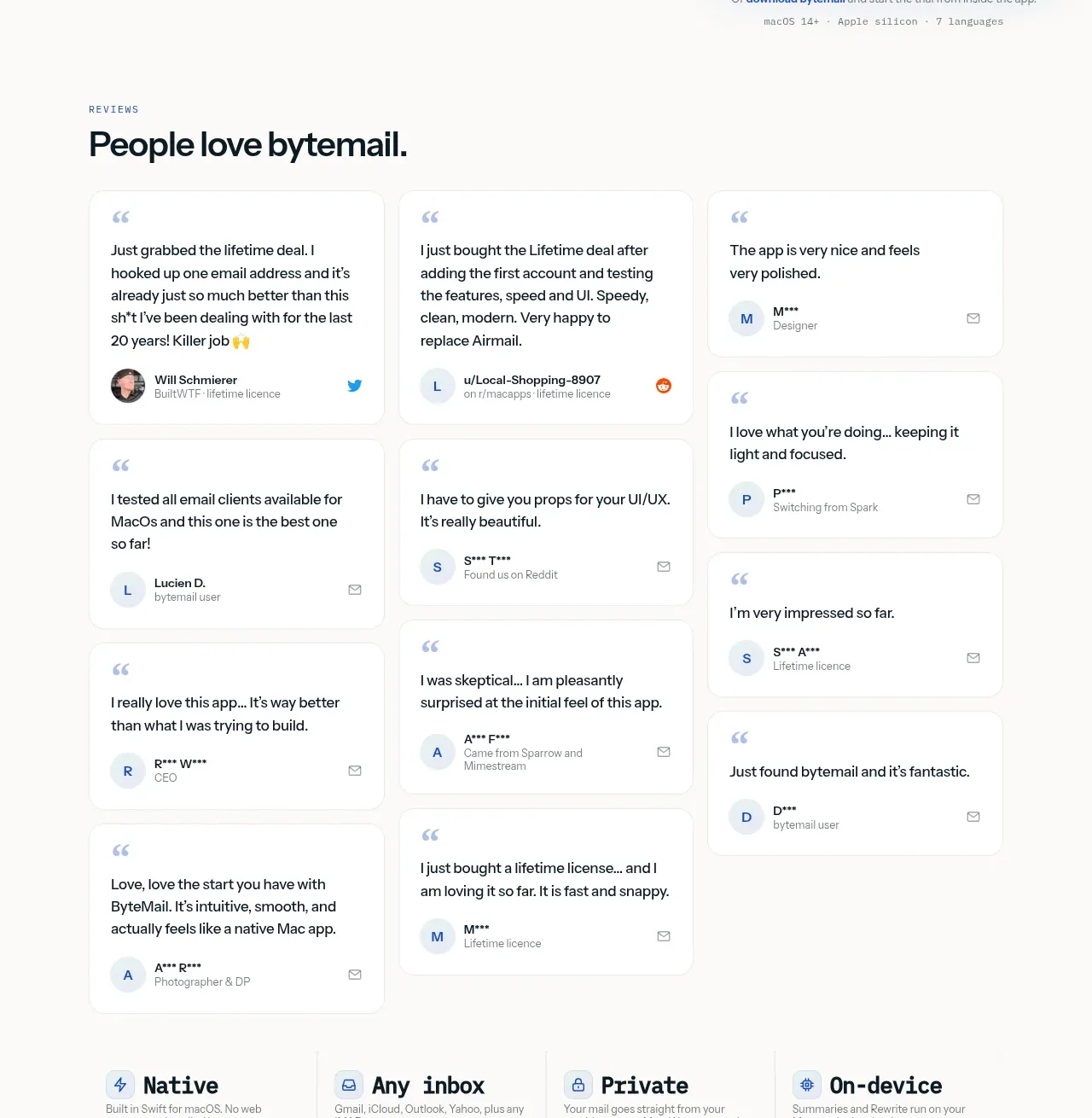
 Customer love masonry testimonials
bytemail · Testimonials
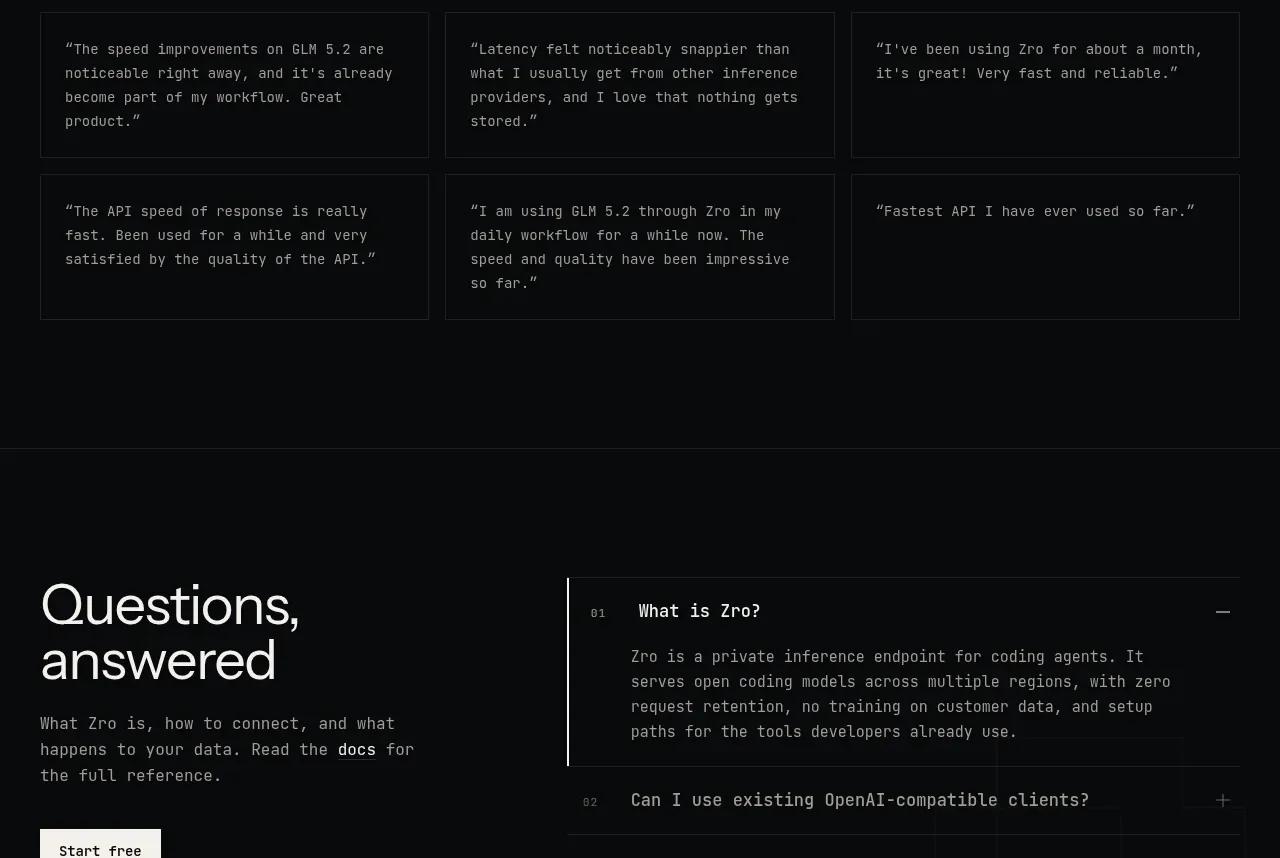
 Developer testimonials
Zro: Uncensored Security Models · Testimonials
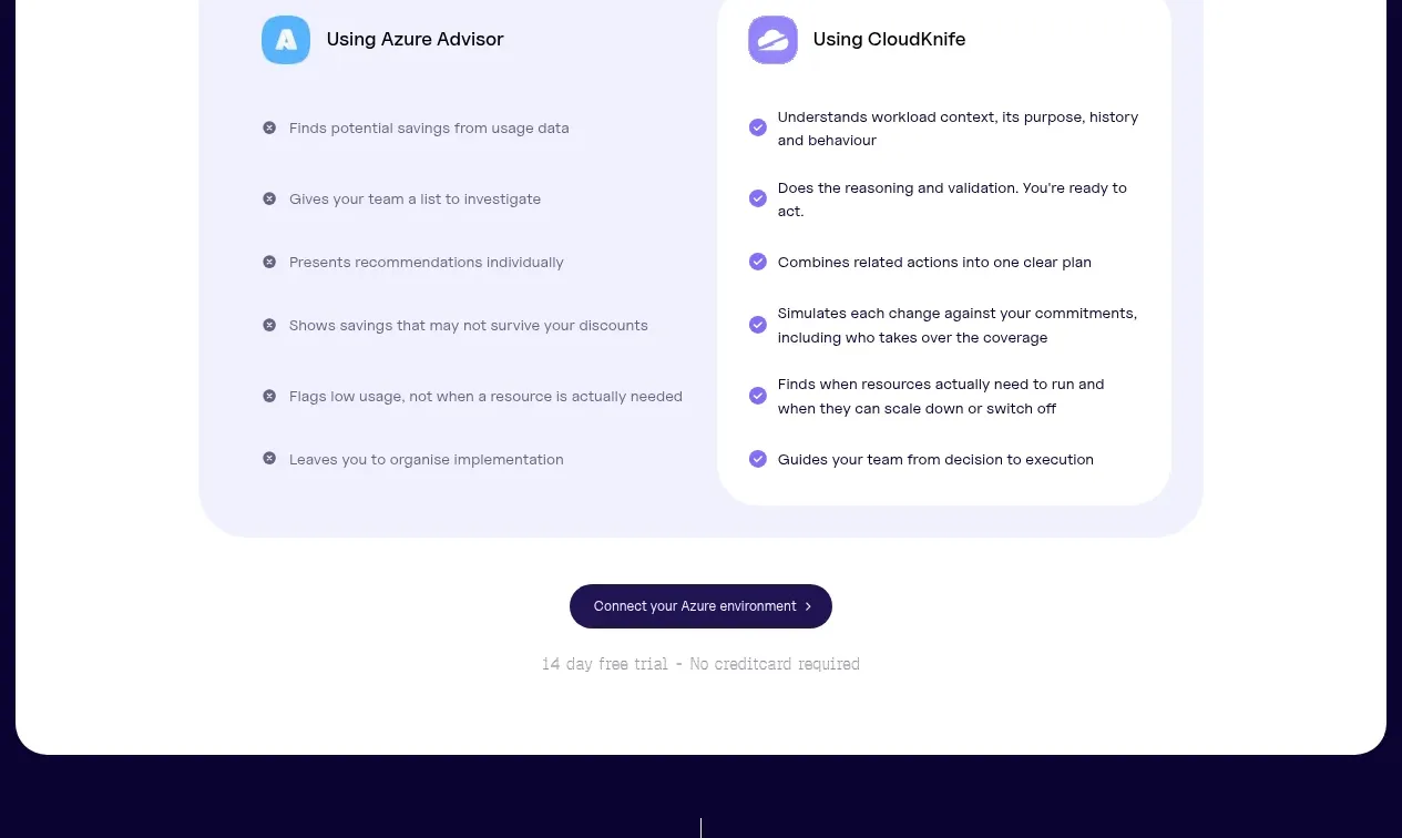
 Customer proof carousel
CloudKnife · Testimonials