 kage
bestproxy.com

Design analysis
Three evenly spaced benefit columns summarize the network, human support, and reseller value with small colorful icons.
Prompt preview
## Reference images

Study these alongside the description below: hierarchy, rhythm, spacing, colour. Build for the product you are asked about, using this design language.

- Component: https://kage-design-assets.t3.tigrisfiles.io/components/bestproxy-com/755647b7-f613-40ca-b212-ae56a9e7b331-1792344032-5.webp
- Full page it was cut from: https://kage-design-assets.t3.tigrisfiles.io/screenshots/bestproxy-com/755647b7-f613-40ca-b212-ae56a9e7b331-1792343992980-full.webp
- Component on Kage: https://kage.design/component/bestproxy-feature-grid-2

## Before you start
Ask what the user's product, audience, and brand are, then apply the principles below to that product rather than reproducing the reference.

Create a three-column benefits strip with a small icon above each item, a concise bold title, and a two-line explanation. Use a white background, a centered max-width container, 32px column gaps, and generous top/bottom padding. Icons should sit in simple purple/mint circular or outlined containers; headings use 18–20px near-black type and body copy uses 14–15px muted gray. Add responsive stacking or a two-column wrap below tablet width.

Never: use logos, product names, copy, illustrations, or imagery from the reference.
More components
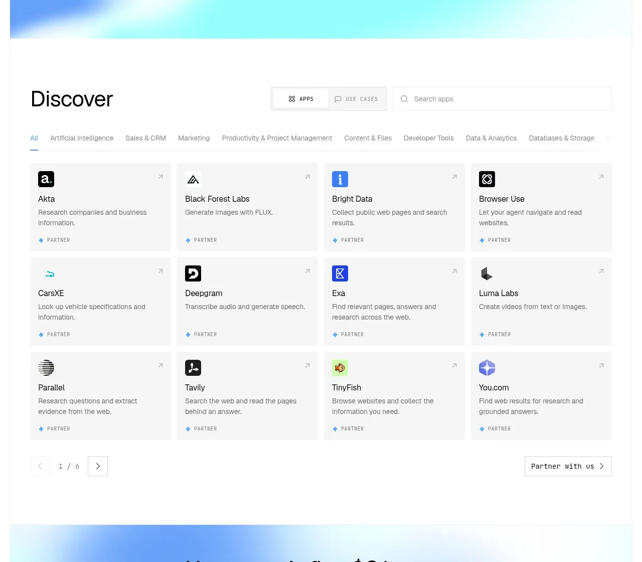
 Discover app directory
Composio Instant · Feature grid
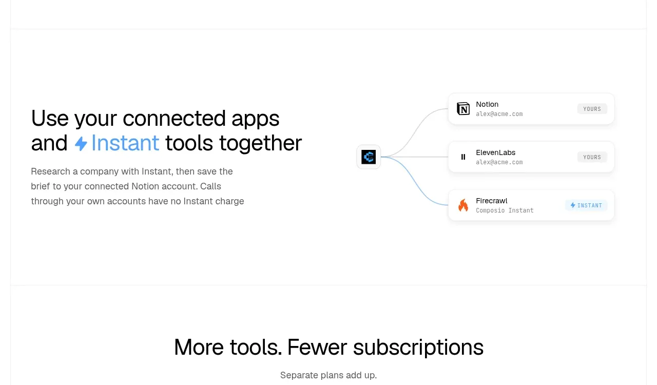 Connected apps workflow
Composio Instant · Feature grid
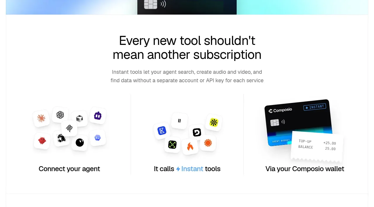 Three-part product workflow
Composio Instant · Feature grid
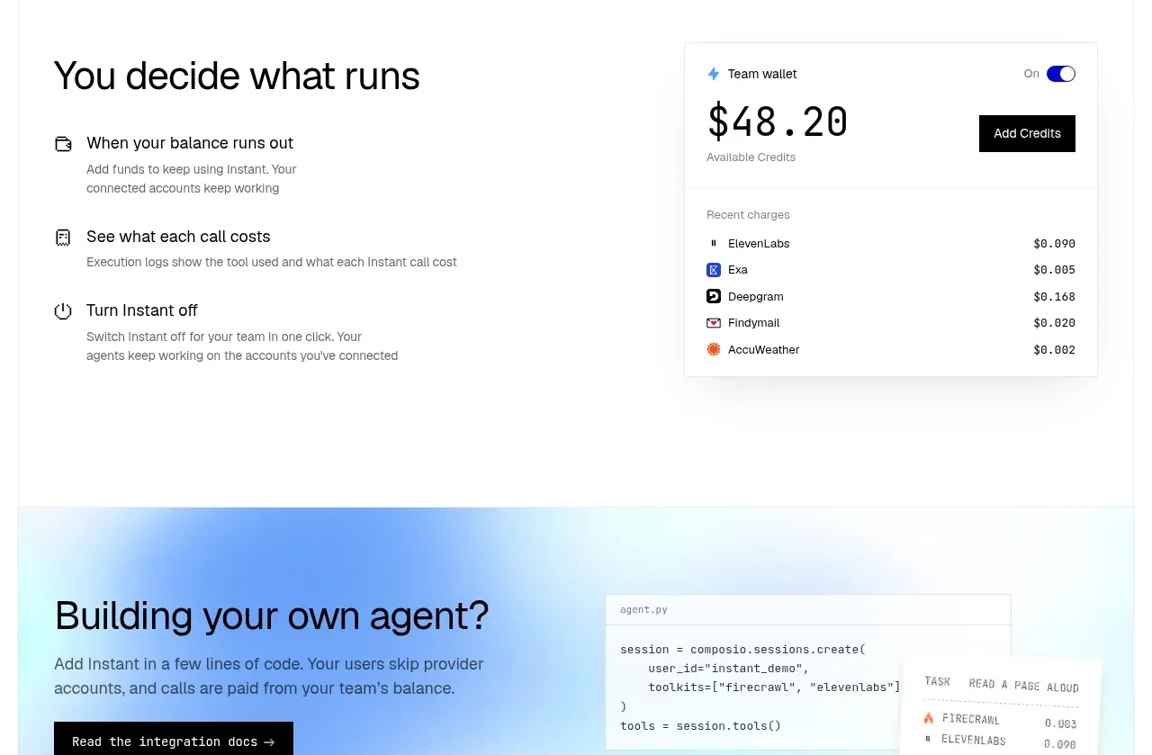 Spending controls
Composio Instant · Feature grid
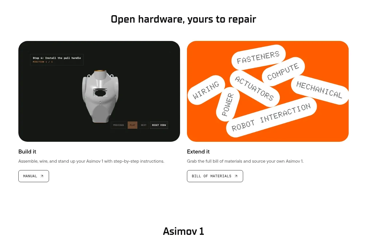
 Open hardware pathways
Asimov 1 · Feature grid
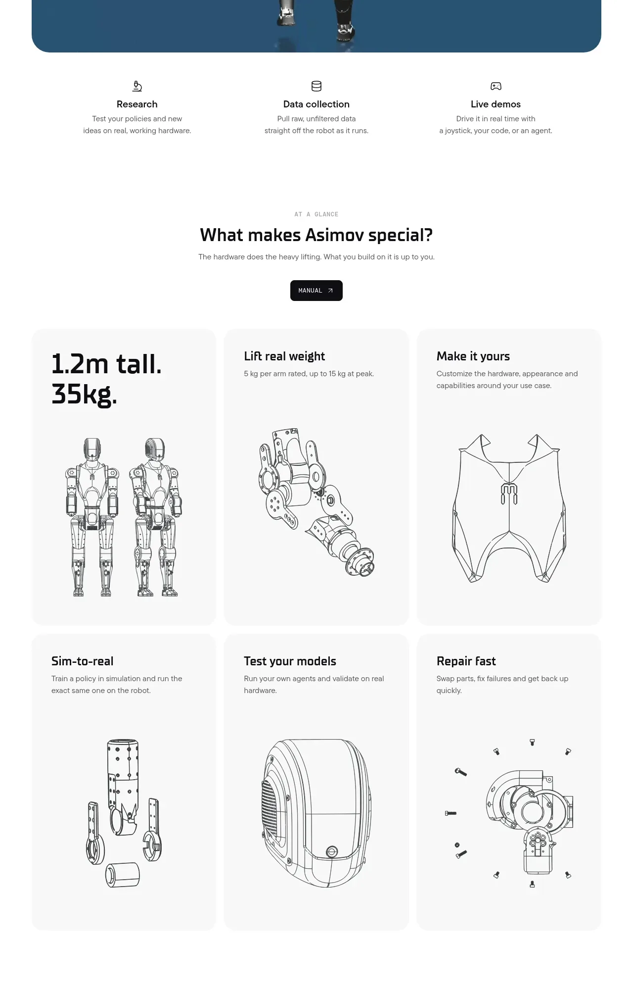 Capability overview and specification cards
Asimov 1 · Feature grid