 kage
bestproxy.com

Design analysis
A trust section combines an editorial proof card with customer imagery, then follows with a bright compliance/infrastructure panel and quantitative proof points.
Prompt preview
## Reference images

Study these alongside the description below: hierarchy, rhythm, spacing, colour. Build for the product you are asked about, using this design language.

- Component: https://kage-design-assets.t3.tigrisfiles.io/components/bestproxy-com/755647b7-f613-40ca-b212-ae56a9e7b331-1792344033-7.webp
- Full page it was cut from: https://kage-design-assets.t3.tigrisfiles.io/screenshots/bestproxy-com/755647b7-f613-40ca-b212-ae56a9e7b331-1792343992980-full.webp
- Component on Kage: https://kage.design/component/bestproxy-feature-grid-3

## Before you start
Ask what the user's product, audience, and brand are, then apply the principles below to that product rather than reproducing the reference.

Create a trust-and-proof section with a centered heading and supporting subtitle, followed by two substantial visual modules. First, use an overlapping split card: a dark editorial text panel with eyebrow, heading, paragraph, checklist, and CTA beside a warm professional customer photo. Second, use a purple compliance/infrastructure panel with centered heading and supporting copy, an abstract security illustration area, and three pale statistic tiles for geographic coverage, integrations, or infrastructure scale. Use navy #171625, purple #8150f5, lavender #f1efff, mint #12d5a0, white, 16px corners, and layered overlap/shadows. Maintain generous section spacing and make the photo/illustration areas crop safely on mobile.

Never: use logos, product names, copy, illustrations, or imagery from the reference.
More components
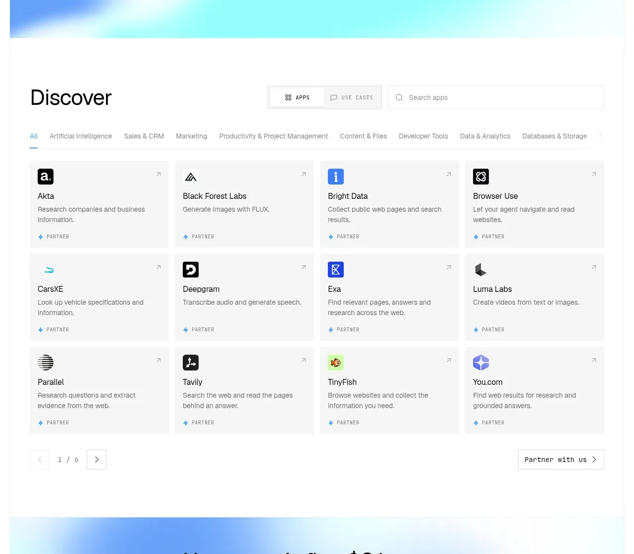
 Discover app directory
Composio Instant · Feature grid
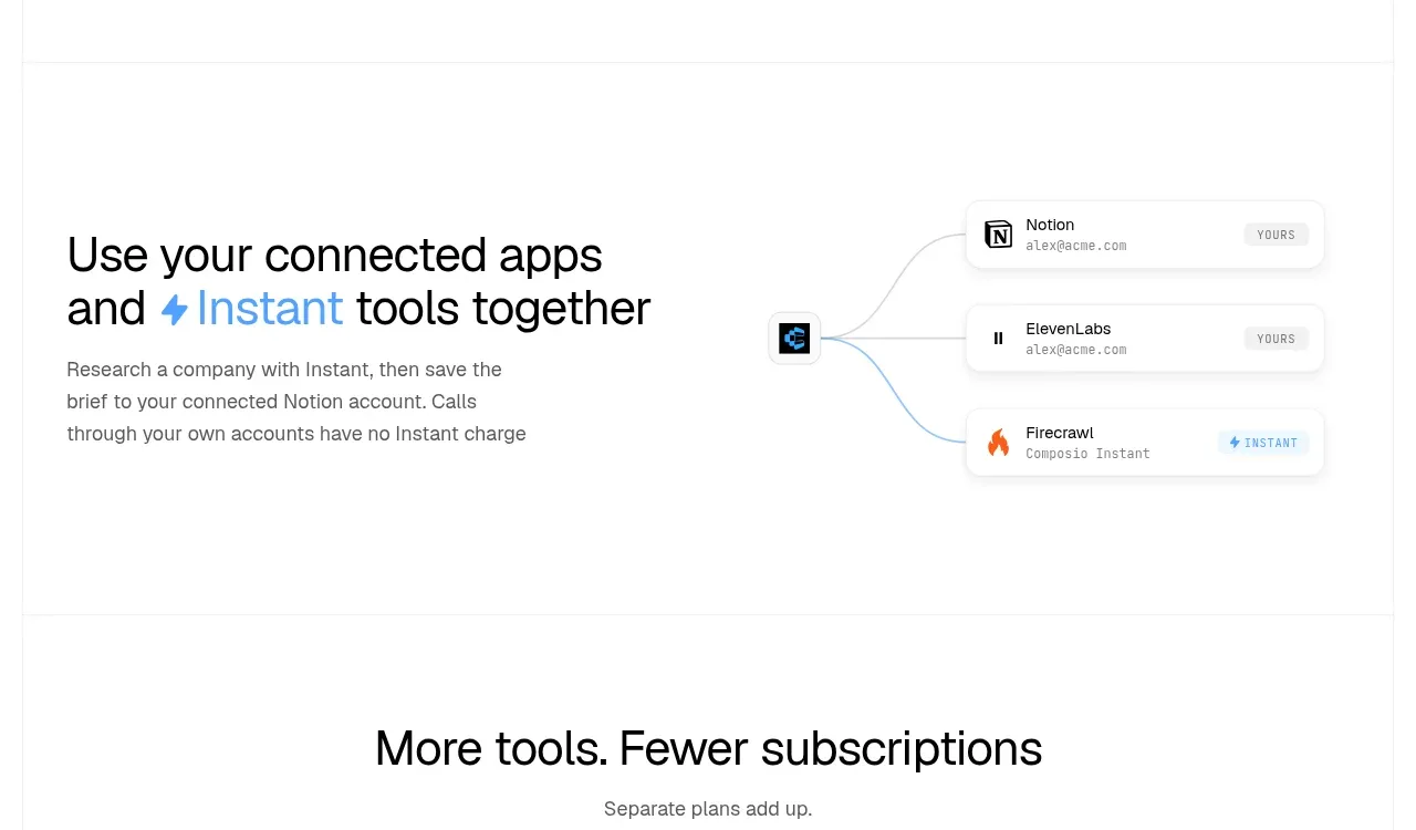 Connected apps workflow
Composio Instant · Feature grid
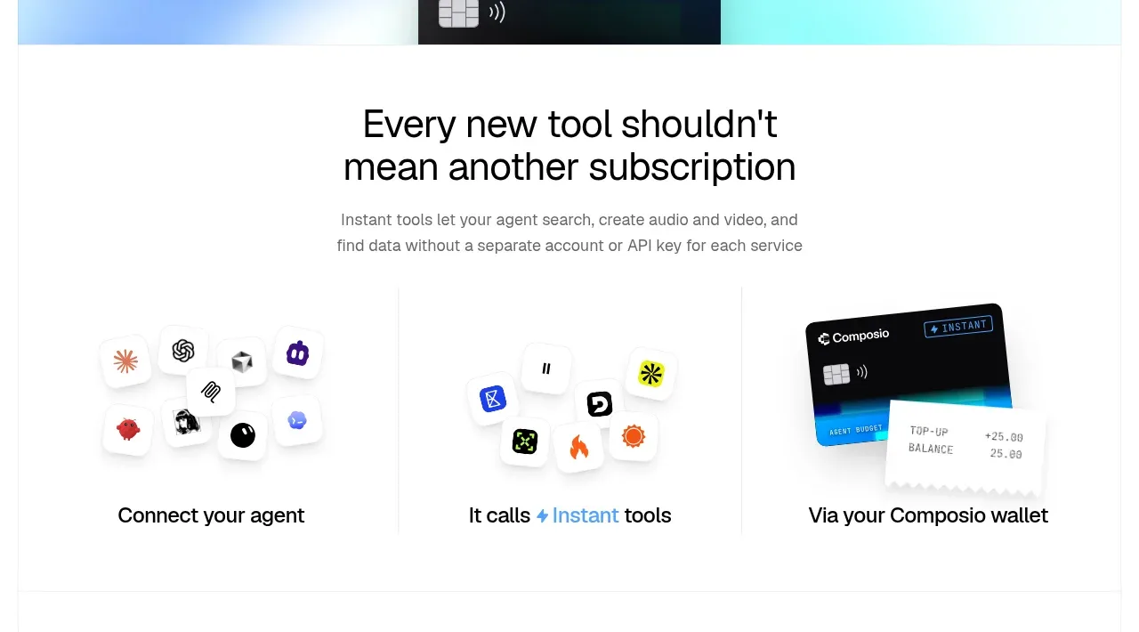 Three-part product workflow
Composio Instant · Feature grid
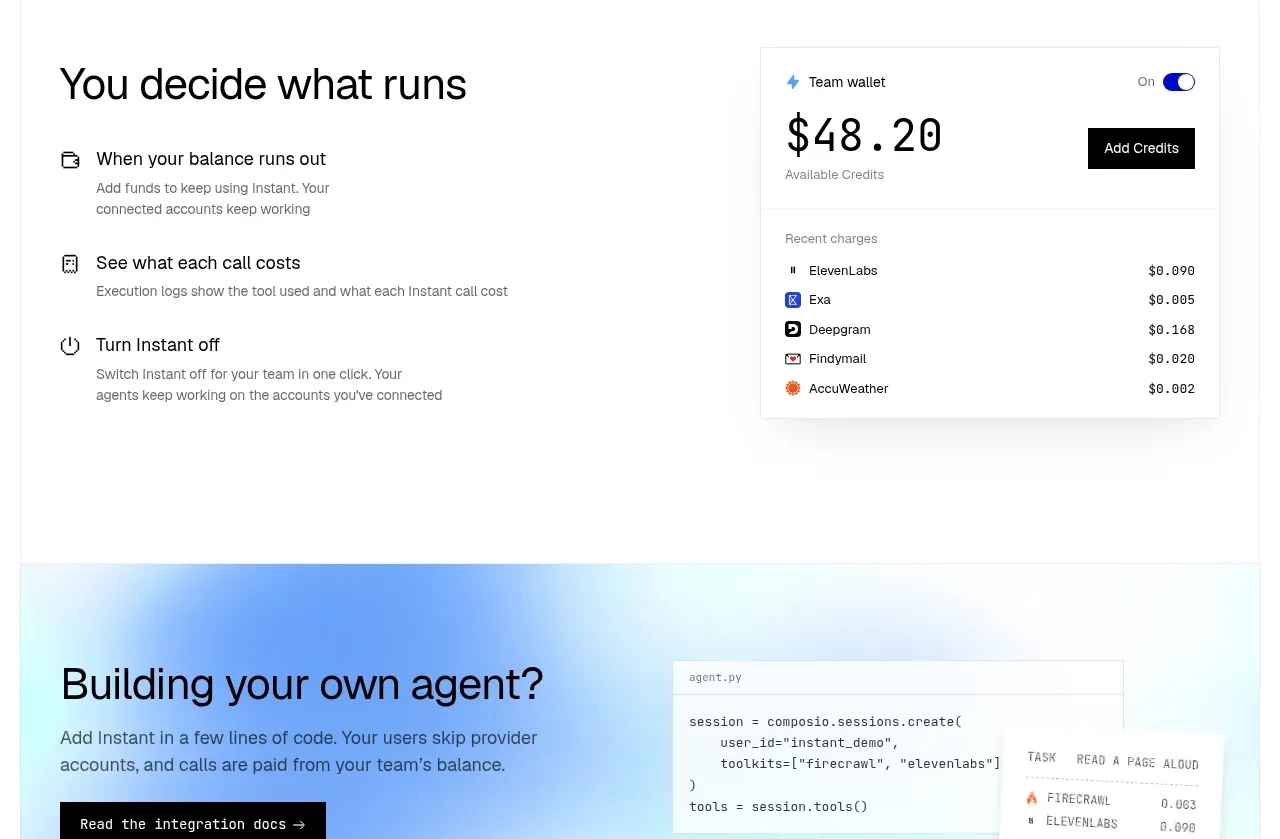 Spending controls
Composio Instant · Feature grid
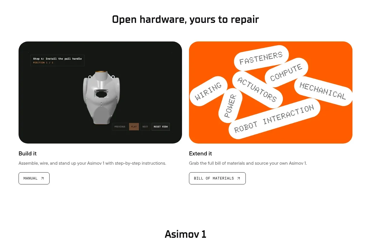
 Open hardware pathways
Asimov 1 · Feature grid
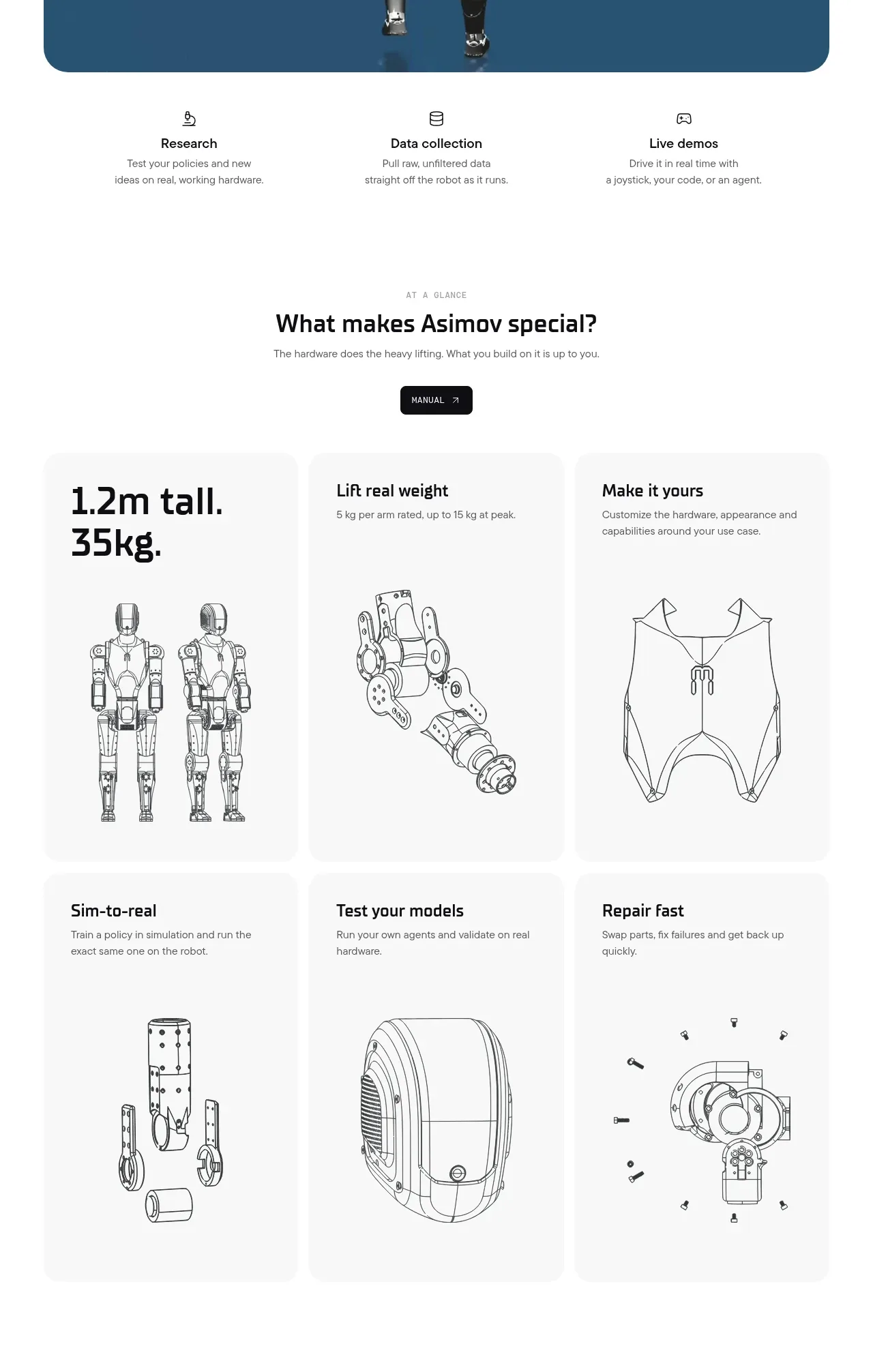 Capability overview and specification cards
Asimov 1 · Feature grid