 kage
kage
blancbrowser.com
Design analysis
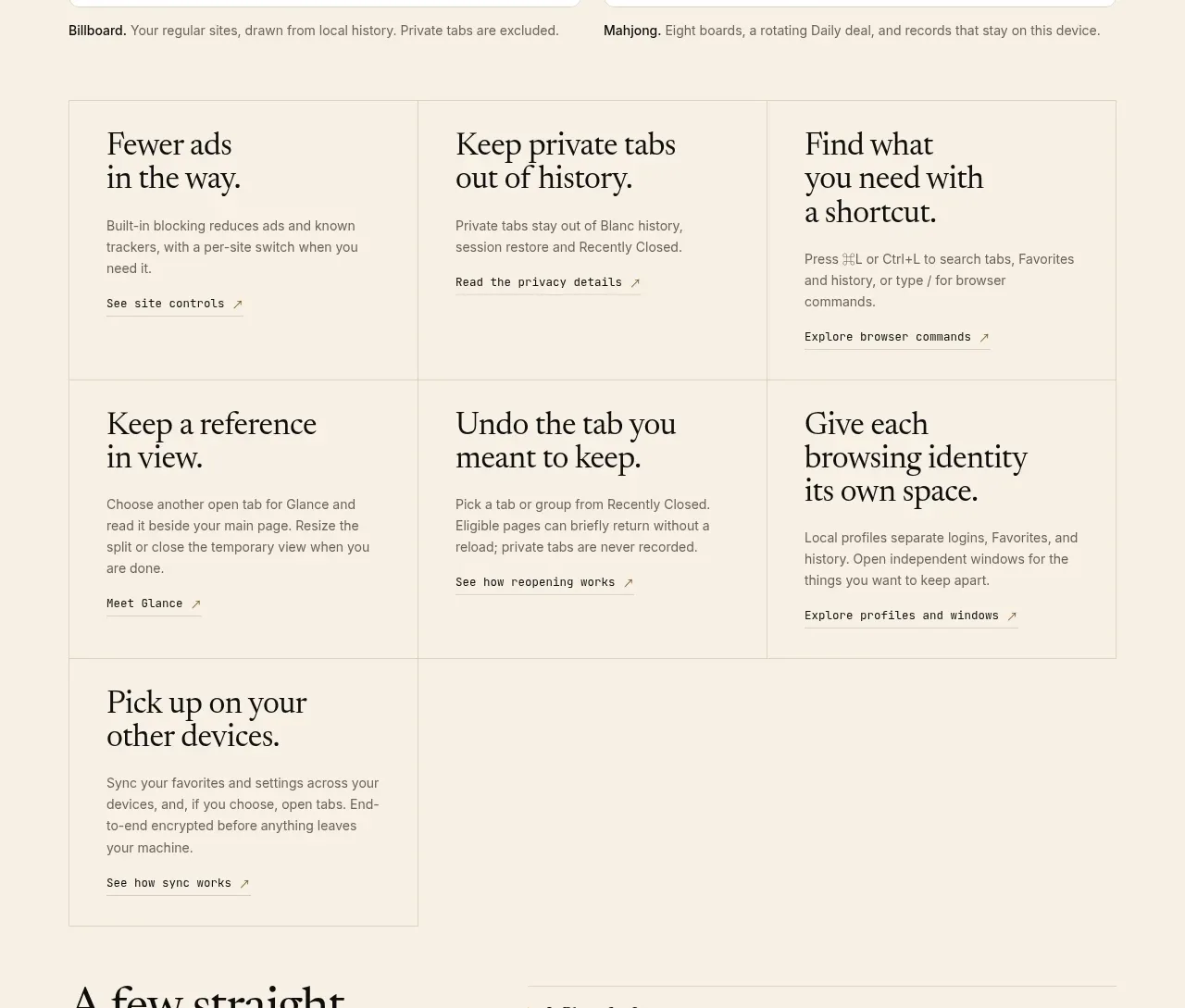
A bordered three-column feature grid presents seven concise capabilities, with repeated serif titles, short explanations, and small text links.
Prompt preview
## Reference images

Study these alongside the description below: hierarchy, rhythm, spacing, colour. Build for the product you are asked about, using this design language.

- Component: https://kage-design-assets.t3.tigrisfiles.io/components/blanc/6c0ef6d1-d2ca-4e94-b731-e699c7d4dc0f-1789711446-3.webp
- Full page it was cut from: https://kage-design-assets.t3.tigrisfiles.io/screenshots/blanc/6c0ef6d1-d2ca-4e94-b731-e699c7d4dc0f-1789711355373-full.webp
- Component on Kage: https://kage.design/component/blanc-feature-grid

## Before you start
Ask what the user's product, audience, and brand are, then apply the principles below to create an original feature grid.

Create a quiet, editorial feature grid with three equal columns and multiple rows inside a single thin bordered matrix. Use warm ivory (#f4eee2) as the page background and slightly lighter cells (#f7f2e8). Separate cells with 1px low-contrast lines (#ddd4c5), without heavy cards or shadows. Each cell contains a compact serif feature title, a short sans-serif explanation, and a small underlined or arrow-ended detail link. Keep titles around 25–30px with tight line height, body text 13–15px in muted brown-gray, and consistent internal padding around 28px. The final row may contain fewer items but should preserve the grid rhythm. On mobile, switch to one column while keeping horizontal separators.

Never: copy the reference's logos, product names, copy, illustrations, or imagery.
More components

 AI-powered helpdesk feature section
intercom.com · Feature grid
AI-powered helpdesk feature section
intercom.com · Feature grid
 Integrations and ecosystem section
intercom.com · Feature grid
Integrations and ecosystem section
intercom.com · Feature grid
 AI agent capabilities section
intercom.com · Feature grid
AI agent capabilities section
intercom.com · Feature grid
 Unified support experience overview
intercom.com · Feature grid
Unified support experience overview
intercom.com · Feature grid

 Core invoicing capabilities
sendinvo.com · Feature grid
Core invoicing capabilities
sendinvo.com · Feature grid
 Audience and trade types
sendinvo.com · Feature grid
Audience and trade types
sendinvo.com · Feature grid