kage
kage
blancbrowser.com
Design analysis
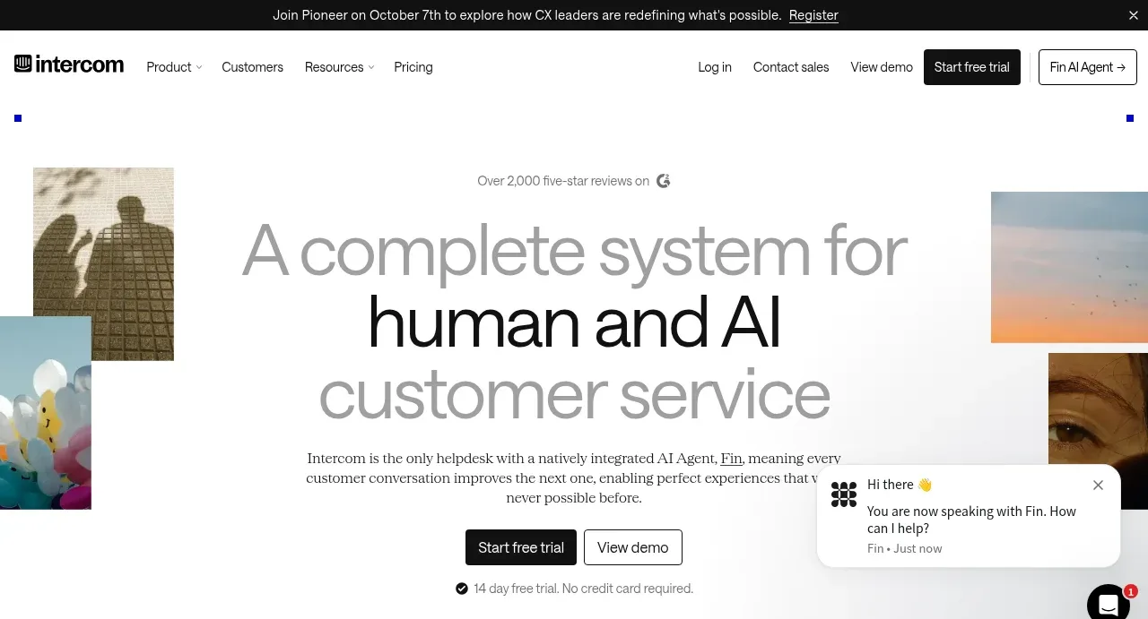
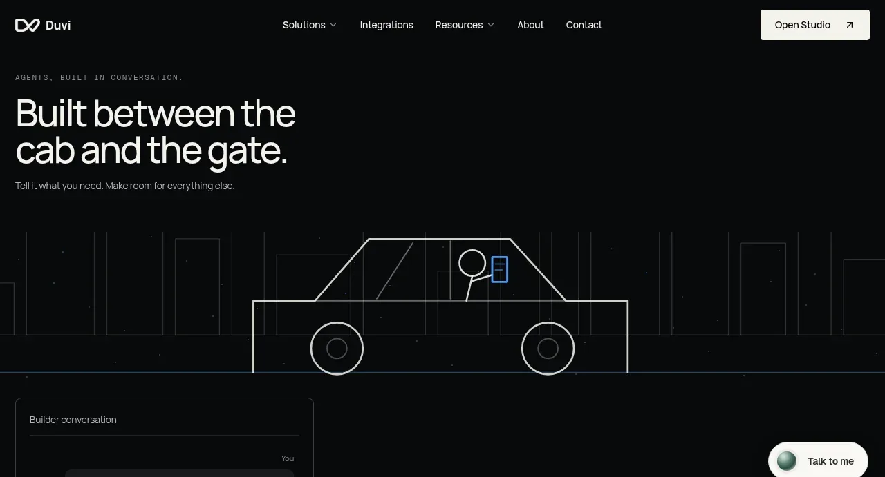
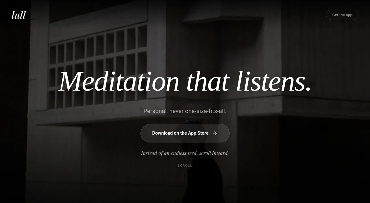
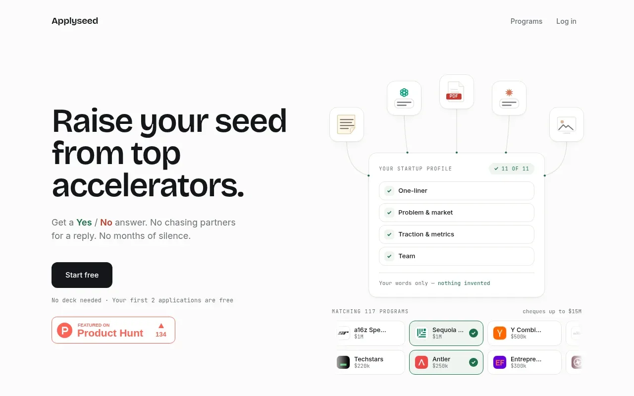
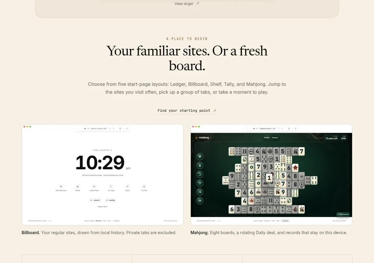
A second editorial section frames several product start-page choices with a serif heading, explanatory text, and two large side-by-side previews with captions.
Prompt preview
## Reference images

Study these alongside the description below: hierarchy, rhythm, spacing, colour. Build for the product you are asked about, using this design language.

- Component: https://kage-design-assets.t3.tigrisfiles.io/components/blanc/6c0ef6d1-d2ca-4e94-b731-e699c7d4dc0f-1789711446-2.webp
- Full page it was cut from: https://kage-design-assets.t3.tigrisfiles.io/screenshots/blanc/6c0ef6d1-d2ca-4e94-b731-e699c7d4dc0f-1789711355373-full.webp
- Component on Kage: https://kage.design/component/blanc-hero-2

## Before you start
Ask what the user's product, audience, and brand are, then apply the principles below to create an original showcase section.

Build a centered showcase section on the same warm ivory background. Use a small uppercase eyebrow, a large two-line serif heading, and a concise centered paragraph. Follow it with a small utility link or label, then a responsive two-column gallery of large rounded interface previews. Each preview should have a thin border, modest radius, realistic but original product UI, and a caption beneath explaining the option. Maintain a clear 24–32px gap between columns and align captions consistently. Let the section breathe with generous top and bottom padding; collapse to one column on mobile. Use near-black type (#171713), muted brown-gray body text (#756d60), warm off-white surfaces (#fbf8f0), and hairline borders (#ded6c8).

Never: copy the reference's logos, product names, copy, illustrations, or imagery.