 kage
kage
blenny.fi5h.xyz
Design analysis
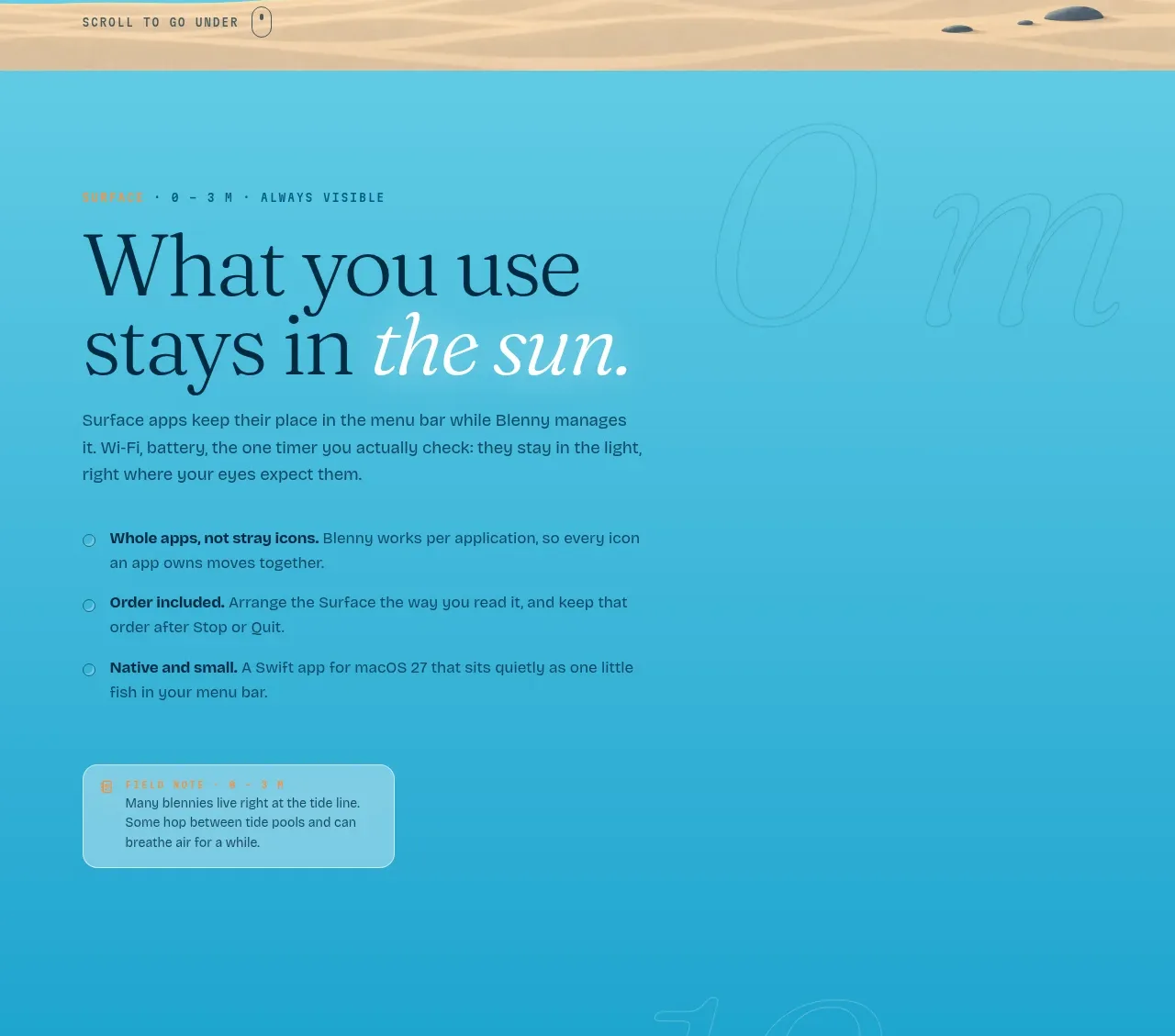
This section explains the first product mode through a headline, supporting copy, three concise benefit bullets, and a small translucent note card.
Prompt preview
## Reference images

Study these alongside the description below: hierarchy, rhythm, spacing, colour. Build for the product you are asked about, using this design language.

- Component: https://kage-design-assets.t3.tigrisfiles.io/components/blenny/33d02076-57e4-4143-93c3-5008f6d9015f-1791180359-1.webp
- Full page it was cut from: https://kage-design-assets.t3.tigrisfiles.io/screenshots/blenny/33d02076-57e4-4143-93c3-5008f6d9015f-1791180160992-full.webp
- Component on Kage: https://kage.design/component/blenny-feature-grid

## Before you start
Ask the user what their product is, who it is for, and what their brand voice and visual identity are. Apply the principles below to that product rather than reproducing this reference.

Build a feature explanation section with an editorial heading, short paragraph, and three vertically stacked benefit bullets. Put the content on a narrow readable column while leaving open space for a faint oversized decorative numeral or typographic watermark. Add one small translucent callout card below the bullets to reinforce a memorable rule or insight. Use the same aqua/cyan family as the hero, transitioning toward #31afd0, with navy text #07304b and low-contrast glass surfaces around rgba(255,255,255,.16). Use a large serif heading, compact monospace eyebrow, and sans-serif body copy. Bullets should have tiny outlined circular markers, generous vertical rhythm, and bold lead-in phrases. Keep the callout rounded 14–18px with a fine translucent border.

Never use logos, product names, copy, illustrations, or imagery from the reference.
More components

 Three-step process cards
godaylight.com · Feature grid
Three-step process cards
godaylight.com · Feature grid

 Use-case selector with vertical video preview
Spira Maxima · Feature grid
Use-case selector with vertical video preview
Spira Maxima · Feature grid

 Routing reliability and model collaboration
FastRouter.ai · Feature grid
Routing reliability and model collaboration
FastRouter.ai · Feature grid
 Goal-oriented product capabilities
FastRouter.ai · Feature grid
Goal-oriented product capabilities
FastRouter.ai · Feature grid
 Insights and enterprise model access
FastRouter.ai · Feature grid
Insights and enterprise model access
FastRouter.ai · Feature grid
 Solutions by organizational role
FastRouter.ai · Feature grid
Solutions by organizational role
FastRouter.ai · Feature grid