 kage
kage
blenny.fi5h.xyz
Design analysis
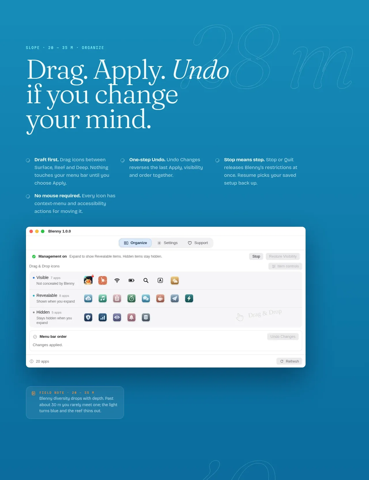
The organization section combines a large statement, a three-column principles row, and a prominent application screenshot demonstrating the workflow.
Prompt preview
## Reference images

Study these alongside the description below: hierarchy, rhythm, spacing, colour. Build for the product you are asked about, using this design language.

- Component: https://kage-design-assets.t3.tigrisfiles.io/components/blenny/33d02076-57e4-4143-93c3-5008f6d9015f-1791180360-3.webp
- Full page it was cut from: https://kage-design-assets.t3.tigrisfiles.io/screenshots/blenny/33d02076-57e4-4143-93c3-5008f6d9015f-1791180160992-full.webp
- Component on Kage: https://kage.design/component/blenny-feature-grid-2

## Before you start
Ask the user what their product is, who it is for, and what their brand voice and visual identity are. Apply the principles below to that product rather than reproducing this reference.

Build a workflow feature section with a large multiline serif headline, a short explanatory paragraph, and a row of three concise principles. Each principle should have a bold lead-in and supporting text; allow a fourth item to wrap naturally on smaller screens. Place a large polished application screenshot or interface mockup below, centered inside the content column, with a subtle shadow and rounded corners. Use a darker blue background around #138db6, pale text #edf4e8, and translucent cards or dividers. Maintain a strong 12-column desktop grid, with the text aligned to the left content edge and the screenshot aligned to the same max width. Use clear vertical spacing between statement, principles, and proof. Let the screenshot become a horizontally scrollable preview on mobile.

Never use logos, product names, copy, illustrations, or imagery from the reference.
More components

 Three-step process cards
godaylight.com · Feature grid
Three-step process cards
godaylight.com · Feature grid

 Use-case selector with vertical video preview
Spira Maxima · Feature grid
Use-case selector with vertical video preview
Spira Maxima · Feature grid

 Routing reliability and model collaboration
FastRouter.ai · Feature grid
Routing reliability and model collaboration
FastRouter.ai · Feature grid
 Goal-oriented product capabilities
FastRouter.ai · Feature grid
Goal-oriented product capabilities
FastRouter.ai · Feature grid
 Insights and enterprise model access
FastRouter.ai · Feature grid
Insights and enterprise model access
FastRouter.ai · Feature grid
 Solutions by organizational role
FastRouter.ai · Feature grid
Solutions by organizational role
FastRouter.ai · Feature grid