 kage
kage
blenny.fi5h.xyz
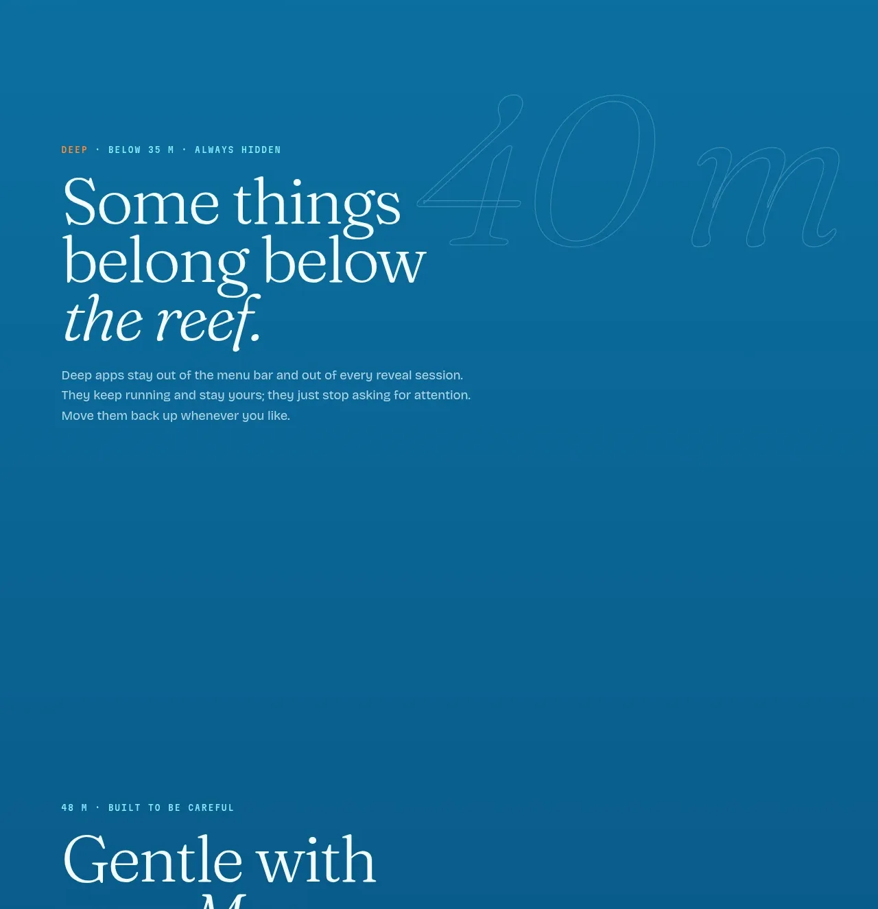
Design analysis
A darker section introduces the deepest mode with a short statement and six consistent cards that communicate safety and reliability principles.
Prompt preview
## Reference images

Study these alongside the description below: hierarchy, rhythm, spacing, colour. Build for the product you are asked about, using this design language.

- Component: https://kage-design-assets.t3.tigrisfiles.io/components/blenny/33d02076-57e4-4143-93c3-5008f6d9015f-1791180360-4.webp
- Full page it was cut from: https://kage-design-assets.t3.tigrisfiles.io/screenshots/blenny/33d02076-57e4-4143-93c3-5008f6d9015f-1791180160992-full.webp
- Component on Kage: https://kage.design/component/blenny-feature-grid-3

## Before you start
Ask the user what their product is, who it is for, and what their brand voice and visual identity are. Apply the principles below to that product rather than reproducing this reference.

Create a dark feature-card section. Begin with a small eyebrow and large serif heading plus a compact paragraph, then show six benefits in a 3-by-2 grid on desktop and one column on mobile. Each card should contain a small outlined icon area, a bold short title, and two or three lines of supporting copy. Use a deep teal/navy background around #0b5b85, pale text #eaf4eb, and cards around rgba(255,255,255,.09) with a 1px translucent border and 14–18px radius. Keep card heights consistent and use generous internal padding. Provide hover elevation or border-brightening, but avoid flashy animation. Ensure icons are generic and accessible with labels where needed.

Never use logos, product names, copy, illustrations, or imagery from the reference.
More components

 Three-step process cards
godaylight.com · Feature grid
Three-step process cards
godaylight.com · Feature grid

 Use-case selector with vertical video preview
Spira Maxima · Feature grid
Use-case selector with vertical video preview
Spira Maxima · Feature grid

 Routing reliability and model collaboration
FastRouter.ai · Feature grid
Routing reliability and model collaboration
FastRouter.ai · Feature grid
 Goal-oriented product capabilities
FastRouter.ai · Feature grid
Goal-oriented product capabilities
FastRouter.ai · Feature grid
 Insights and enterprise model access
FastRouter.ai · Feature grid
Insights and enterprise model access
FastRouter.ai · Feature grid
 Solutions by organizational role
FastRouter.ai · Feature grid
Solutions by organizational role
FastRouter.ai · Feature grid