 kage
kage
blenny.fi5h.xyz
Design analysis
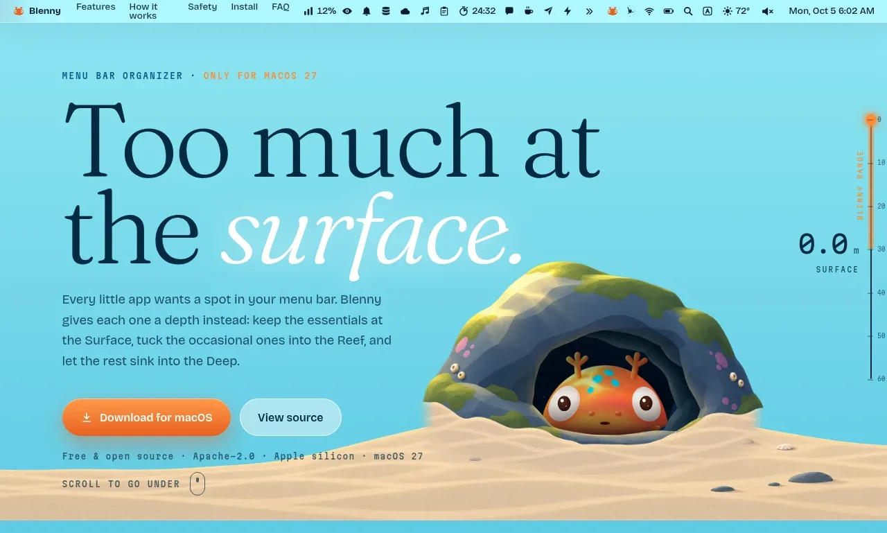
The hero pairs an oversized editorial headline with concise positioning copy, two actions, metadata, and a playful product visual that establishes the page's depth metaphor.
Prompt preview
## Reference images

Study these alongside the description below: hierarchy, rhythm, spacing, colour. Build for the product you are asked about, using this design language.

- Component: https://kage-design-assets.t3.tigrisfiles.io/components/blenny/33d02076-57e4-4143-93c3-5008f6d9015f-1791180359-0.webp
- Full page it was cut from: https://kage-design-assets.t3.tigrisfiles.io/screenshots/blenny/33d02076-57e4-4143-93c3-5008f6d9015f-1791180160992-full.webp
- Component on Kage: https://kage.design/component/blenny-hero

## Before you start
Ask the user what their product is, who it is for, and what their brand voice and visual identity are. Apply the principles below to that product rather than reproducing this reference.

Create an immersive hero immediately below the navigation. Use a wide two-column composition: a large display headline and short explanatory paragraph on the left, with a product visual or responsive preview integrated toward the lower/right area. Make the primary action a warm accent button and the secondary action an understated outlined or translucent button. Add a tiny eyebrow, compact product metadata, and a scroll cue. Use a bright aqua-to-cyan background around #65d0dc, dark ink #062748, and a warm orange accent around #f58b3f. Set the headline in an elegant high-contrast serif with italic emphasis on one phrase; use a practical sans-serif for body text. Allow the visual to overlap the lower edge of the hero, but keep all content readable and provide mobile stacking. Use large, deliberate whitespace and rounded buttons around 999px.

Never use logos, product names, copy, illustrations, or imagery from the reference.
More components

 AI workflow hero
Incredible · Hero
AI workflow hero
Incredible · Hero

 Photographic power-home hero
godaylight.com · Hero
Photographic power-home hero
godaylight.com · Hero
 Warm mission statement panel
godaylight.com · Hero
Warm mission statement panel
godaylight.com · Hero
 Grid problem statement
godaylight.com · Hero
Grid problem statement
godaylight.com · Hero
 Decentralized energy statement
godaylight.com · Hero
Decentralized energy statement
godaylight.com · Hero

 Product hero with download action and video
HyperFrames Studio (Desktop) · Hero
Product hero with download action and video
HyperFrames Studio (Desktop) · Hero