 kage
bonds.chat
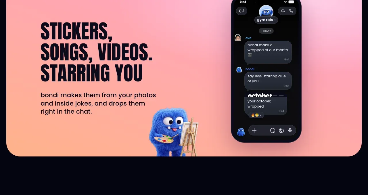
Design analysis
A warm pink-to-peach feature card presents creative outputs made from conversation, pairing left-aligned copy with a tall phone mockup on the right.
Prompt preview
## Reference images

Study these alongside the description below: hierarchy, rhythm, spacing, colour. Build for the product you are asked about, using this design language.

- Component: https://kage-design-assets.t3.tigrisfiles.io/components/bonds/92b84629-52db-439e-9b50-1b68fbcd9bda-1792562654-5.webp
- Full page it was cut from: https://kage-design-assets.t3.tigrisfiles.io/screenshots/bonds/92b84629-52db-439e-9b50-1b68fbcd9bda-1792562529975-full.webp
- Component on Kage: https://kage.design/component/bonds-feature-grid

## Before you start
Ask what creative outputs the user's product generates and what device or interface best demonstrates them. Ask for brand colours and translate the same layout logic into that identity.

Create a horizontal feature card with a warm pink-to-peach gradient (`#f4a0bd` to `#ffc08f`), 20–26px corner radius, and a two-column layout. Put a bold condensed uppercase heading and two-to-three lines of supporting copy on the left, aligned vertically around the center. Put a realistic but original phone or app mockup on the right, slightly inset from the top and bottom. Use dark navy text (`#080817`), generous 56–80px padding, and a small supporting visual near the lower edge if desired. Keep the phone secondary to the benefit statement, provide a stacked mobile layout, and ensure the copy remains readable against the gradient.

Never: use the reference's logos, product names, copy, illustrations, imagery, or exact visual assets.
More components
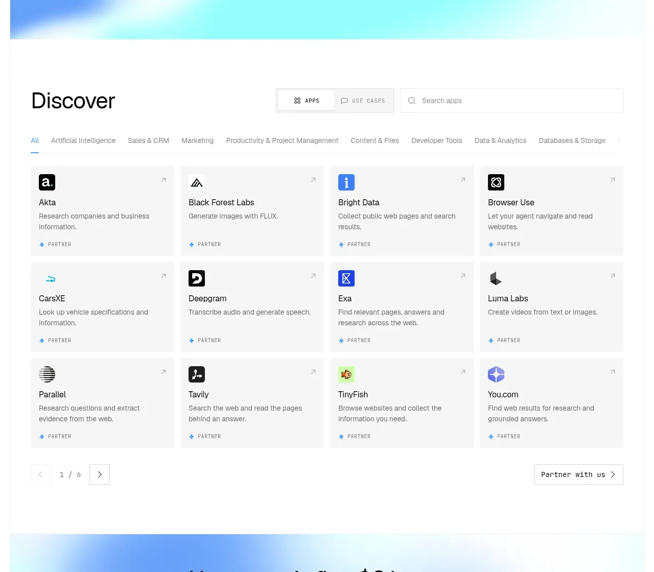
 Discover app directory
Composio Instant · Feature grid
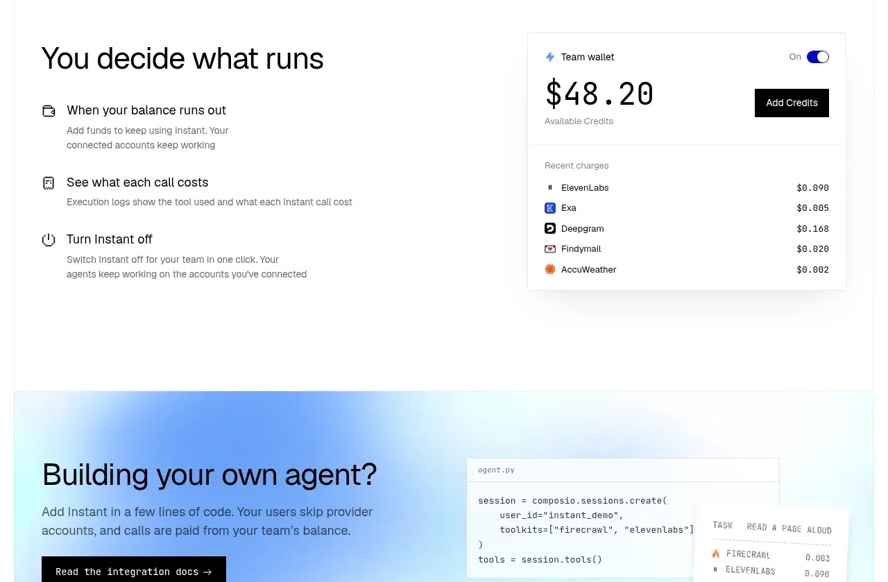 Spending controls
Composio Instant · Feature grid
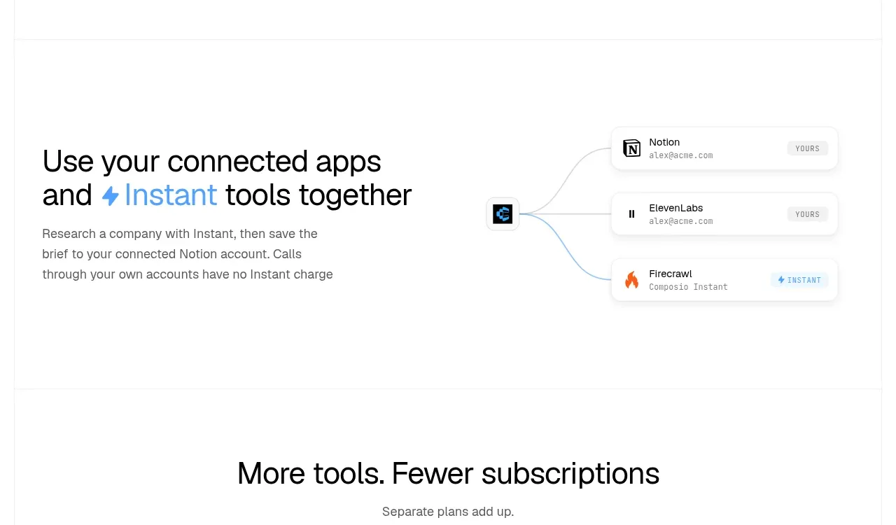 Connected apps workflow
Composio Instant · Feature grid
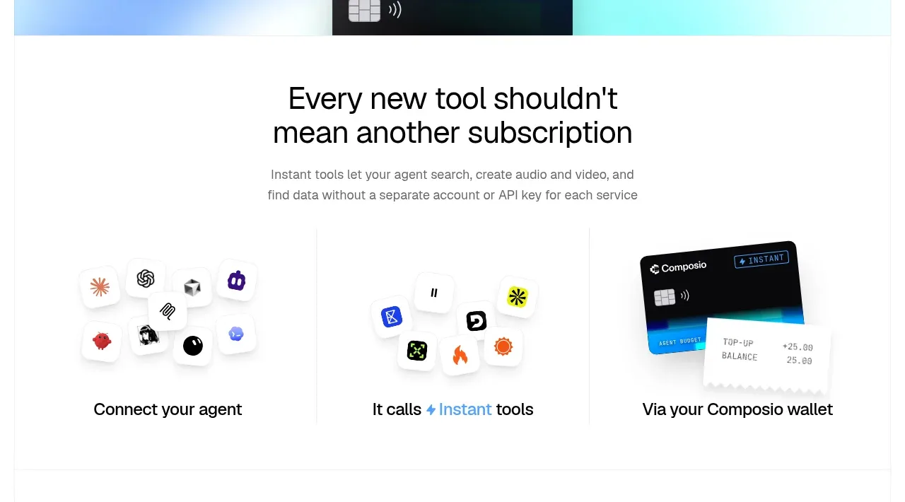 Three-part product workflow
Composio Instant · Feature grid
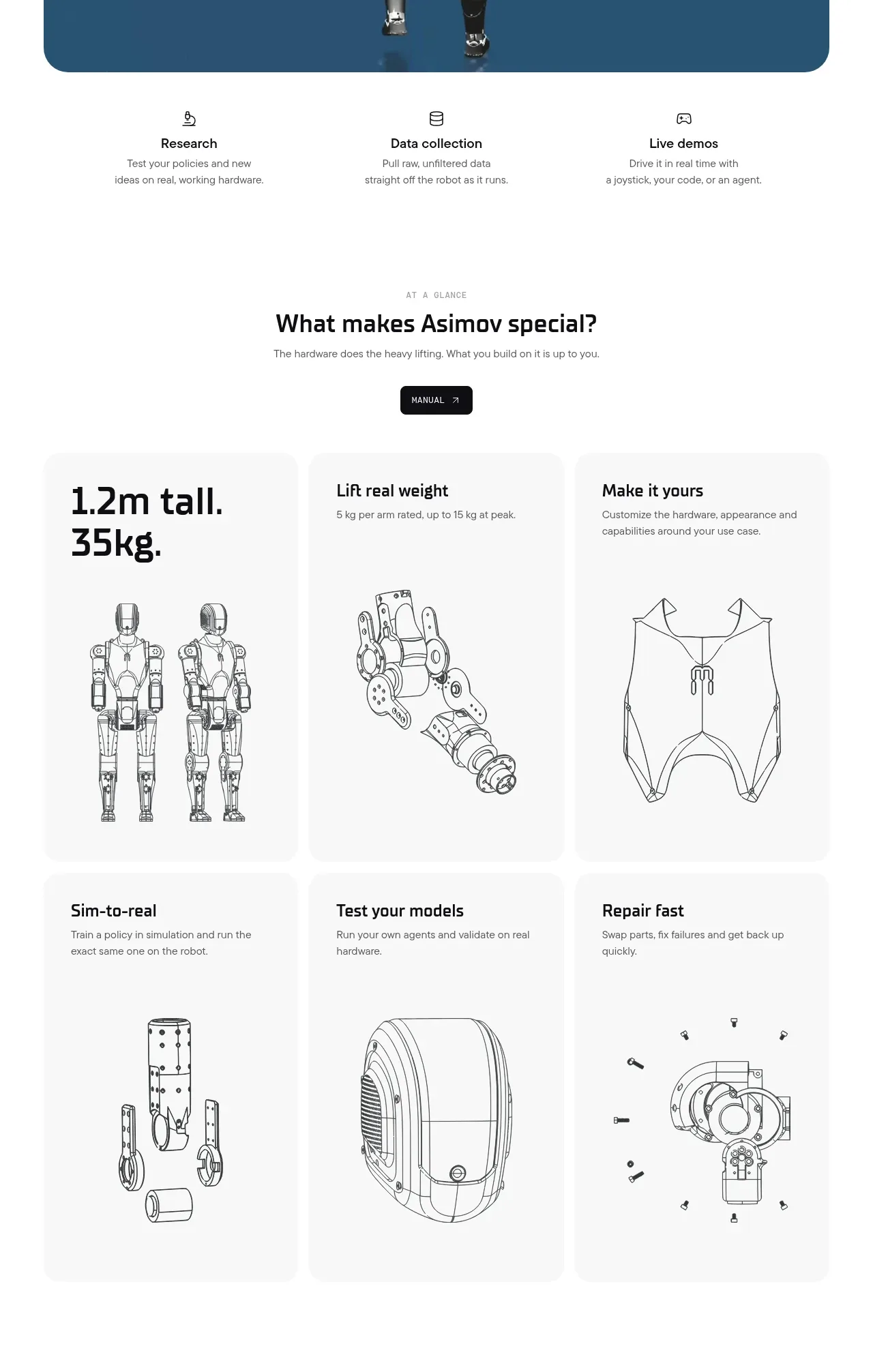
 Capability overview and specification cards
Asimov 1 · Feature grid
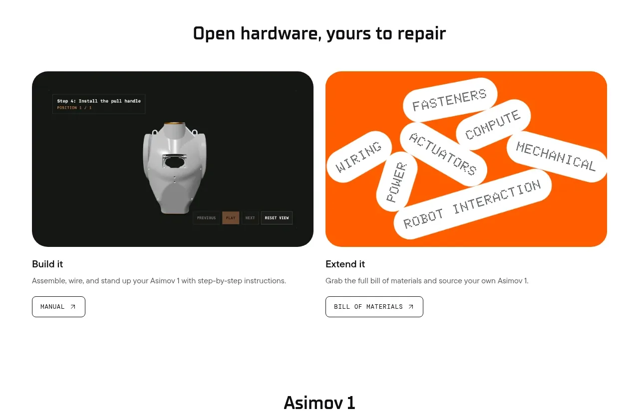 Open hardware pathways
Asimov 1 · Feature grid