 kage
bonds.chat

Design analysis
A centered promise leads into two side-by-side cards that contrast the user's ongoing investment with the product's reciprocal care, using progress and chat UI as evidence.
Prompt preview
## Reference images

Study these alongside the description below: hierarchy, rhythm, spacing, colour. Build for the product you are asked about, using this design language.

- Component: https://kage-design-assets.t3.tigrisfiles.io/components/bonds/92b84629-52db-439e-9b50-1b68fbcd9bda-1792562655-6.webp
- Full page it was cut from: https://kage-design-assets.t3.tigrisfiles.io/screenshots/bonds/92b84629-52db-439e-9b50-1b68fbcd9bda-1792562529975-full.webp
- Component on Kage: https://kage.design/component/bonds-feature-grid-2

## Before you start
Ask what relationship or workflow should feel reciprocal in the user's product and what two perspectives are worth comparing. Build the component around those answers.

Design a dark comparison section with a centered two-line condensed headline, white plus electric-blue emphasis, and a short muted supporting paragraph. Below it, place two equal-width cards in a responsive grid. Use deep indigo surfaces (`#111128`), 18–22px radius, subtle `#29284e` borders, and 22–28px padding. The first card should show a simple progress or vitality state with a large visual area; the second should show a realistic conversation or activity feed. Add small status chips or reactions near the bottom to make the states feel alive. Keep card headings prominent, body text muted lavender (`#a6a4c5`), and stack cards on mobile.

Never: use the reference's logos, product names, copy, illustrations, imagery, or exact visual assets.
More components
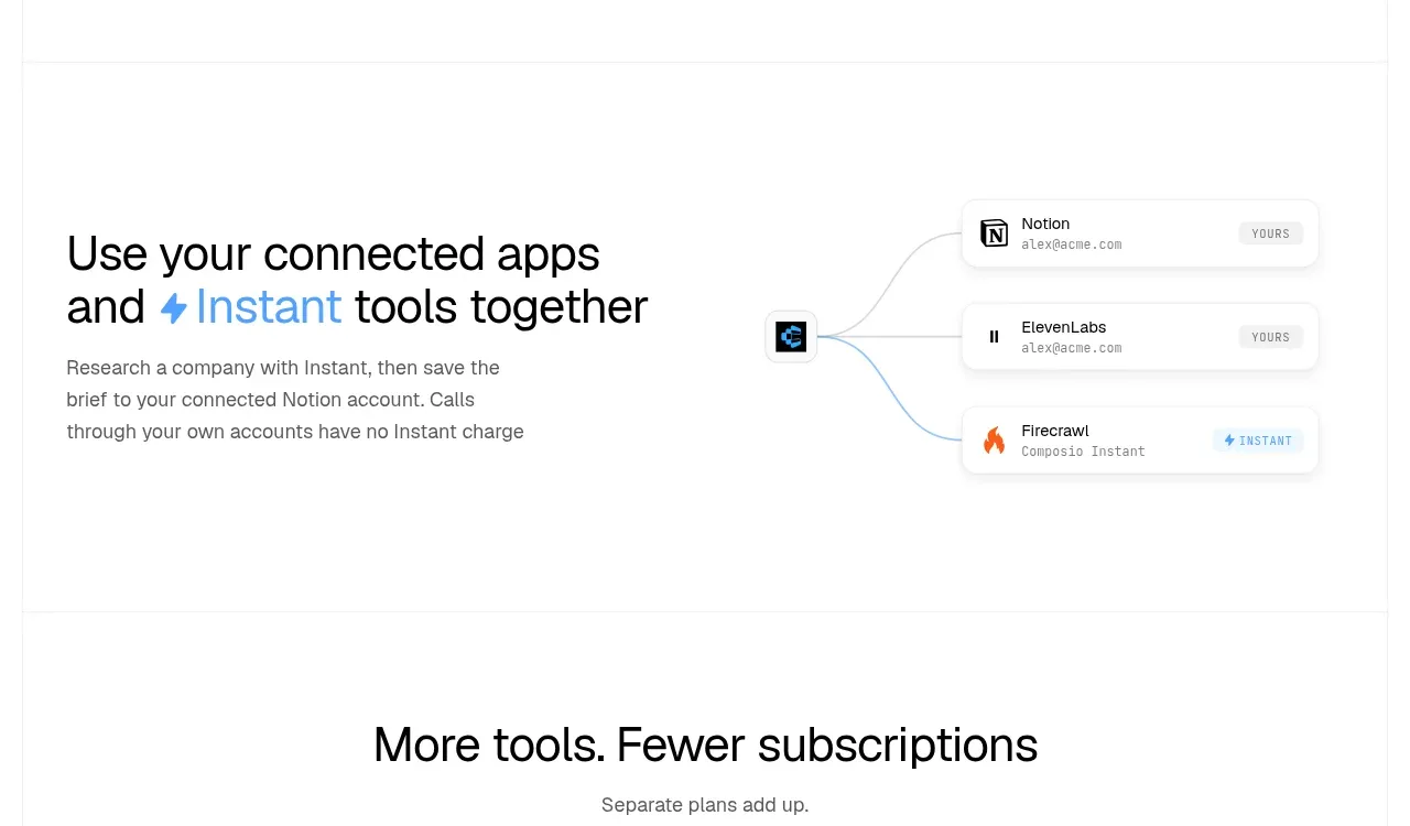
 Connected apps workflow
Composio Instant · Feature grid
 Spending controls
Composio Instant · Feature grid
 Three-part product workflow
Composio Instant · Feature grid
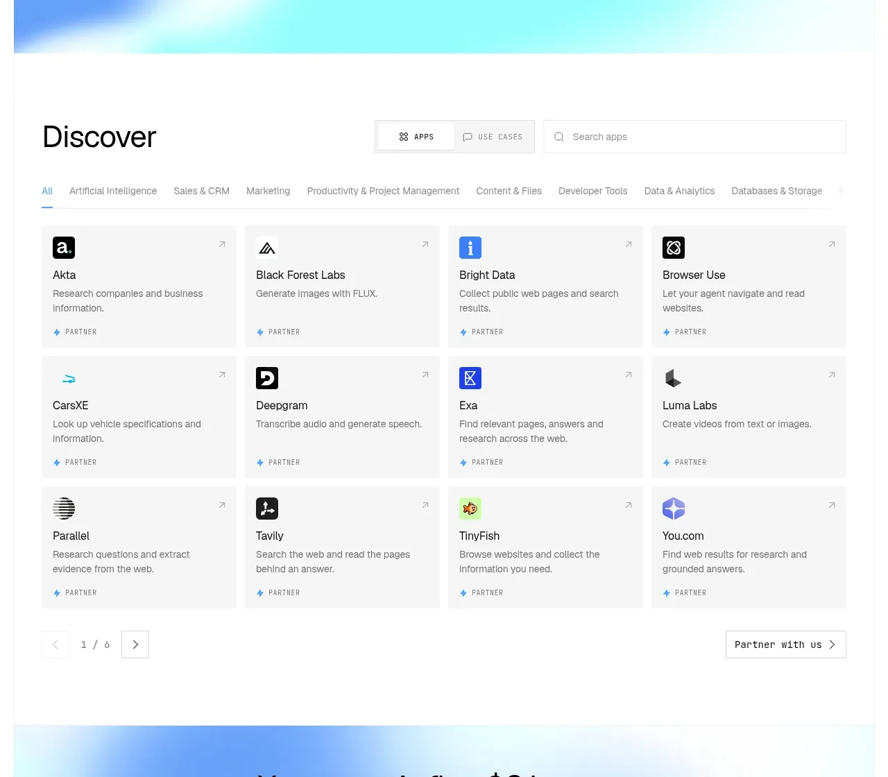 Discover app directory
Composio Instant · Feature grid
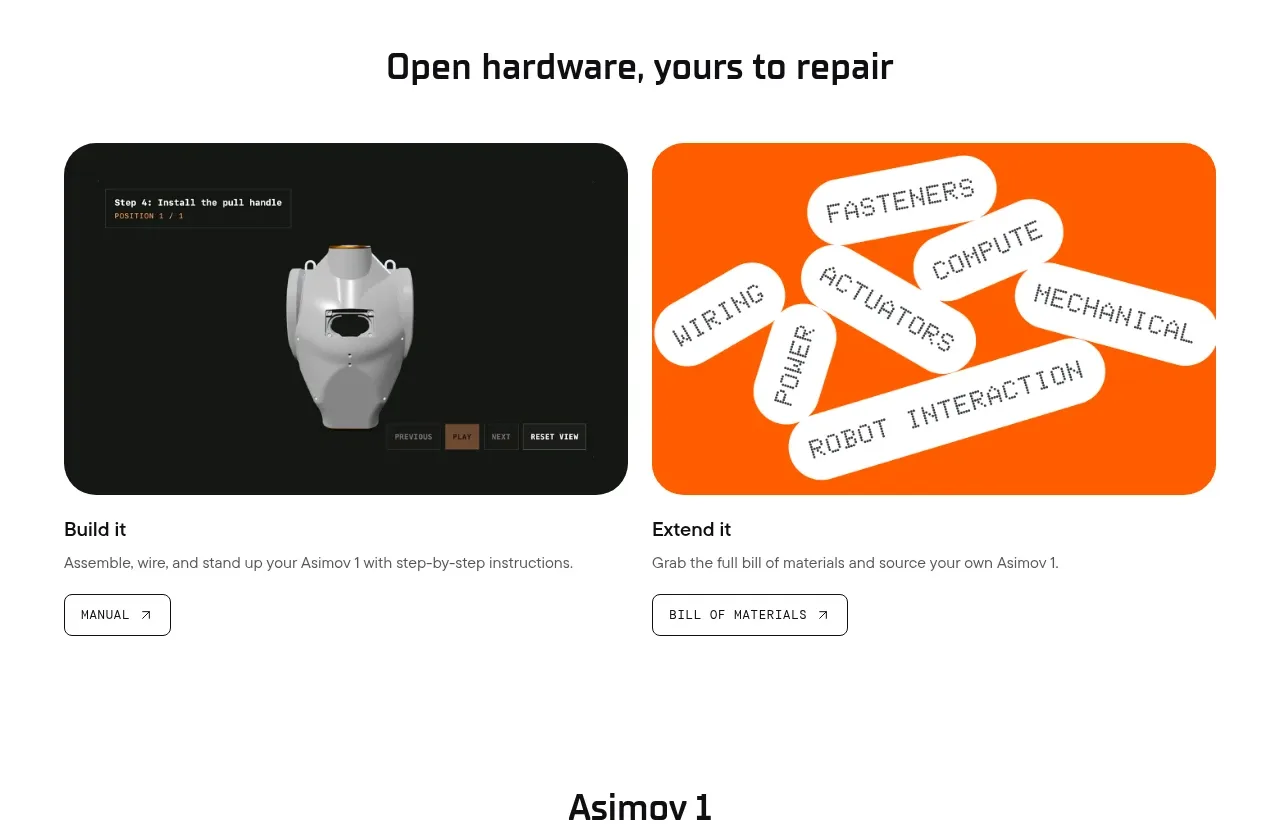
 Open hardware pathways
Asimov 1 · Feature grid
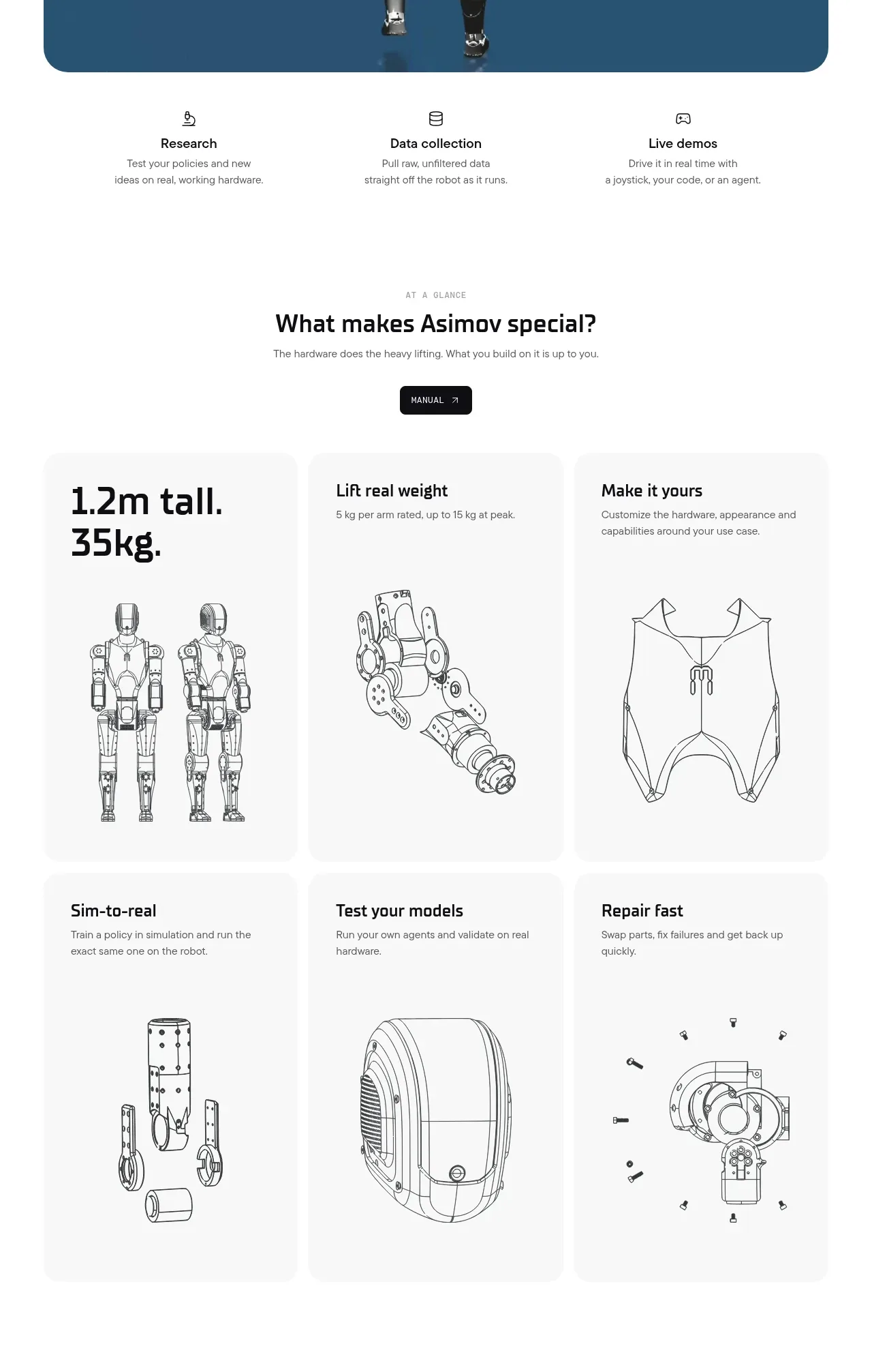 Capability overview and specification cards
Asimov 1 · Feature grid