 kage
kage
botbus.io
Design analysis
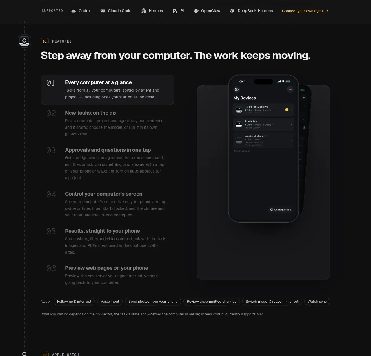
This long feature section combines a section heading, numbered feature list, a large device card, capability chips, and a short qualification note, letting users scan benefits while seeing the interface in context.
Prompt preview
## Reference images

Study these alongside the description below: hierarchy, rhythm, spacing, colour. Build for the product you are asked about, using this design language.

- Component: https://kage-design-assets.t3.tigrisfiles.io/components/botbus/3351c24c-0aff-40a1-9a6d-203e8c2d3da7-1791525845-3.webp
- Full page it was cut from: https://kage-design-assets.t3.tigrisfiles.io/screenshots/botbus/3351c24c-0aff-40a1-9a6d-203e8c2d3da7-1791525750475-full.webp
- Component on Kage: https://kage.design/component/botbus-feature-grid

## Before you start
Ask what the user's product and brand are, then apply the principles below to that product rather than reproducing this reference.

Create a dark feature walkthrough section with a small numbered eyebrow, a strong section headline, and a two-column body. On the left, show six vertically stacked numbered feature items; make the selected item a rounded bordered panel with brighter text and supporting copy while the remaining items are quieter rows. On the right, place a tall rounded showcase card containing a large product UI mockup. Below or beside it, include compact pill-shaped capability tags and a concise muted caveat. Use a subtle vertical guide line and small circular markers if a timeline feel helps, but keep the content scannable. Use #101010 background, #191919 cards, #292929 borders, white headings, #858585 inactive text, 14–16px body copy, and 18–24px card radii. Include hover/focus states that highlight a feature and update the showcase area, but keep the layout functional without JavaScript.

Never: use logos, product names, copy, illustrations, or imagery from the reference.
More components

 Privacy and optional intelligence
Mailwell · Feature grid
Privacy and optional intelligence
Mailwell · Feature grid
 Reliable, recoverable actions
Mailwell · Feature grid
Reliable, recoverable actions
Mailwell · Feature grid
 Unified account setup
Mailwell · Feature grid
Unified account setup
Mailwell · Feature grid
 Fast local workflow and calm reading
Mailwell · Feature grid
Fast local workflow and calm reading
Mailwell · Feature grid

 Cloud layer workflows
ProcBoss · Feature grid
Cloud layer workflows
ProcBoss · Feature grid
 Operational blind spots
ProcBoss · Feature grid
Operational blind spots
ProcBoss · Feature grid