 kage
kage
botbus.io
Design analysis
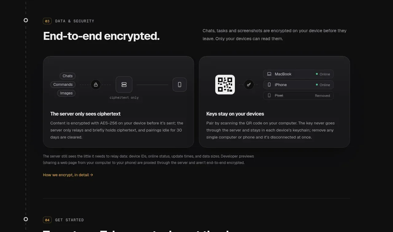
The security subsection presents a clear headline and two equal cards explaining separate privacy principles, followed by a small caveat and detail link.
Prompt preview
## Reference images

Study these alongside the description below: hierarchy, rhythm, spacing, colour. Build for the product you are asked about, using this design language.

- Component: https://kage-design-assets.t3.tigrisfiles.io/components/botbus/3351c24c-0aff-40a1-9a6d-203e8c2d3da7-1791525846-5.webp
- Full page it was cut from: https://kage-design-assets.t3.tigrisfiles.io/screenshots/botbus/3351c24c-0aff-40a1-9a6d-203e8c2d3da7-1791525750475-full.webp
- Component on Kage: https://kage.design/component/botbus-feature-grid-3

## Before you start
Ask what the user's product and brand are, then apply the principles below to that product rather than reproducing this reference.

Create a security-focused section on a nearly black background. Use a numbered eyebrow and a two-column heading row with a large direct headline on the left and a short reassurance paragraph on the right. Under it, place two equal rounded cards with compact abstract UI diagrams at the top and a clear card title plus explanatory text below. Follow the cards with a small-print limitation or scope note and a low-emphasis “learn more” link. Use #191919 cards, #303030 borders, 18–22px radii, white headings, gray copy, and one warm accent around #c4ad69 for links or status indicators. Keep the diagrams schematic and product-agnostic, with high contrast and ample internal padding.

Never: use logos, product names, copy, illustrations, or imagery from the reference.
More components

 Privacy and optional intelligence
Mailwell · Feature grid
Privacy and optional intelligence
Mailwell · Feature grid
 Reliable, recoverable actions
Mailwell · Feature grid
Reliable, recoverable actions
Mailwell · Feature grid
 Unified account setup
Mailwell · Feature grid
Unified account setup
Mailwell · Feature grid
 Fast local workflow and calm reading
Mailwell · Feature grid
Fast local workflow and calm reading
Mailwell · Feature grid

 Cloud layer workflows
ProcBoss · Feature grid
Cloud layer workflows
ProcBoss · Feature grid
 Operational blind spots
ProcBoss · Feature grid
Operational blind spots
ProcBoss · Feature grid