 kage
kage
botbus.io
Design analysis
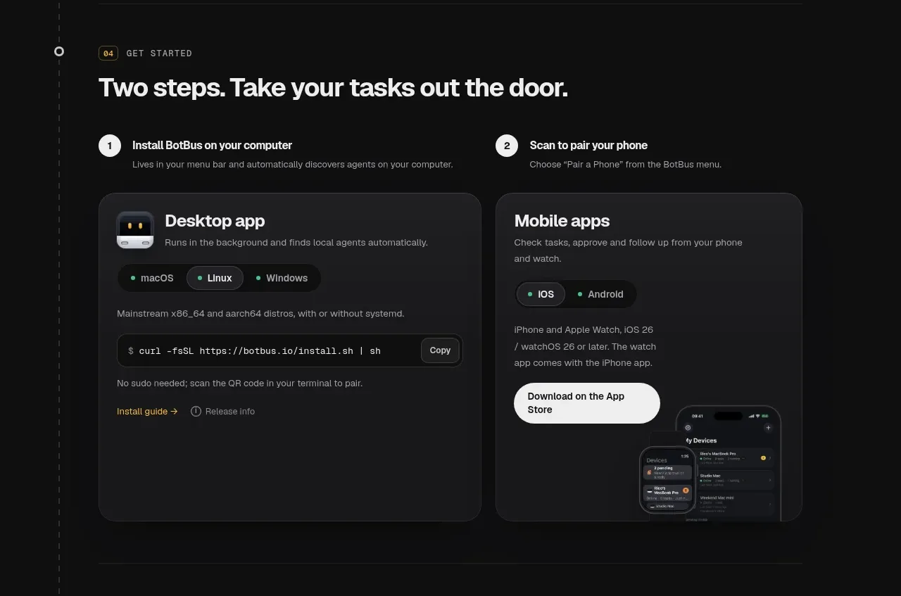
A getting-started section turns setup into two numbered columns, each with a concise instruction and a large dark card containing platform details, controls, and a relevant action.
Prompt preview
## Reference images

Study these alongside the description below: hierarchy, rhythm, spacing, colour. Build for the product you are asked about, using this design language.

- Component: https://kage-design-assets.t3.tigrisfiles.io/components/botbus/3351c24c-0aff-40a1-9a6d-203e8c2d3da7-1791525846-6.webp
- Full page it was cut from: https://kage-design-assets.t3.tigrisfiles.io/screenshots/botbus/3351c24c-0aff-40a1-9a6d-203e8c2d3da7-1791525750475-full.webp
- Component on Kage: https://kage.design/component/botbus-feature-grid-4

## Before you start
Ask what the user's product and brand are, then apply the principles below to that product rather than reproducing this reference.

Build a setup section titled with a concise outcome-oriented headline. Start with two equal step columns, each having a circular number badge, a bold step label, and one line of supporting copy. Beneath each step, add a tall dark rounded card. The first card may contain platform chips, an install command in a monospace field with a copy button, and secondary links; the second may contain supported mobile platform chips, a prominent store/download button, and a small interface preview. Use a 24px column gap, #191919 card backgrounds, #2d2d2d borders, 20px radii, 16–20px internal spacing, and a bright off-white primary button contrasted against the dark surface. Make code copying and download actions keyboard accessible.

Never: use logos, product names, copy, illustrations, or imagery from the reference.
More components

 Privacy and optional intelligence
Mailwell · Feature grid
Privacy and optional intelligence
Mailwell · Feature grid
 Reliable, recoverable actions
Mailwell · Feature grid
Reliable, recoverable actions
Mailwell · Feature grid
 Unified account setup
Mailwell · Feature grid
Unified account setup
Mailwell · Feature grid
 Fast local workflow and calm reading
Mailwell · Feature grid
Fast local workflow and calm reading
Mailwell · Feature grid

 Cloud layer workflows
ProcBoss · Feature grid
Cloud layer workflows
ProcBoss · Feature grid
 Operational blind spots
ProcBoss · Feature grid
Operational blind spots
ProcBoss · Feature grid