kage
kage
botbus.io
Design analysis
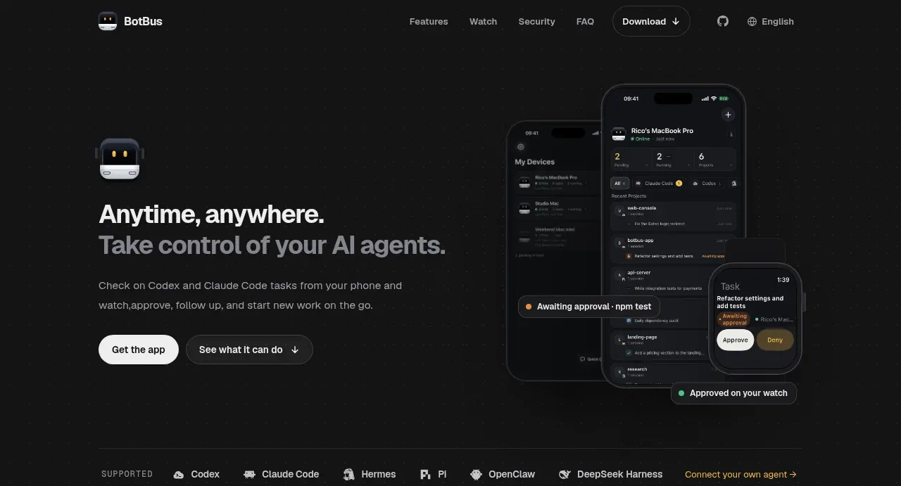
The hero pairs a concise two-line value proposition and two actions on the left with a large layered device visual on the right, creating an immediate explanation of remote agent control.
Prompt preview
## Reference images

Study these alongside the description below: hierarchy, rhythm, spacing, colour. Build for the product you are asked about, using this design language.

- Component: https://kage-design-assets.t3.tigrisfiles.io/components/botbus/3351c24c-0aff-40a1-9a6d-203e8c2d3da7-1791525845-1.webp
- Full page it was cut from: https://kage-design-assets.t3.tigrisfiles.io/screenshots/botbus/3351c24c-0aff-40a1-9a6d-203e8c2d3da7-1791525750475-full.webp
- Component on Kage: https://kage.design/component/botbus-hero

## Before you start
Ask what the user's product and brand are, then apply the principles below to that product rather than reproducing this reference.

Create a dark, split hero directly below the navigation, using a two-column layout inside a wide max-width container. Put a small product/feature marker above a large 40–56px bold headline, a muted supporting paragraph beneath it, and two horizontally aligned calls to action: a light filled primary button and a dark outlined secondary button with an optional arrow. Reserve the right half for a large layered product-interface visual with overlapping phone, desktop, or wearable frames and small status callouts; use the visual to communicate the product rather than decorative art. Use #101010–#151515 backgrounds, white typography, muted gray copy around #929292, a warm yellow-green accent around #c4ad69, 16–20px radii, and generous 72–112px vertical spacing. On mobile, stack the visual below the copy.

Never: use logos, product names, copy, illustrations, or imagery from the reference.