 kage
kage
bun.sh

Design analysis
A restrained, editorial benchmark section that pairs a bold value proposition with compact comparison cards. The repeated horizontal bars, consistent scales, and concise footnotes make performance differences immediately legible without overwhelming the page.
Prompt preview
## Reference images

Study these alongside the description below: hierarchy, rhythm, spacing, colour. Build for the product you are asked about, using this design language.

- Component: https://kage-design-assets.t3.tigrisfiles.io/components/bun-sh/5fab2b15-2f70-4d99-a79d-411d5e236c09-1789073824-7.webp
- Full page it was cut from: https://kage-design-assets.t3.tigrisfiles.io/screenshots/bun-sh/5fab2b15-2f70-4d99-a79d-411d5e236c09-1789073774-full.webp
- Component on Kage: https://kage.design/component/bun-chart

## Before you start
Ask the user what their product does, who it is for, and what brand direction they want to use. Then apply the principles below to their product and brand rather than reproducing this reference literally.

## Build a benchmark comparison chart section
Create a responsive, editorial-style performance comparison section for the user's product. The section should communicate a clear advantage through a short headline, a supporting paragraph, and a row of compact benchmark cards. Use realistic placeholder data relevant to the user's product, but make the component easy to replace with live or static data.

### Layout and alignment
- Use a wide, centered content container with a maximum width of approximately 1140–1200px and generous horizontal padding, around 64px on desktop and 24px on mobile.
- Place the introduction above the chart in a two-column layout: a dominant headline on the left and explanatory body copy on the right. Align both columns to the same top edge.
- Below the introduction, place three equal-width benchmark cards in one row on desktop. Stack them vertically on narrow screens.
- Give every card the same internal structure: title, muted subtitle, metric rows, and a separated result footer.
- Keep all chart labels and values aligned to predictable columns. Bars should share a common visual scale within each card and sit between the label and value.
- Add a small methodology note below the cards, aligned with the chart container rather than centered independently.

### Typography hierarchy
- Use a bold, condensed or tightly tracked display face for the main heading. Set it large and assertive, approximately 64–76px on desktop with a line-height around 0.9–1.0; reduce to 42–52px on mobile.
- Allow the headline to wrap across several short lines. Emphasize the product's advantage using a contrasting muted text colour for the less important phrase.
- Use a neutral sans-serif for body copy, card metadata, labels, values, and footnotes.
- Set supporting paragraph text around 16–18px with a line-height of 1.45–1.6 and a comfortable maximum width.
- Card titles should be semibold at approximately 15–16px. Subtitles and methodology text should be 12–13px in a muted colour.
- Use tabular numerals or a monospaced style for metric values and result summaries so figures line up cleanly.

### Colour
- Keep the primary surface near white, approximately #FFFFFF or #FAFAFA.
- Use near-black for the main heading and comparison labels, approximately #111111–#171717.
- Use a cool medium grey for supporting copy and secondary labels, approximately #626262–#777777.
- Use very pale grey chart tracks, approximately #F1F1F1–#F4F4F4.
- Use one vivid accent colour for the product's highlighted bar and key result, such as magenta #E7258D, electric pink #F21B88, or a brand-appropriate equivalent.
- Keep competitor bars near-black or dark charcoal, approximately #181818.
- Ensure accent text and bar colours meet accessible contrast requirements wherever they carry meaning.

### Borders, radius, and spacing
- Use thin, understated borders around the chart group and between cards, approximately 1px solid #DEDEDE.
- Prefer square or very lightly rounded corners, approximately 0–4px; the visual language should feel technical and precise rather than soft and consumer-oriented.
- Use generous vertical spacing: roughly 110–140px between major sections, 32–48px between the intro and cards, and 24px or more inside each card.
- Separate the card footer with a thin horizontal rule and give it at least 18–20px of top padding.
- Keep chart rows compact but breathable, with approximately 14–18px between rows.

### Chart behaviour and interaction
- Render each comparison as a horizontal bar chart with a light track behind every bar.
- Make the highlighted product row visually distinct through the accent colour and slightly stronger label weight; keep the other rows dark and neutral.
- Show the exact metric value at the far right of each row, including appropriate units such as MB, seconds, requests per second, or percentage.
- Use proportional bar widths based on the card's data. Do not compare bar widths across separate cards unless the underlying units and scale are genuinely shared.
- In the footer, show a concise relative result such as “X% less than the highest” followed by a small text link or action for viewing methodology. Make the action keyboard accessible and provide a visible hover/focus state.
- If the chart animates, animate bars from zero to their final widths over 500–800ms with an ease-out curve, and respect `prefers-reduced-motion`.
- On mobile, preserve readable values and avoid horizontal overflow; allow cards to stack and let bars use the available width.

### Accessibility and implementation
- Use semantic section, heading, paragraph, list, and link elements.
- Provide an accessible table-like interpretation of the data for screen readers, or include visually hidden text describing each bar's exact value and comparison.
- Never rely on bar colour alone to identify the featured product; use a label, weight, or accessible marker too.
- Make the methodology action a real link or button with a clear focus ring.
- Build the component with reusable data structures so card titles, competitors, values, units, colours, and links can be changed without rewriting the layout.

## Never
- Never copy the reference's logos, product names, brand marks, or proprietary content.
- Never reuse the reference's exact headline, paragraph, benchmark titles, labels, values, or link text.
- Never copy illustrations, imagery, screenshots, or decorative assets from the reference.
- Never make the result look like a pixel-for-pixel reproduction; preserve only the general information hierarchy and interaction principles.
- Never distort bar lengths, mix incompatible units on one shared scale, or hide the underlying values behind visual decoration.
More components
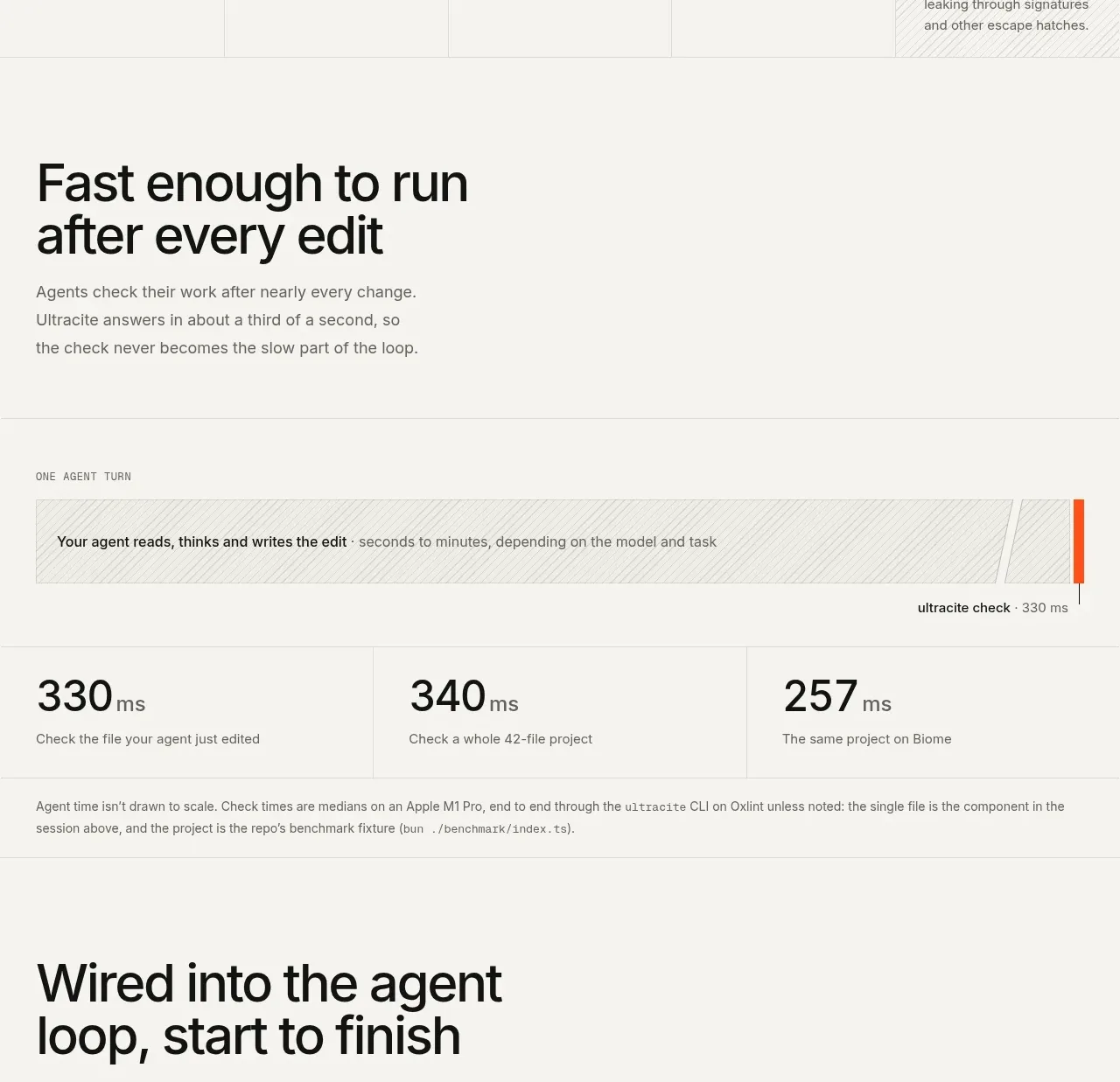
 Fast feedback timing comparison
Ultracite v8 · Chart
Fast feedback timing comparison
Ultracite v8 · Chart
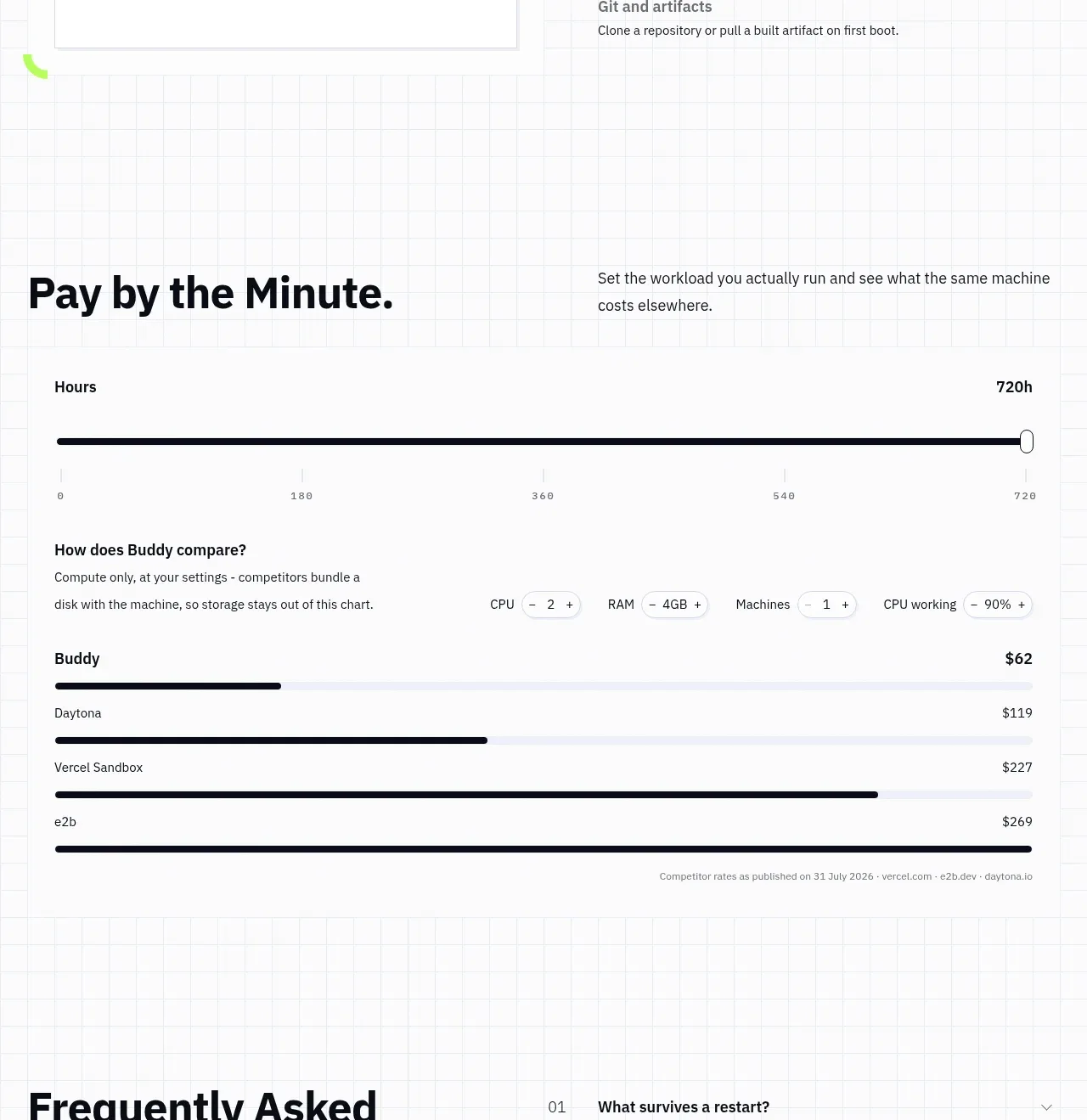
 Usage and cost comparison
AI Sandboxes by Buddy · Chart
Usage and cost comparison
AI Sandboxes by Buddy · Chart
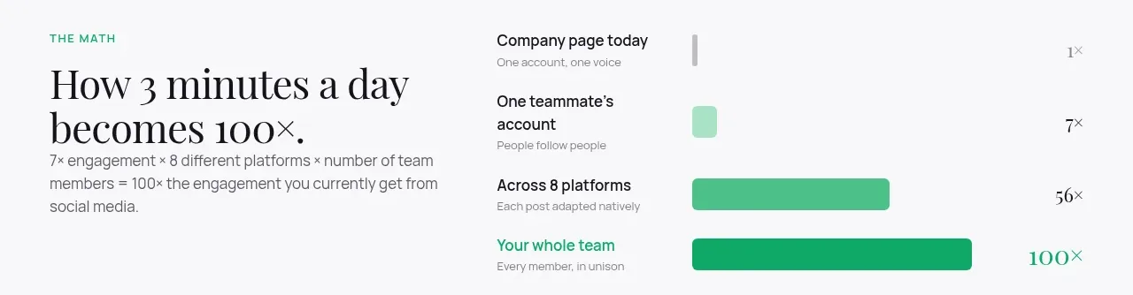
 Time-to-impact comparison
Agent Craft · Chart
Time-to-impact comparison
Agent Craft · Chart
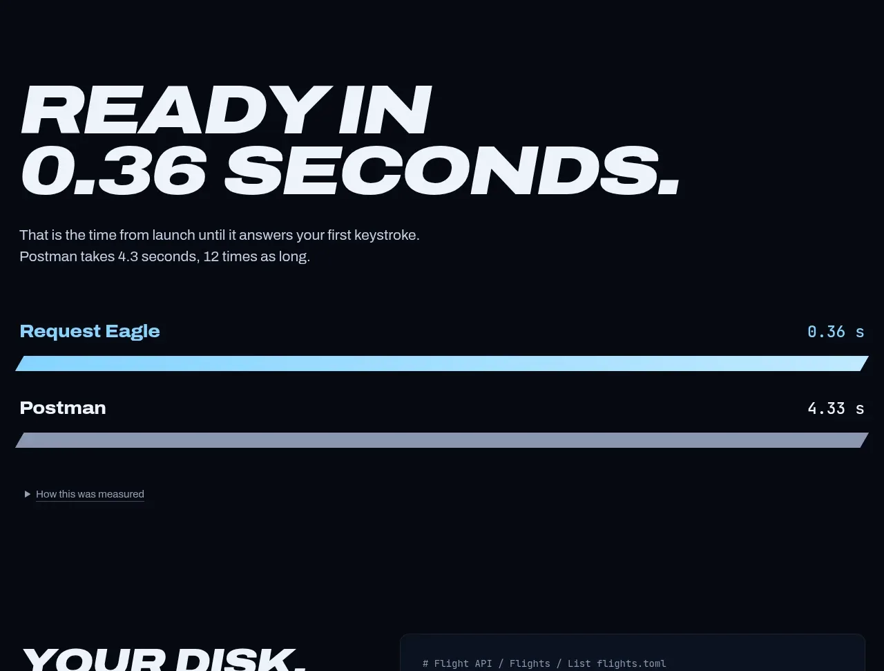
 Performance comparison chart
Request Eagle · Chart
Performance comparison chart
Request Eagle · Chart
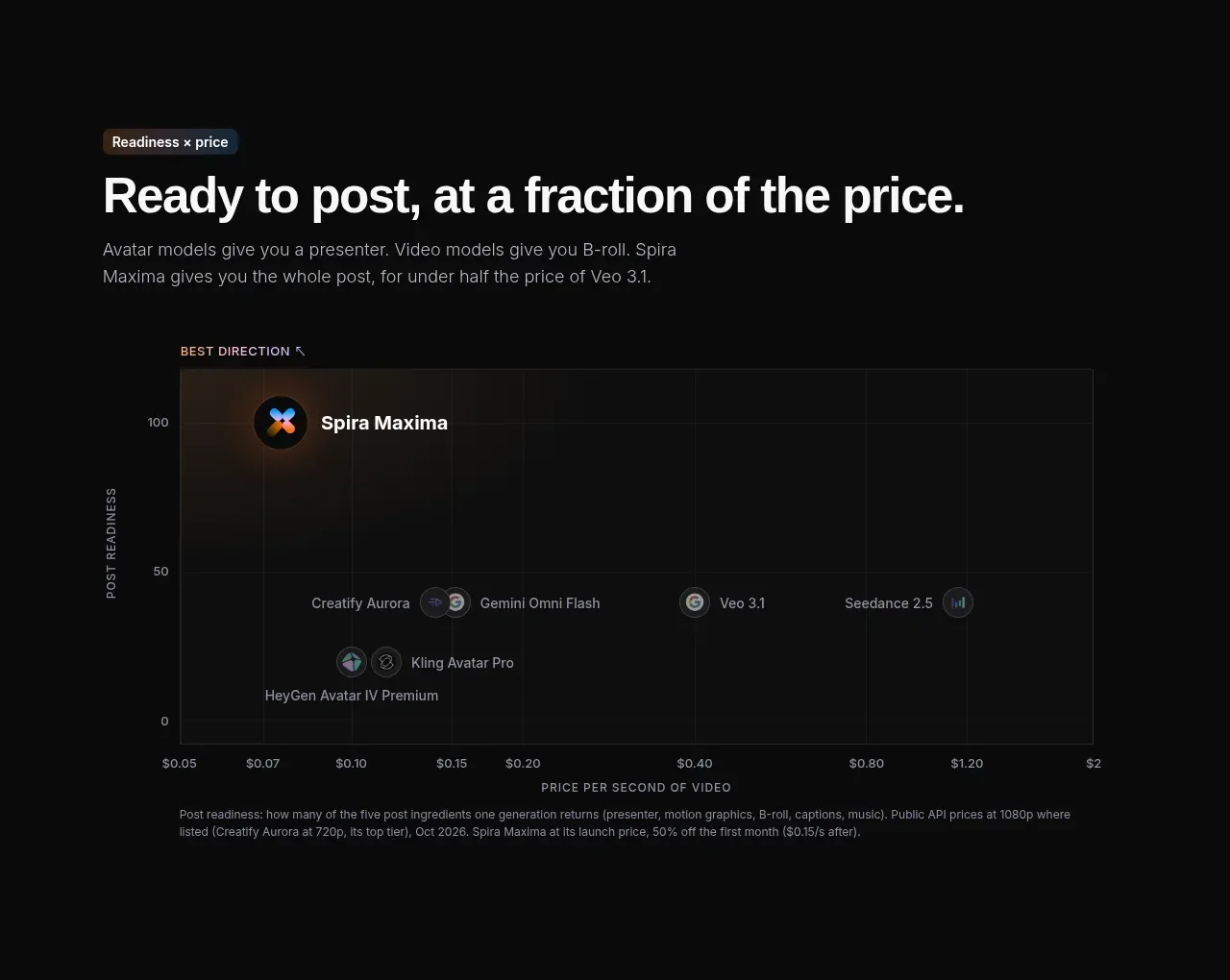
 Value positioning scatter chart
Spira Maxima · Chart
Value positioning scatter chart
Spira Maxima · Chart
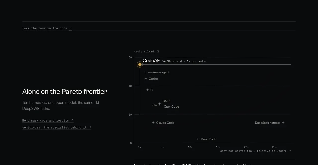
 Benchmark and Pareto proof
CodeAF · Chart
Benchmark and Pareto proof
CodeAF · Chart