 kage
kage
bun.sh

Design analysis
This component works by pairing a focused, bordered code example with a lightweight capability list, then extending the section into a scannable API index. The strong two-column hierarchy helps developers understand one practical entry point while discovering the broader library at a glance.
Prompt preview
## Reference images

Study these alongside the description below: hierarchy, rhythm, spacing, colour. Build for the product you are asked about, using this design language.

- Component: https://kage-design-assets.t3.tigrisfiles.io/components/bun-sh/5fab2b15-2f70-4d99-a79d-411d5e236c09-1789073824-8.webp
- Full page it was cut from: https://kage-design-assets.t3.tigrisfiles.io/screenshots/bun-sh/5fab2b15-2f70-4d99-a79d-411d5e236c09-1789073774-full.webp
- Component on Kage: https://kage.design/component/bun-chart-2

## Before you start
Ask the user what their product does, who it is for, and what visual brand or design system it uses. Then apply the principles below to create an original version for their product—not a copy of the reference.

## Build this component
Create a developer-focused feature section that combines a capability navigation list, a large code example, and a follow-up API or feature index.

### Design language

- Use a restrained documentation aesthetic with a warm off-white or white page background, approximately `#ffffff` or `#fcfcfb`.
- Set the section inside a centered, wide content container, approximately `1120–1240px` at desktop widths, with generous vertical whitespace between the opening feature row and the lower index.
- The upper feature row uses a two-column layout: a narrow left rail for capabilities and a dominant right panel for the example. Use approximately `28–32%` for the rail and `68–72%` for the example, with a `48–64px` gap. Collapse to one column on smaller screens.
- Align the top of the capability list and code panel. Keep the left rail visually quiet so the code example remains the focal point.
- Render the capability list as a vertical stack of short labels. Use a small circular marker for each item; highlight the active item with a vivid accent such as magenta `#d62983`, while inactive markers use near-black `#111111`. Use muted gray text around `#666666` for inactive labels and near-black `#171717` for the active label.
- Use a compact sans-serif for interface text and headings. Use a monospaced font for filenames, API names, and code. The visual hierarchy should be: bold lower-section heading, small uppercase/letter-spaced category labels, readable panel description, then code.
- The code example should be a rectangular bordered panel with a very light gray surface, approximately `#f7f7f7`, a `1px` border around `#dddddd`, and little or no corner rounding (`0–2px`). Avoid cards with heavy shadows.
- Give the panel a slim header row separated from the code body by a `1px` horizontal rule. Put a concise explanatory sentence on the left, a text link with an arrow on the right, and a filename row beneath it. Preserve generous horizontal padding, approximately `18–20px`.
- Use syntax highlighting sparingly: magenta/purple `#a72d70` for keywords or function names, green `#5d7734` for strings, blue `#315b91` for constants or built-ins, and dark gray `#292929` for ordinary code. Keep the code readable rather than decorative.
- Include a small copy affordance in the upper-right area of the code body. It can be an icon button with a transparent background, subtle gray border or icon, and a visible hover/focus state. On activation, provide a brief “Copied” state or accessible status message.
- Below the feature row, introduce a secondary index with a bold heading on the left and an outlined reference/action button on the right. The button should use a white background, near-black `1px` border, minimal radius, compact padding, and a right-pointing arrow.
- Build the lower index as a three-column grid on desktop, divided by thin light-gray vertical rules. Use category labels in small uppercase monospaced text with tracking around `0.08em`; list API or feature names in the accent color and descriptions beneath in muted gray. Stack columns on mobile while retaining clear grouping.
- Use spacing tokens consistently: `8px` for small inline gaps, `16px` for panel internals, `24–32px` between list items, `32–48px` between major elements, and `80–120px` for large section separation.
- Make all links and buttons keyboard accessible. Use underlines or clear contrast for text links, visible `2px` focus rings, and responsive behavior that preserves readable code through horizontal scrolling rather than shrinking it excessively.

## Never

- Never reuse the reference product’s logos, product names, API names, exact code, labels, copy, or category names.
- Never copy the reference layout as a branded clone; adapt the proportions and content structure to the user’s product and brand.
- Never use illustrations, screenshots, or imagery from the reference.
- Never rely on color alone to communicate the active capability; include text, weight, or another accessible state cue.
- Never hide essential code behind an interaction or make the code unreadably small on mobile.
More components
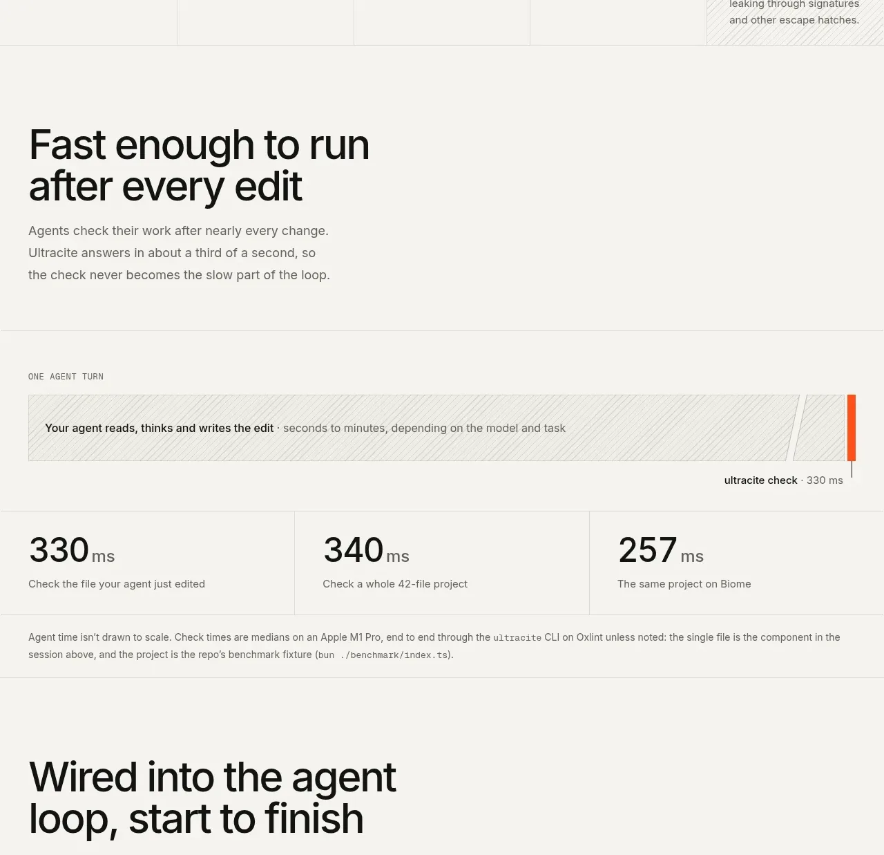
 Fast feedback timing comparison
Ultracite v8 · Chart
Fast feedback timing comparison
Ultracite v8 · Chart
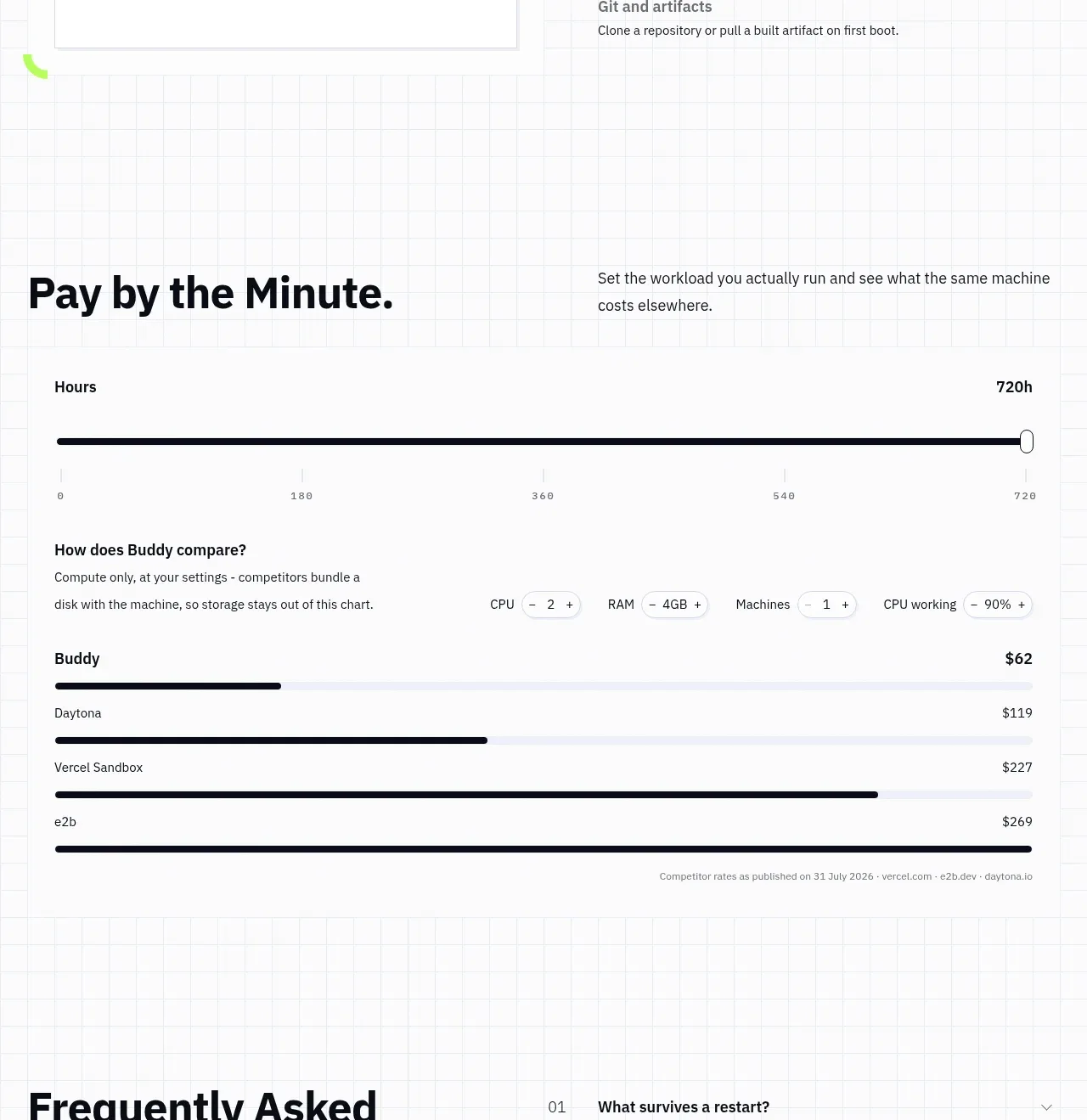
 Usage and cost comparison
AI Sandboxes by Buddy · Chart
Usage and cost comparison
AI Sandboxes by Buddy · Chart
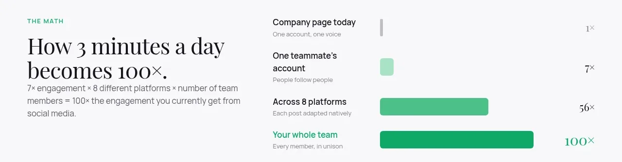
 Time-to-impact comparison
Agent Craft · Chart
Time-to-impact comparison
Agent Craft · Chart
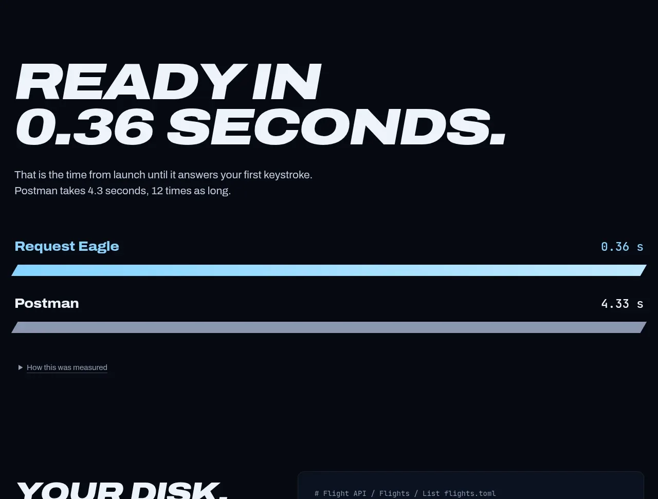
 Performance comparison chart
Request Eagle · Chart
Performance comparison chart
Request Eagle · Chart
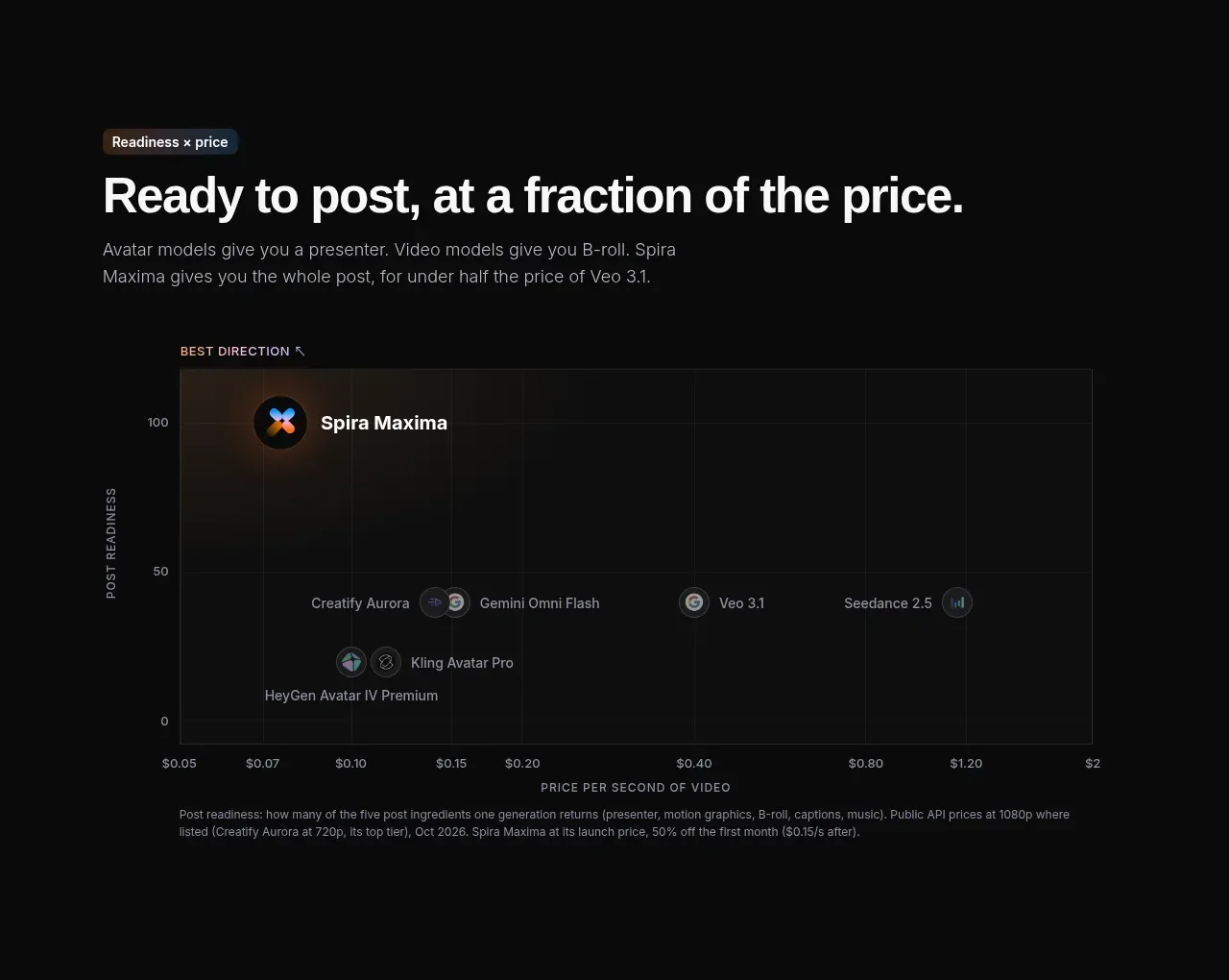
 Value positioning scatter chart
Spira Maxima · Chart
Value positioning scatter chart
Spira Maxima · Chart
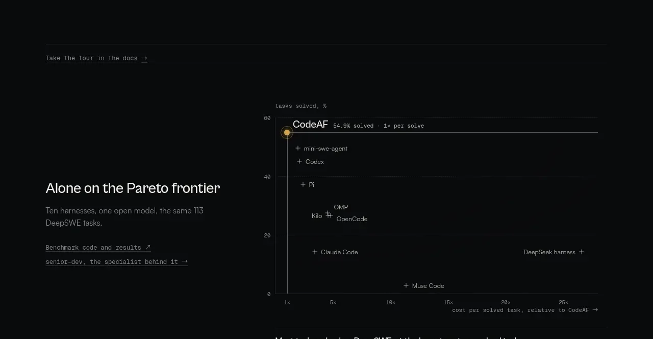
 Benchmark and Pareto proof
CodeAF · Chart
Benchmark and Pareto proof
CodeAF · Chart