 kage
kage
busabase.com
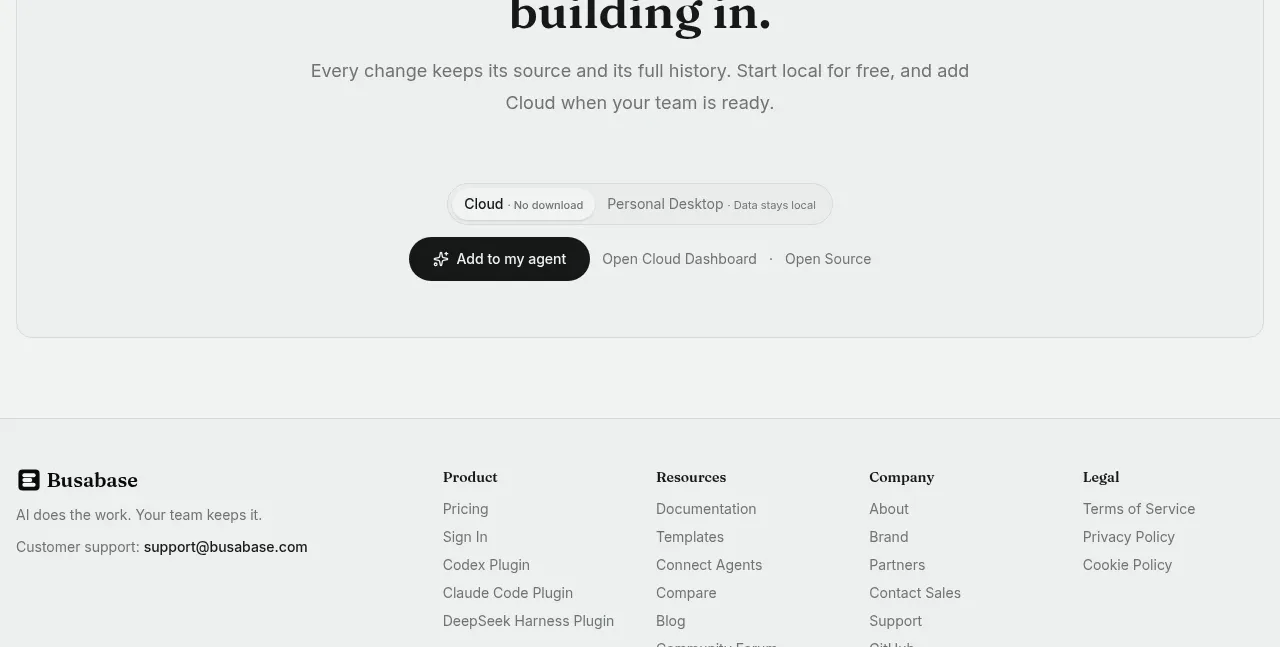
Design analysis
A large rounded panel closes the marketing narrative with a small code-like symbol, a two-line serif invitation, explanatory copy, deployment selector, and a strong primary action with supporting links.
Prompt preview
## Reference images

Study these alongside the description below: hierarchy, rhythm, spacing, colour. Build for the product you are asked about, using this design language.

- Component: https://kage-design-assets.t3.tigrisfiles.io/components/busabase/7d05ddcb-d0f9-4d81-8382-8bbb1120492e-1791612079-9.webp
- Full page it was cut from: https://kage-design-assets.t3.tigrisfiles.io/screenshots/busabase/7d05ddcb-d0f9-4d81-8382-8bbb1120492e-1791612035007-full.webp
- Component on Kage: https://kage.design/component/busabase-cta

## Before you start
Ask what final action the user's product wants visitors to take and what reassurance should appear immediately before it. Use the user's product, brand, and conversion language.

Build a prominent closing CTA inside a wide rounded container with a subtle border. Center a small abstract utility glyph above a large two-line serif headline, followed by a concise paragraph that reduces perceived risk. Add a compact deployment or plan selector and a dark pill-shaped primary button with one or two quiet secondary links beside it. Use an off-white #f3f5f4 page, a slightly lighter #f7f9f8 panel, #dce1de border, 12px radius, 44–72px vertical padding, charcoal #171918 headings, #717874 copy, and near-black #151716 action styling. Keep the content width narrow and the CTA visually decisive. On mobile, stack the actions and make the primary button full width.

Never: use logos, product names, copy, illustrations, or imagery from the reference.
More components
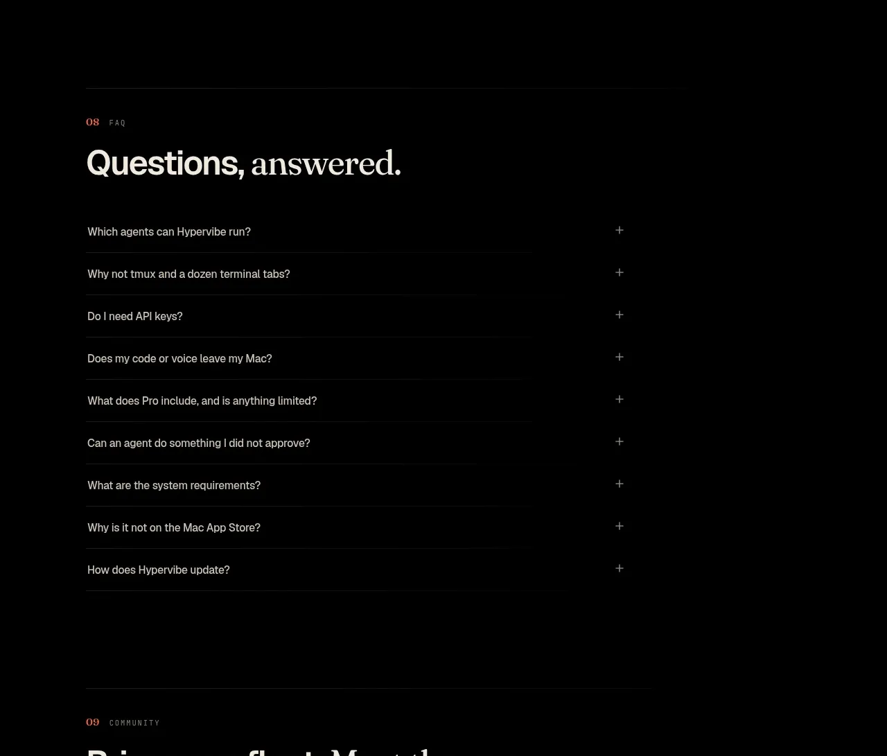
 Community invitation
Hypervibe · Call to action
Community invitation
Hypervibe · Call to action
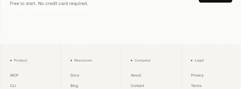
 Trust and final conversion
Lune · Call to action
Trust and final conversion
Lune · Call to action
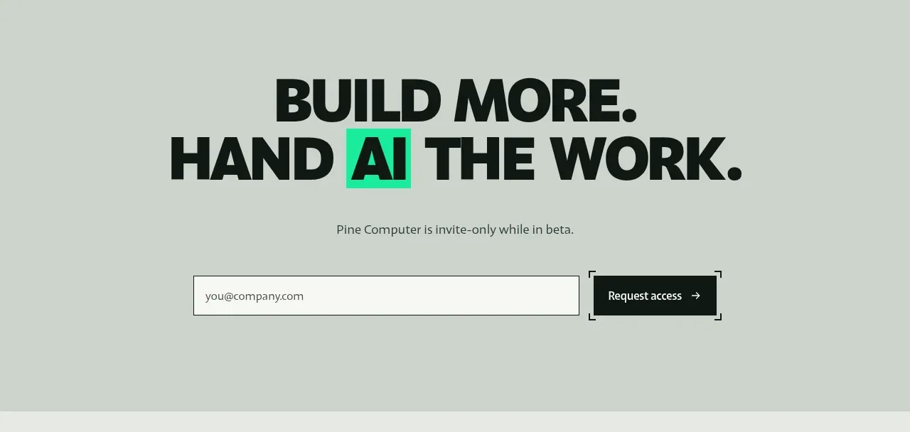
 Request-access conversion block
Pine Computer · Call to action
Request-access conversion block
Pine Computer · Call to action
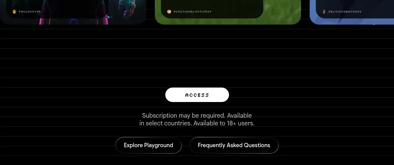
 Access conversion block
Playground by Google Labs · Call to action
Access conversion block
Playground by Google Labs · Call to action
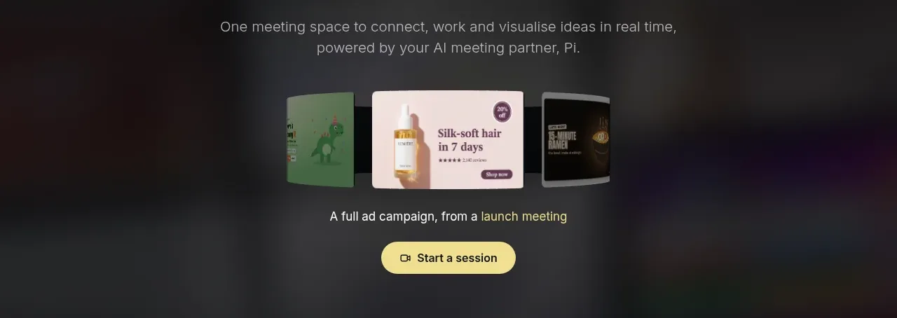
 Closing product call to action
HeyPi · Call to action
Closing product call to action
HeyPi · Call to action
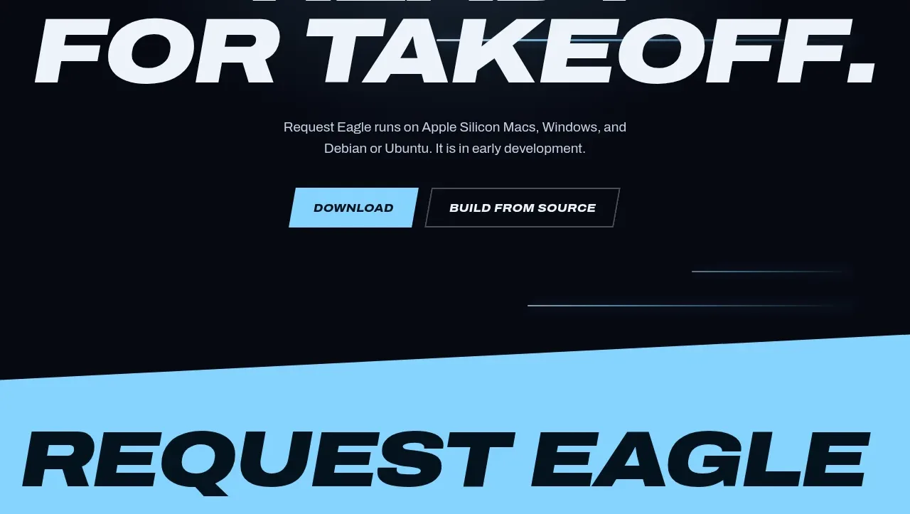
 Final download call to action
Request Eagle · Call to action
Final download call to action
Request Eagle · Call to action