 kage
kage
heypi.xyz

Design analysis
A dark closing band restates the human-plus-automation value proposition, shows a compact product visual, and repeats the primary action.
Prompt preview
## Reference images

Study these alongside the description below: hierarchy, rhythm, spacing, colour. Build for the product you are asked about, using this design language.

- Component: https://kage-design-assets.t3.tigrisfiles.io/components/heypi/9fccb756-63dd-4cec-9422-c066b077bc89-1791612277-6.webp
- Full page it was cut from: https://kage-design-assets.t3.tigrisfiles.io/screenshots/heypi/9fccb756-63dd-4cec-9422-c066b077bc89-1791612175185-full.webp
- Component on Kage: https://kage.design/component/heypi-cta

## Before you start
Ask the user what final conversion action matters most and what promise should be reinforced at the end of the page. Apply these rules to their product.

Build a dark, atmospheric closing CTA with a centered large serif headline, a muted supporting paragraph, and a compact floating product or content preview beneath it. Add one pale-yellow pill-shaped primary button below the preview. Use a soft radial glow or blurred gradient behind the visual while keeping the section restrained and premium. Suggested colours: #171719, #29262A, #F3F1E8, #AAA8A1, #E7D56D. Use 24–32px radii, strong vertical rhythm, a clear hover/focus treatment, and responsive sizing so the preview never forces horizontal scrolling.

Never use logos, product names, copy, illustrations, or imagery from the reference.
More components
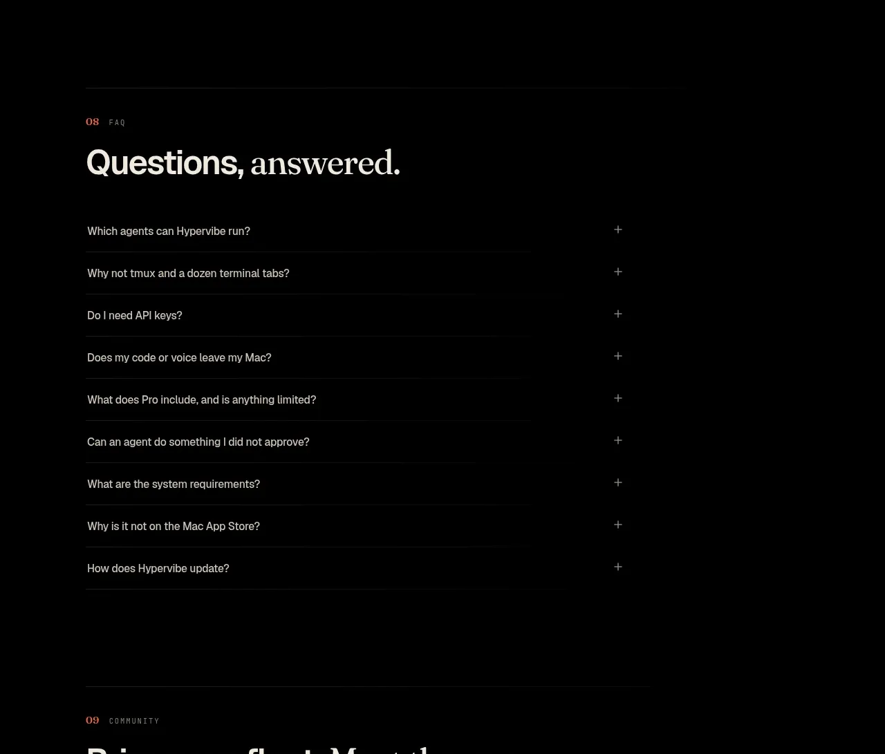
 Community invitation
Hypervibe · Call to action
Community invitation
Hypervibe · Call to action
 Trust and final conversion
Lune · Call to action
Trust and final conversion
Lune · Call to action

 Request-access conversion block
Pine Computer · Call to action
Request-access conversion block
Pine Computer · Call to action
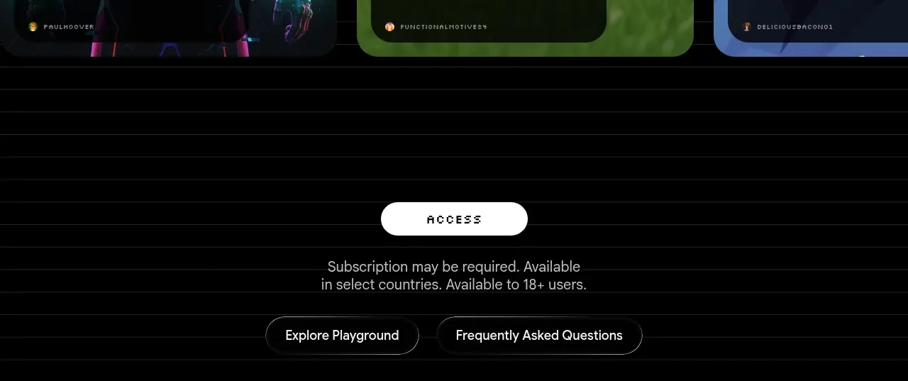
 Access conversion block
Playground by Google Labs · Call to action
Access conversion block
Playground by Google Labs · Call to action
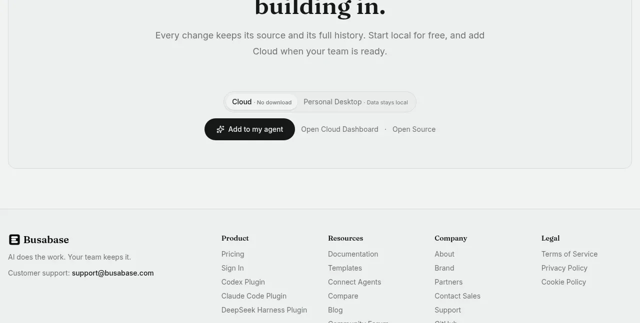
 Final conversion call to action
Busabase · Call to action
Final conversion call to action
Busabase · Call to action
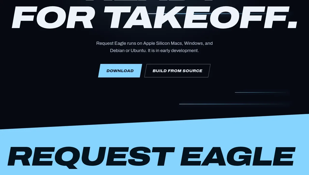
 Final download call to action
Request Eagle · Call to action
Final download call to action
Request Eagle · Call to action