 kage
kage
requesteagle.tokarev.work
Design analysis
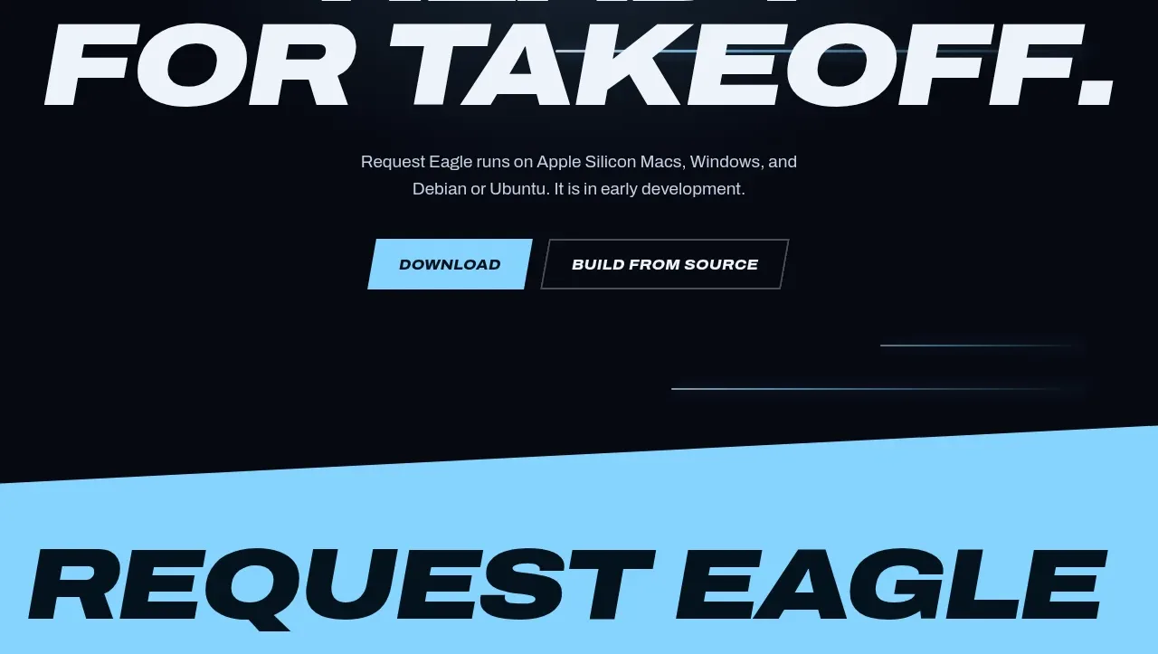
The closing CTA resets the visual rhythm with a centered brand mark area, a huge two-line headline, supporting compatibility copy, and paired actions. Thin glowing rules and a dark atmospheric background make it feel like a confident ending.
Prompt preview
## Reference images

Study these alongside the description below: hierarchy, rhythm, spacing, colour. Build for the product you are asked about, using this design language.

- Component: https://kage-design-assets.t3.tigrisfiles.io/components/request-eagle/fb8c7e5d-6253-47fd-b840-135fd368731b-1791612077-9.webp
- Full page it was cut from: https://kage-design-assets.t3.tigrisfiles.io/screenshots/request-eagle/fb8c7e5d-6253-47fd-b840-135fd368731b-1791612032869-full.webp
- Component on Kage: https://kage.design/component/request-eagle-cta

## Before you start
Ask what final action the user's product wants visitors to take, what platforms or trust details should be mentioned, and what brand mark is available. Apply the principles below to that product.

Create a centered closing CTA on a deep navy-to-black atmospheric background. Begin with a small abstract product mark or icon treatment, then use a huge two-line italic uppercase headline with a strong first line and larger second line. Keep the supporting sentence centered and constrained to roughly 520px, followed by a filled cyan primary button and a transparent outlined secondary button.

Use soft cyan horizontal glows around `#74cbed`, background `#060b14`, off-white type `#f1f5fa`, and muted copy `#aeb8c6`. Provide 110–150px vertical padding, 18–24px button gaps, and buttons with chamfered/slanted ends, 14–16px bold italic uppercase labels, and visible hover/focus states. Keep the CTA responsive: reduce headline size sharply on mobile, stack buttons when needed, and preserve centered alignment.

Never use logos, product names, copy, illustrations, or imagery from the reference.
More components
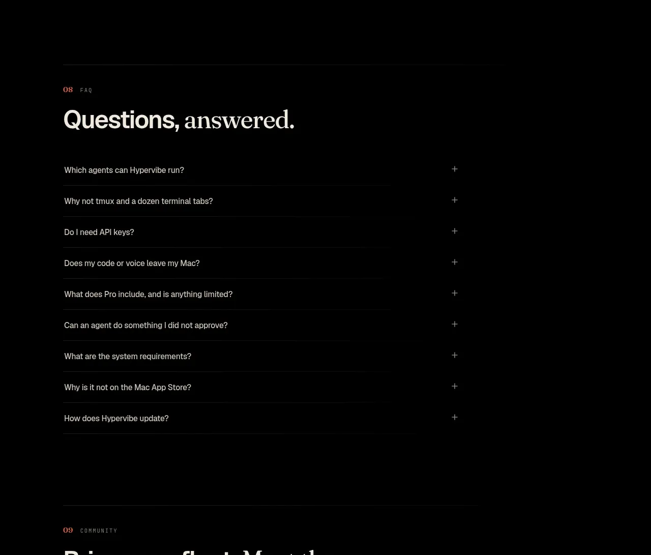
 Community invitation
Hypervibe · Call to action
Community invitation
Hypervibe · Call to action
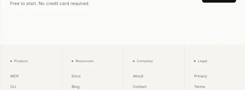
 Trust and final conversion
Lune · Call to action
Trust and final conversion
Lune · Call to action
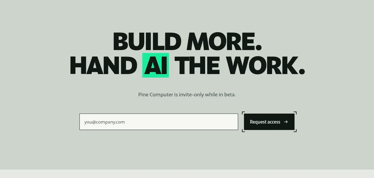
 Request-access conversion block
Pine Computer · Call to action
Request-access conversion block
Pine Computer · Call to action
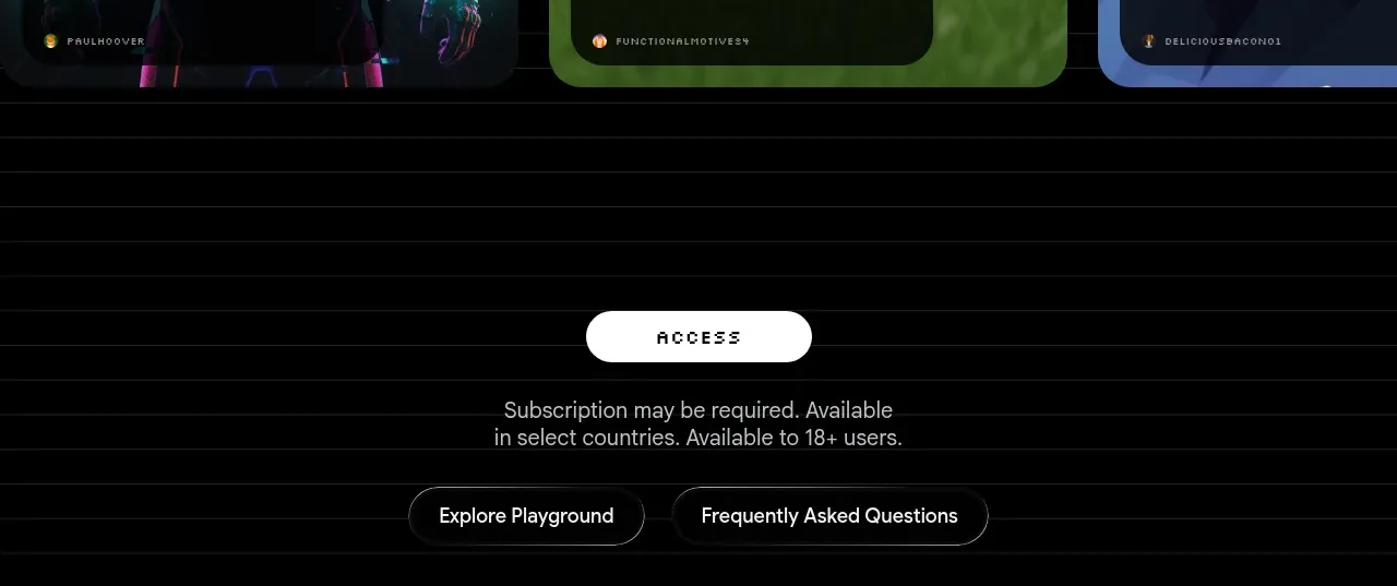
 Access conversion block
Playground by Google Labs · Call to action
Access conversion block
Playground by Google Labs · Call to action

 Closing product call to action
HeyPi · Call to action
Closing product call to action
HeyPi · Call to action
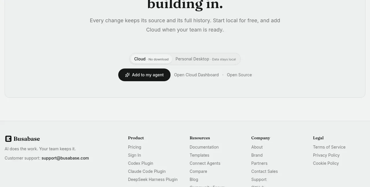
 Final conversion call to action
Busabase · Call to action
Final conversion call to action
Busabase · Call to action