 kage
kage
busabase.com

Design analysis
A slim launch announcement sits above a compact product navigation. The restrained header balances utility links, search, account actions, and a dark primary button without competing with the page hero.
Prompt preview
## Reference images

Study these alongside the description below: hierarchy, rhythm, spacing, colour. Build for the product you are asked about, using this design language.

- Component: https://kage-design-assets.t3.tigrisfiles.io/components/busabase/7d05ddcb-d0f9-4d81-8382-8bbb1120492e-1791612076-0.webp
- Full page it was cut from: https://kage-design-assets.t3.tigrisfiles.io/screenshots/busabase/7d05ddcb-d0f9-4d81-8382-8bbb1120492e-1791612035007-full.webp
- Component on Kage: https://kage.design/component/busabase-navigation

## Before you start
Ask what the user's product is, who it serves, and what its brand voice and visual identity are. Apply the principles below to that product rather than reproducing the reference.

Build a two-row responsive site header: a very thin announcement strip followed by a clean product navigation. Keep the announcement centered and low contrast, with one emphasized linked phrase and a subtle arrow. In the navigation, align the brand mark/name left, group a few dropdown links beside it, and place search, theme/language utilities, sign-in, and one filled account CTA on the right. Use a pale warm-gray background around #f4f6f5, thin #d9ddda borders, near-black #161817 text, muted #747a77 secondary text, 12–14px UI typography, and a compact 40px navigation height. Use 6px button radius and 1px borders; keep horizontal padding around 12–24px and preserve generous whitespace. Collapse secondary links into a menu on small screens while retaining the brand and primary action.

Never: use logos, product names, copy, illustrations, icons, or imagery from the reference.
More components

 Minimal top navigation
Agibot · Navigation
Minimal top navigation
Agibot · Navigation

 Top navigation
Hypervibe · Navigation
Top navigation
Hypervibe · Navigation
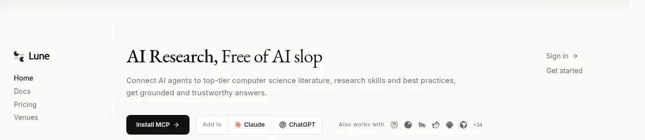
 Editorial research product navigation
Lune · Navigation
Editorial research product navigation
Lune · Navigation

 Minimal product navigation
Pine Computer · Navigation
Minimal product navigation
Pine Computer · Navigation

 Top experiment navigation
Playground by Google Labs · Navigation
Top experiment navigation
Playground by Google Labs · Navigation
 Sticky section navigation
Playground by Google Labs · Navigation
Sticky section navigation
Playground by Google Labs · Navigation