kage
kage
capacity.so
Design analysis
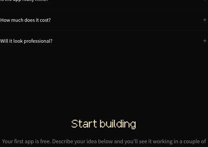
A focused conversion block repeats the core prompt composer below a short invitation, reducing friction by letting visitors start immediately.
Prompt preview
## Reference images

Study these alongside the description below: hierarchy, rhythm, spacing, colour. Build for the product you are asked about, using this design language.

- Component: https://kage-design-assets.t3.tigrisfiles.io/components/capacity-so/08f2bf80-ea5b-4604-8f5e-193c94acfc56-1791551996-9.webp
- Full page it was cut from: https://kage-design-assets.t3.tigrisfiles.io/screenshots/capacity-so/08f2bf80-ea5b-4604-8f5e-193c94acfc56-1791551914192-full.webp
- Component on Kage: https://kage.design/component/capacity-form

## Before you start
Ask what action the user's product wants visitors to take, what information is necessary, and what brand style should shape the form. Then apply these principles to the user's conversion flow.

Create a centered conversion form with a compact heading, short reassurance about time or cost, and a large dark prompt/input surface. Include a generous textarea, optional tool or category selectors, attachment affordance, and a clear submit button. Keep the panel around 500px wide, use a charcoal fill #171717, 1px border #ffffff14, 12–16px radius, 20–24px padding, and muted placeholder text. Add a nearby row of popular prompt links only if useful. Provide visible focus states, validation, loading feedback, and a mobile-friendly full-width layout.

**Never:** use logos, product names, copy, illustrations, or imagery from the reference.