kage
kage
xem.email
Design analysis
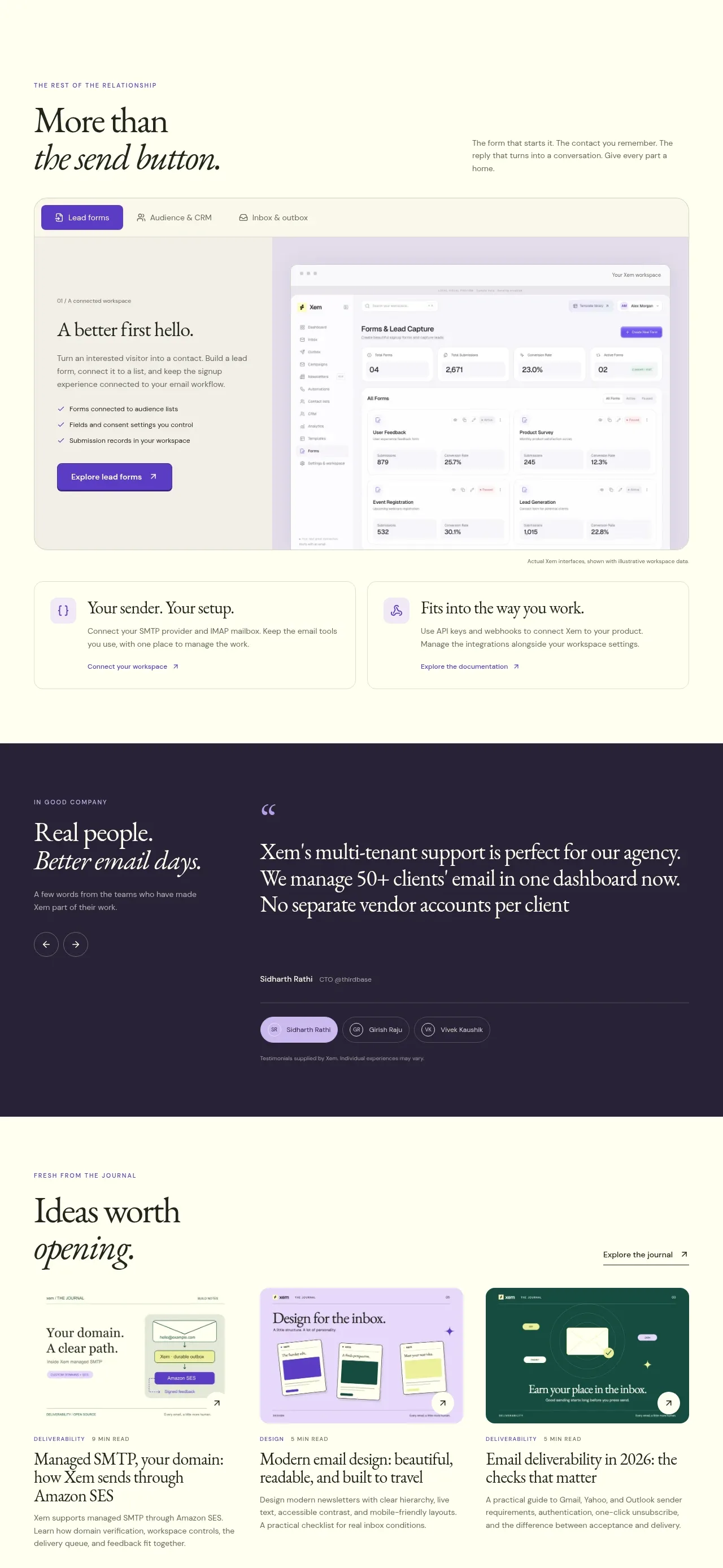
This portion explains the broader sending system through an AI/context panel, a form-building dashboard preview, and two supporting integration cards before transitioning into social proof.
Prompt preview
## Reference images

Study these alongside the description below: hierarchy, rhythm, spacing, colour. Build for the product you are asked about, using this design language.

- Component: https://kage-design-assets.t3.tigrisfiles.io/components/xem/cfdda217-53f8-4a81-998a-9d07a076ba78-1790143674-9.webp
- Full page it was cut from: https://kage-design-assets.t3.tigrisfiles.io/screenshots/xem/cfdda217-53f8-4a81-998a-9d07a076ba78-1790143376275-full.webp
- Component on Kage: https://kage.design/component/xem-form

## Before you start
Ask what forms, integrations, or sending workflows the user's product supports and which action should be the main CTA. Then create an original implementation.

Build a sequence of related product-workflow panels on a soft cream canvas. First use a lavender rounded split card with a serif heading about the workspace/context model on the left and an assistant or command preview on the right. Follow it with a section heading and a large rounded form-builder dashboard mockup: put a compact tab row above, explanatory copy and a purple CTA in a left rail, and a realistic UI preview on the right. Finish with two equal supporting cards about setup and integrations. Use #f0eef9, #f8f7ec, #fffefa, and dark forest #1b2d27; use #5d37c8 for CTAs, 18–24px radii, subtle borders, and responsive stacking. Make all previews semantically structured rather than flat images where possible.

Never use the reference's logo, product name, copy, illustrations, or imagery.