kage
kage
flowoapp.com
Design analysis
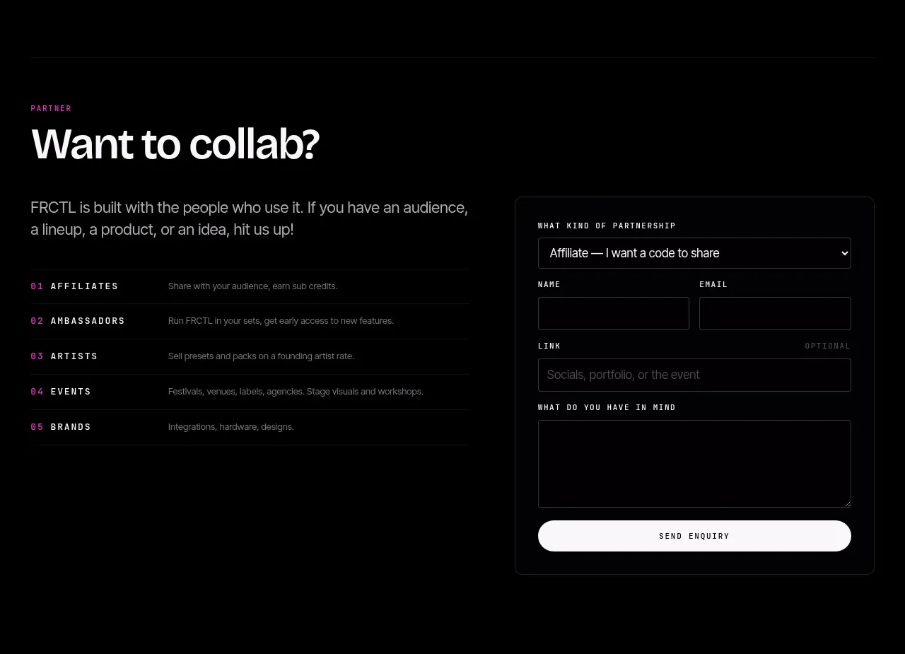
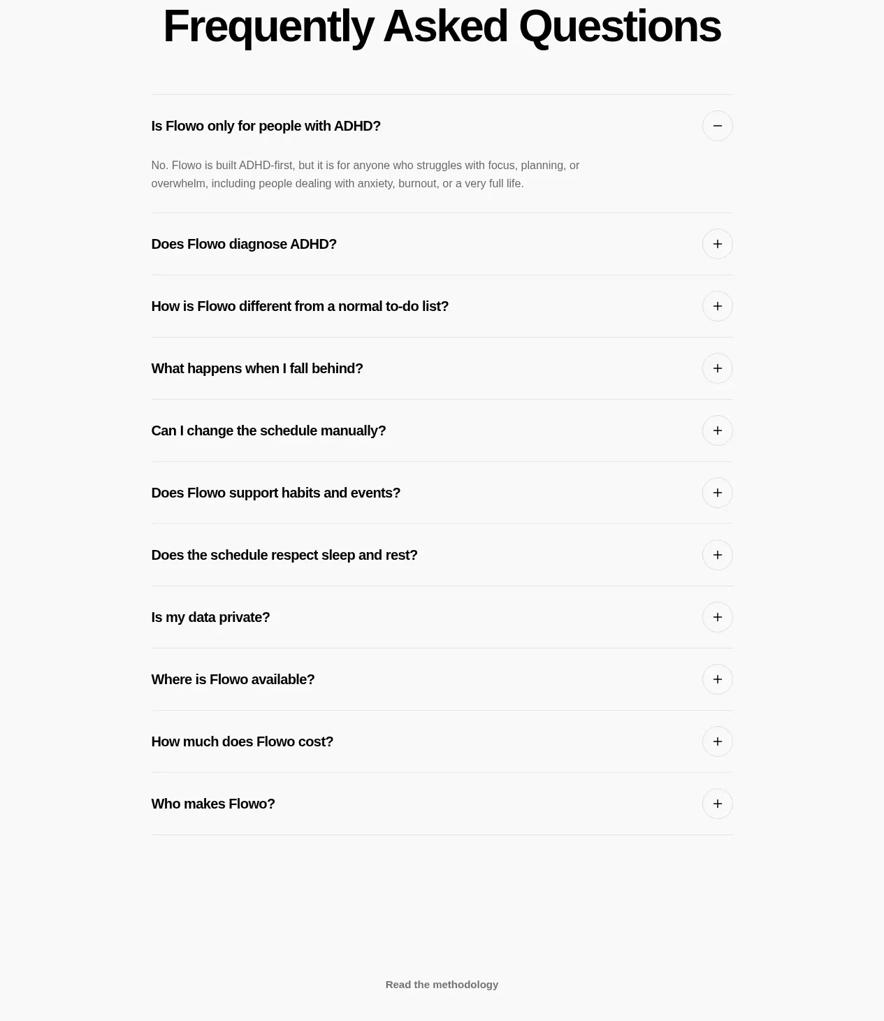
A compact signup block combines a clear news-update headline, store or product actions, and a simple email form with consent control.
Prompt preview
## Reference images

Study these alongside the description below: hierarchy, rhythm, spacing, colour. Build for the product you are asked about, using this design language.

- Component: https://kage-design-assets.t3.tigrisfiles.io/components/flowo/46dcd8ed-31a5-4fb1-ab3b-3d3a2b966cfb-1791439604-8.webp
- Full page it was cut from: https://kage-design-assets.t3.tigrisfiles.io/screenshots/flowo/46dcd8ed-31a5-4fb1-ab3b-3d3a2b966cfb-1791439391035-full.webp
- Component on Kage: https://kage.design/component/flowo-form

## Before you start
Ask what the user is signing up for, what follow-up they should expect, and what consent language is legally appropriate. Build the form for the user's product and brand with original copy.

Create a low-friction product-news signup section. Lead with a short headline and one-sentence explanation, offer relevant product actions if needed, then place a clean form with labeled fields, optional consent, and a clear submit button.

- Center the content in a 360–480px max-width with 56–96px vertical padding.
- Use a 30–40px headline, 13–15px explanation, and 12–14px field labels.
- Use white or near-white inputs with 1px `#DDDDD8` borders, 10–14px radius, and 44–50px height.
- Use a deep teal primary action (`#073847`) with white text; keep secondary store links visually subordinate.
- Show inline validation, error text, loading state, success confirmation, and keyboard labels.
- Make privacy consent explicit and never pre-check optional marketing consent.

Never use logos, product names, copy, illustrations, or imagery from the reference.