kage
kage
frctl.art
Design analysis
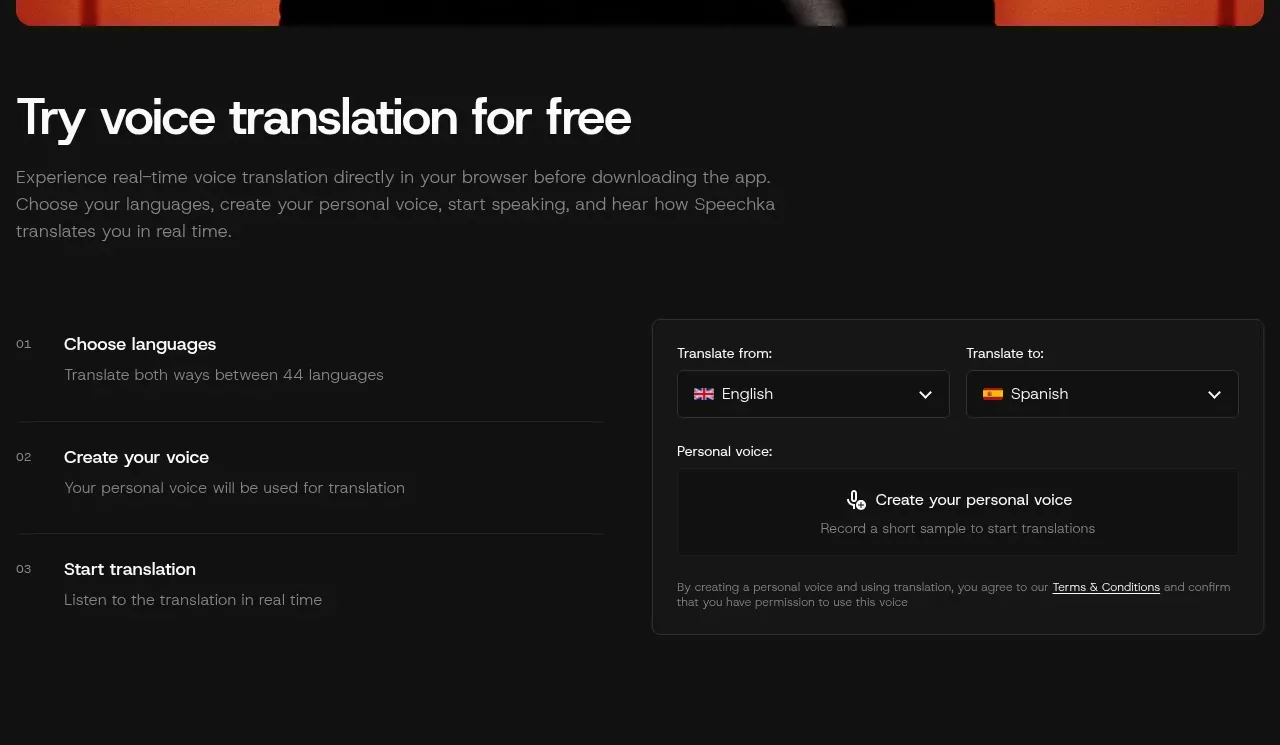
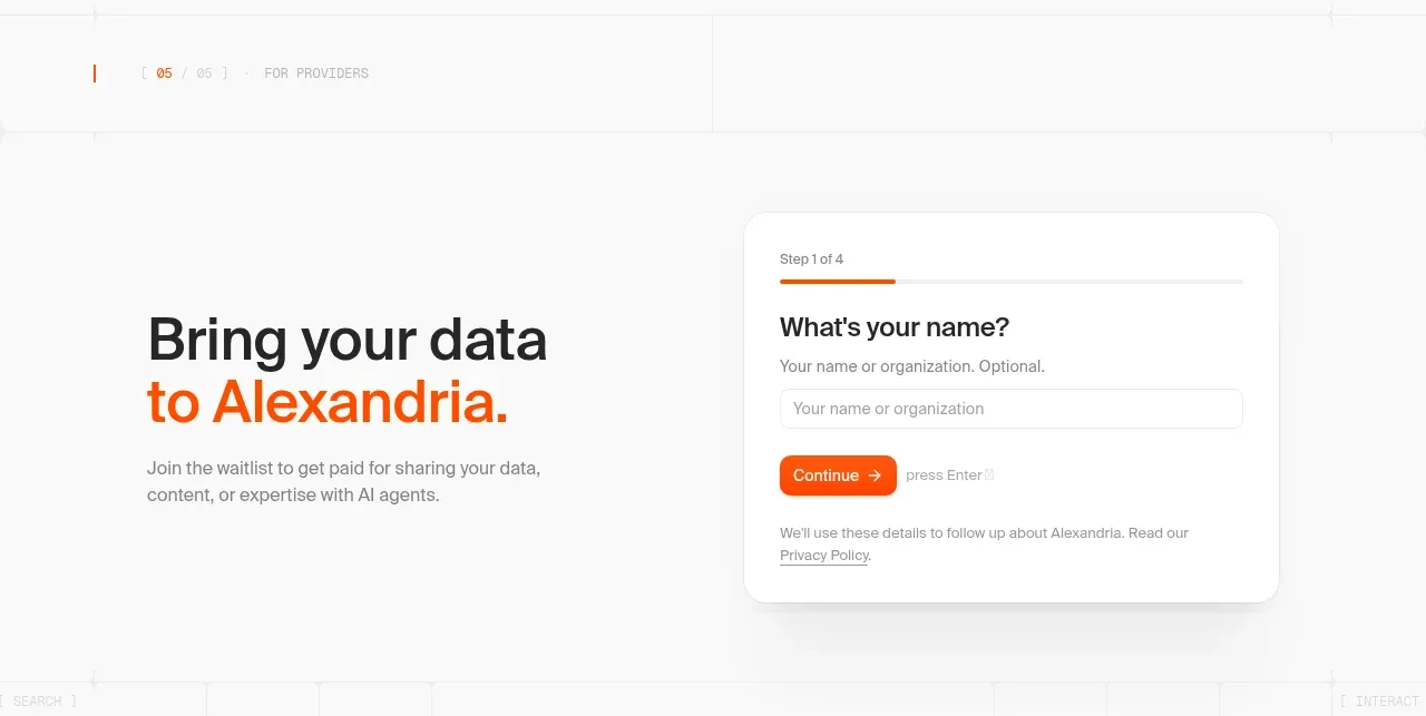
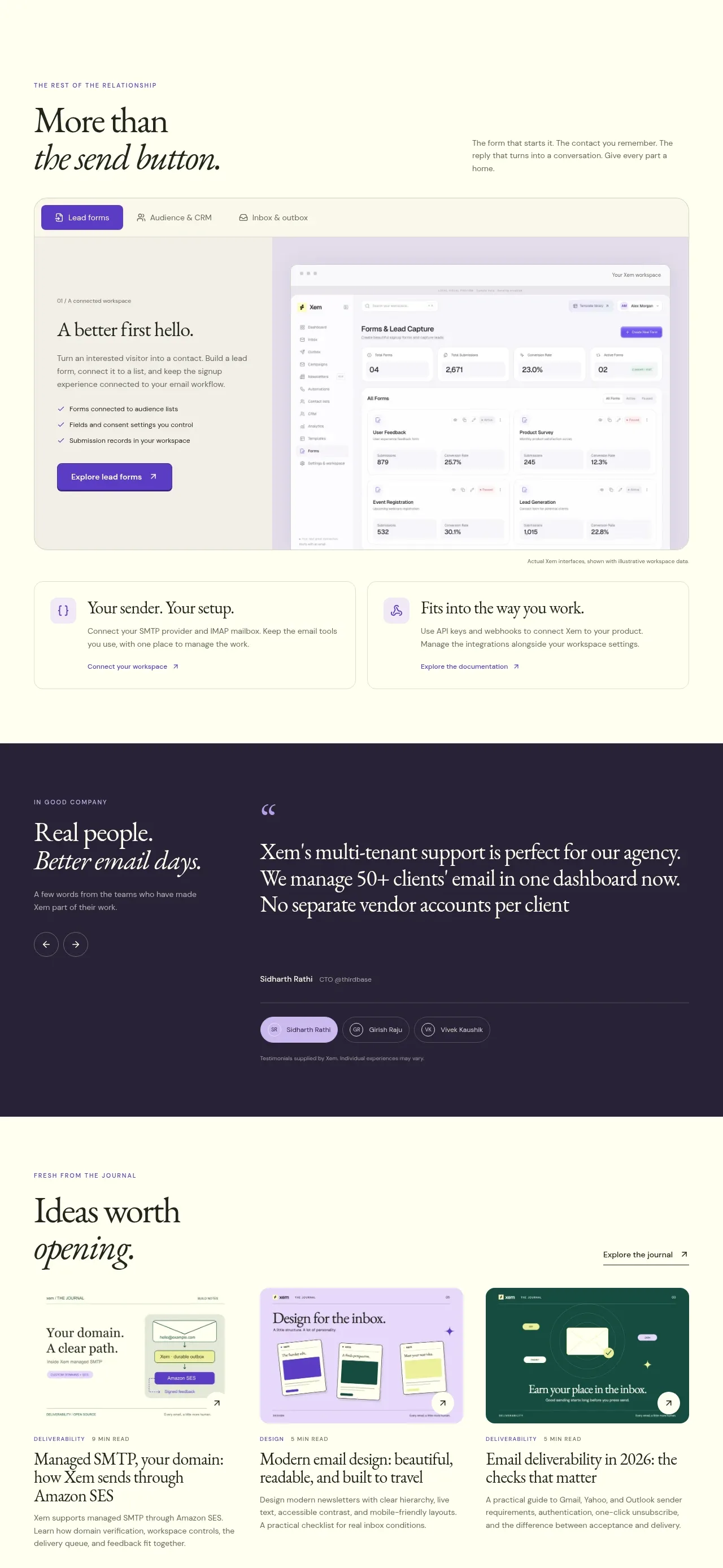
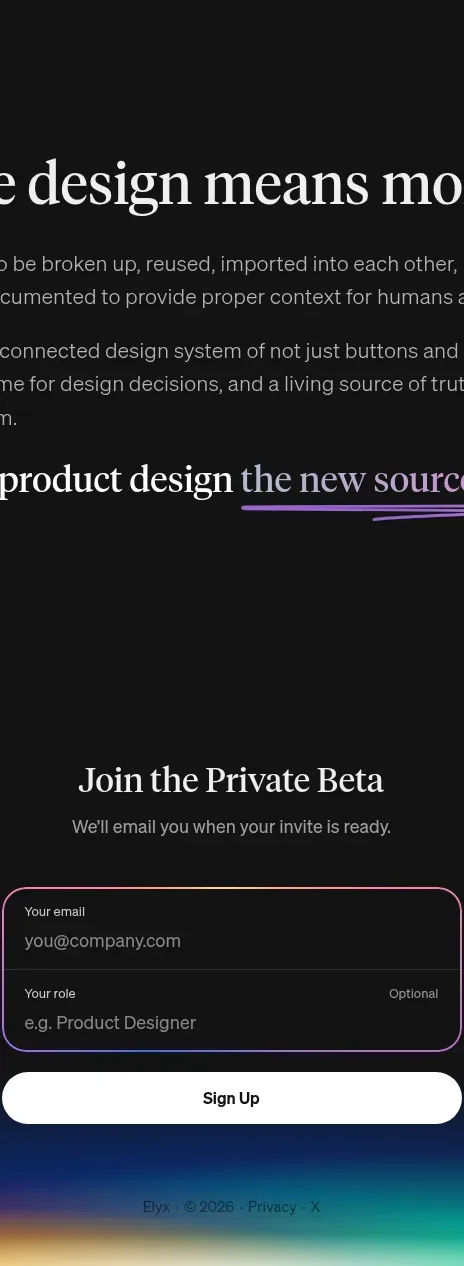
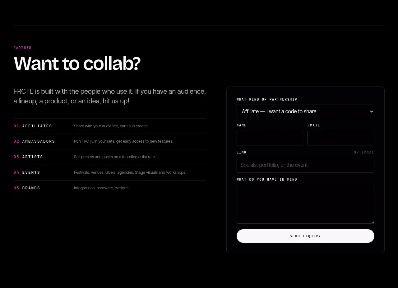
A collaboration invitation pairs a short explanatory column and numbered partnership types with a dark bordered enquiry form. The split layout makes the invitation feel editorial while keeping the conversion action concrete.
Prompt preview
## Reference images

Study these alongside the description below: hierarchy, rhythm, spacing, colour. Build for the product you are asked about, using this design language.

- Component: https://kage-design-assets.t3.tigrisfiles.io/components/frctl/44ee5e18-5619-4ecf-b1a3-c989d58893aa-1790488994-4.webp
- Full page it was cut from: https://kage-design-assets.t3.tigrisfiles.io/screenshots/frctl/44ee5e18-5619-4ecf-b1a3-c989d58893aa-1790488956222-full.webp
- Component on Kage: https://kage.design/component/frctl-form

## Before you start
Ask what kind of partnership or lead the user's product wants, what qualification fields are essential, and what tone the brand should use. Then implement this section for that use case.

Create a two-column dark partnership section inside a 32px gutter. On the left, use a small magenta uppercase eyebrow, a large 40–48px heading, a short paragraph, and a numbered list of four or five partnership categories. Each list row should have a mono index, uppercase label, one-line explanation, and a faint divider. On the right, place a slightly raised form card with a thin border (#242126), 16px radius, and 22–24px padding. Include a select field, paired name/email inputs, a full-width link input, a larger message textarea, and a bright off-white full-width submit pill. Use black/#050505 surfaces, near-white headings, gray descriptions, magenta labels, and visible focus rings. Stack the columns below 720px and preserve comfortable field spacing.

Never: use logos, product names, copy, illustrations, or imagery from the reference.