kage
kage
speechka.io
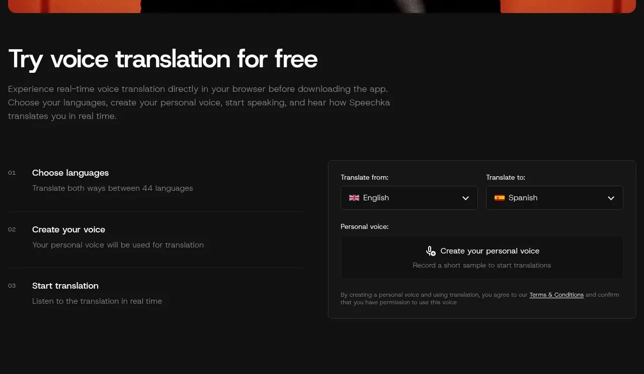
Design analysis
The section combines a short invitation with a three-step explanation on the left and a bordered translation setup panel on the right, making the product understandable before signup.
Prompt preview
## Reference images

Study these alongside the description below: hierarchy, rhythm, spacing, colour. Build for the product you are asked about, using this design language.

- Component: https://kage-design-assets.t3.tigrisfiles.io/components/speechka/662d10a3-b9d2-40f0-bccc-e5bde29d7609-1790229790-2.webp
- Full page it was cut from: https://kage-design-assets.t3.tigrisfiles.io/screenshots/speechka/662d10a3-b9d2-40f0-bccc-e5bde29d7609-1790229722330-full.webp
- Component on Kage: https://kage.design/component/speechka-form

## Before you start
Ask what the user's product is, who it serves, and what brand personality and visual identity it should use. Apply the principles below to that product rather than reproducing the reference.

Build a two-column product demo section. Put a clear heading and concise explanatory copy above or to the left, then show three numbered steps with short labels and secondary descriptions. Pair them with a compact, bordered demo card containing paired select fields, a prominent voice/action control, helper text, and a small terms note. Use a dark #111111 page, #151515 card, white headings, gray body text around #858585, fine borders around #292929, and red #ed171b only for the main action or status. Use 12px card corners, 24–36px spacing, and a responsive single-column fallback. Selects and recording controls need visible focus, hover, disabled, and active states.

Never use logos, product names, copy, illustrations, or imagery from the reference.