kage
kage
hark.com

Design analysis
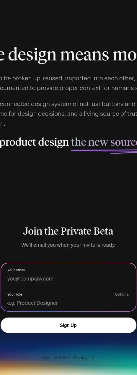
The conversion close uses a simple heading, a compact social/email registration card, and a soft ambient gradient that separates the form from the footer.
Prompt preview
## Reference images

Study these alongside the description below: hierarchy, rhythm, spacing, colour. Build for the product you are asked about, using this design language.

- Component: https://kage-design-assets.t3.tigrisfiles.io/components/hark/c0ab7f75-9849-4088-b995-f4bab40ea0a8-1791525721-9.webp
- Full page it was cut from: https://kage-design-assets.t3.tigrisfiles.io/screenshots/hark/c0ab7f75-9849-4088-b995-f4bab40ea0a8-1791525672611-full.webp
- Component on Kage: https://kage.design/component/hark-form

## Before you start
Ask what the user's product, audience, and brand are, then apply the principles below to create an original version for that product.

Create a compact final registration section with a centered heading and a low-friction form card floating over a soft ambient background.

### Design language
- Center the heading above a narrow form card; keep the entire module visually simple.
- Use a translucent white or very pale card with a 20–28px radius, subtle border, and diffuse shadow.
- Stack social sign-in buttons, a thin divider, a contact field, and a primary continuation button.
- Use pill controls, light gray fills (`#eef0f2`), charcoal primary action (`#1c1c1c`), and muted helper text (`#8b8b8b`).
- Add a broad blurred pastel glow behind the card, using low-opacity cyan, lavender, and peach rather than a hard-edged illustration.
- Include clear keyboard focus, validation, loading, and disabled states.

### Never
- Never reuse logos, product names, copy, illustrations, or imagery from the reference.
- Never ask for unnecessary fields or make the ambient glow reduce form contrast.