 kage
kage
capacity.so

Design analysis
A compact transparent navigation overlays the atmospheric hero, balancing the wordmark and primary links with a right-aligned demo and account actions.
Prompt preview
## Reference images

Study these alongside the description below: hierarchy, rhythm, spacing, colour. Build for the product you are asked about, using this design language.

- Component: https://kage-design-assets.t3.tigrisfiles.io/components/capacity-so/08f2bf80-ea5b-4604-8f5e-193c94acfc56-1791551993-0.webp
- Full page it was cut from: https://kage-design-assets.t3.tigrisfiles.io/screenshots/capacity-so/08f2bf80-ea5b-4604-8f5e-193c94acfc56-1791551914192-full.webp
- Component on Kage: https://kage.design/component/capacity-navigation

## Before you start
Ask what the user's product is, who it serves, and what brand personality and visual identity it should use. Then apply the following principles to that product rather than copying the reference.

Build a responsive top navigation over a dark, image-led or textured hero. Keep the layout centered in a max-width container with the brand at left, a small set of secondary links beside it, and utility actions at right. Use a restrained sans-serif type scale, compact 12–14px labels, generous horizontal alignment, and a filled pill for the highest-priority account action. Use translucent or transparent dark treatment so the hero remains visible, with white text and muted gray secondary links. Keep the nav height around 64px, use subtle hover opacity/color transitions, and collapse links into a mobile menu.

**Never:** use logos, product names, copy, illustrations, or imagery from the reference.
More components

 Minimal top navigation
Agibot · Navigation
Minimal top navigation
Agibot · Navigation

 Top navigation
Hypervibe · Navigation
Top navigation
Hypervibe · Navigation
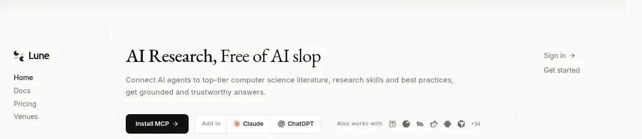
 Editorial research product navigation
Lune · Navigation
Editorial research product navigation
Lune · Navigation

 Minimal product navigation
Pine Computer · Navigation
Minimal product navigation
Pine Computer · Navigation

 Top experiment navigation
Playground by Google Labs · Navigation
Top experiment navigation
Playground by Google Labs · Navigation
 Sticky section navigation
Playground by Google Labs · Navigation
Sticky section navigation
Playground by Google Labs · Navigation