 kage
kage
kugelaudio.com
Design analysis
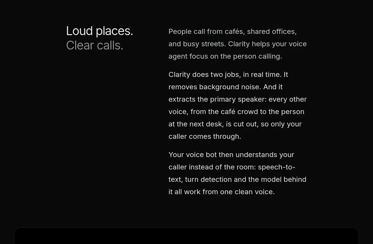
A sparse two-column explanation contrasts the user's everyday problem with a clear account of how the product works in real time.
Prompt preview
## Reference images

Study these alongside the description below: hierarchy, rhythm, spacing, colour. Build for the product you are asked about, using this design language.

- Component: https://kage-design-assets.t3.tigrisfiles.io/components/clarity/18084f24-bf00-4b1e-9761-c33f370871f3-1790921029-2.webp
- Full page it was cut from: https://kage-design-assets.t3.tigrisfiles.io/screenshots/clarity/18084f24-bf00-4b1e-9761-c33f370871f3-1790920906751-full.webp
- Component on Kage: https://kage.design/component/clarity-feature-grid

## Before you start
Ask what the user's product is, who it serves, and what their brand personality and primary conversion goal are. Apply the following principles to that product rather than reproducing the reference.

Build an editorial product-explanation section on a nearly black background. Use a wide max-width container with a two-column grid: a short, large statement in the left column and longer explanatory paragraphs in the right. Keep the left heading visually dominant with a deliberate line break and use one muted line to create contrast. Set body copy at 17–20px with 1.55–1.7 line height, limited to a readable measure. Use a generous top and bottom rhythm, roughly 96–140px vertical padding, and a 35–40% / 60–65% column split. Colours should be approximately #090a0a, #f0f1f2, #8f949a, and #d0d3d6; avoid cards and unnecessary dividers. On mobile, stack the columns while preserving the heading-to-explanation hierarchy.

Never: use logos, product names, copy, illustrations or imagery from the reference.
More components

 Three-step process cards
godaylight.com · Feature grid
Three-step process cards
godaylight.com · Feature grid

 Use-case selector with vertical video preview
Spira Maxima · Feature grid
Use-case selector with vertical video preview
Spira Maxima · Feature grid

 Insights and enterprise model access
FastRouter.ai · Feature grid
Insights and enterprise model access
FastRouter.ai · Feature grid
 Solutions by organizational role
FastRouter.ai · Feature grid
Solutions by organizational role
FastRouter.ai · Feature grid
 Routing reliability and model collaboration
FastRouter.ai · Feature grid
Routing reliability and model collaboration
FastRouter.ai · Feature grid
 Goal-oriented product capabilities
FastRouter.ai · Feature grid
Goal-oriented product capabilities
FastRouter.ai · Feature grid