 kage
kage
kugelaudio.com
Design analysis
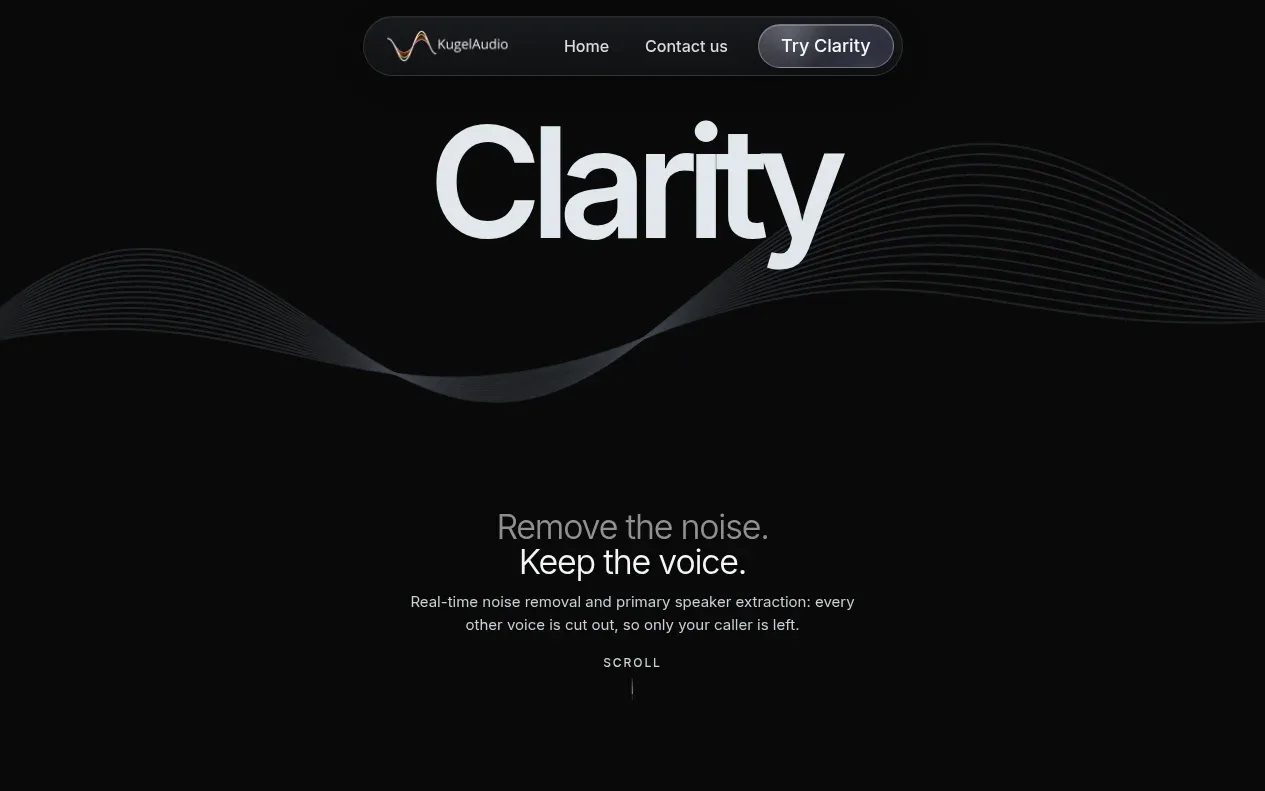
The hero uses an oversized centered title, an abstract audio-wave visual, a concise promise, and a small scroll cue to establish the product category without clutter.
Prompt preview
## Reference images

Study these alongside the description below: hierarchy, rhythm, spacing, colour. Build for the product you are asked about, using this design language.

- Component: https://kage-design-assets.t3.tigrisfiles.io/components/clarity/18084f24-bf00-4b1e-9761-c33f370871f3-1790921029-1.webp
- Full page it was cut from: https://kage-design-assets.t3.tigrisfiles.io/screenshots/clarity/18084f24-bf00-4b1e-9761-c33f370871f3-1790920906751-full.webp
- Component on Kage: https://kage.design/component/clarity-hero

## Before you start
Ask what the user's product is, who it serves, and what their brand personality and primary conversion goal are. Apply the following principles to that product rather than reproducing the reference.

Create a full-width dark hero directly beneath the navigation. Center a very large one-word or short product headline in a bold modern sans-serif, with a responsive size around clamp(64px, 12vw, 132px). Place a restrained abstract signal/waveform treatment behind or below the title using thin low-contrast lines or CSS/SVG generated geometry, never a stock image. Follow it with a two-line value proposition, then a small uppercase scroll indicator with a thin animated vertical rule. Use generous vertical spacing and a calm, cinematic composition: #080909 background, #eef1f3 headline, #8d9298 supporting text, and #252a30 for the waveform. Keep the first action or scroll cue within the hero's lower third. Add subtle entrance motion and respect prefers-reduced-motion.

Never: use logos, product names, copy, illustrations or imagery from the reference.
More components

 AI workflow hero
Incredible · Hero
AI workflow hero
Incredible · Hero

 Decentralized energy statement
godaylight.com · Hero
Decentralized energy statement
godaylight.com · Hero
 Photographic power-home hero
godaylight.com · Hero
Photographic power-home hero
godaylight.com · Hero
 Warm mission statement panel
godaylight.com · Hero
Warm mission statement panel
godaylight.com · Hero
 Grid problem statement
godaylight.com · Hero
Grid problem statement
godaylight.com · Hero

 Product hero with download action and video
HyperFrames Studio (Desktop) · Hero
Product hero with download action and video
HyperFrames Studio (Desktop) · Hero