 kage
kage
kugelaudio.com
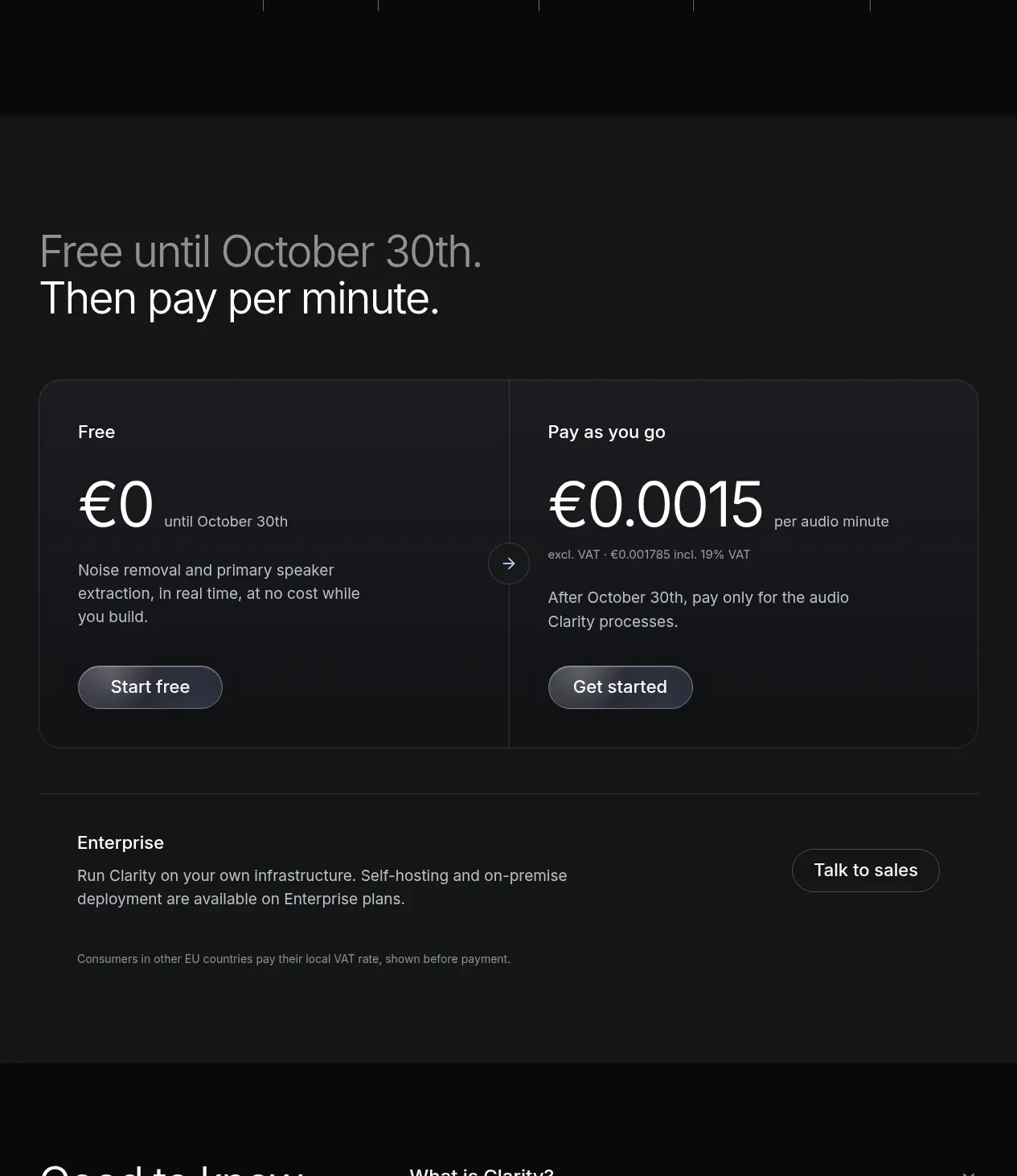
Design analysis
The pricing section clearly separates a free introductory offer from usage-based billing, then adds an enterprise path beneath the main two-column card.
Prompt preview
## Reference images

Study these alongside the description below: hierarchy, rhythm, spacing, colour. Build for the product you are asked about, using this design language.

- Component: https://kage-design-assets.t3.tigrisfiles.io/components/clarity/18084f24-bf00-4b1e-9761-c33f370871f3-1790921031-7.webp
- Full page it was cut from: https://kage-design-assets.t3.tigrisfiles.io/screenshots/clarity/18084f24-bf00-4b1e-9761-c33f370871f3-1790920906751-full.webp
- Component on Kage: https://kage.design/component/clarity-pricing-table

## Before you start
Ask what the user's product is, who it serves, and what their brand personality and primary conversion goal are. Apply the following principles to that product rather than reproducing the reference.

Create a pricing section on a charcoal surface with a large two-line heading that communicates the pricing transition. Below it, use a single rounded two-column pricing card: one side for an introductory/free plan and one for usage-based billing. Show plan labels, prominent price figures, billing unit, concise inclusions, and one button per plan. Separate columns with a subtle rule and optionally place a small circular directional marker at the boundary. Under the card, add an enterprise row with short explanatory copy and a right-aligned sales button. Use #151719 background, #191b1f card, #f0f1f2 prices, #a6abb1 supporting text, #30343a borders, and a muted blue-grey primary button. Make the selected/high-value plan clear without relying on bright colour; ensure currency, VAT, and billing terms are explicit. Stack the card columns on mobile.

Never: use logos, product names, copy, illustrations or imagery from the reference.
More components
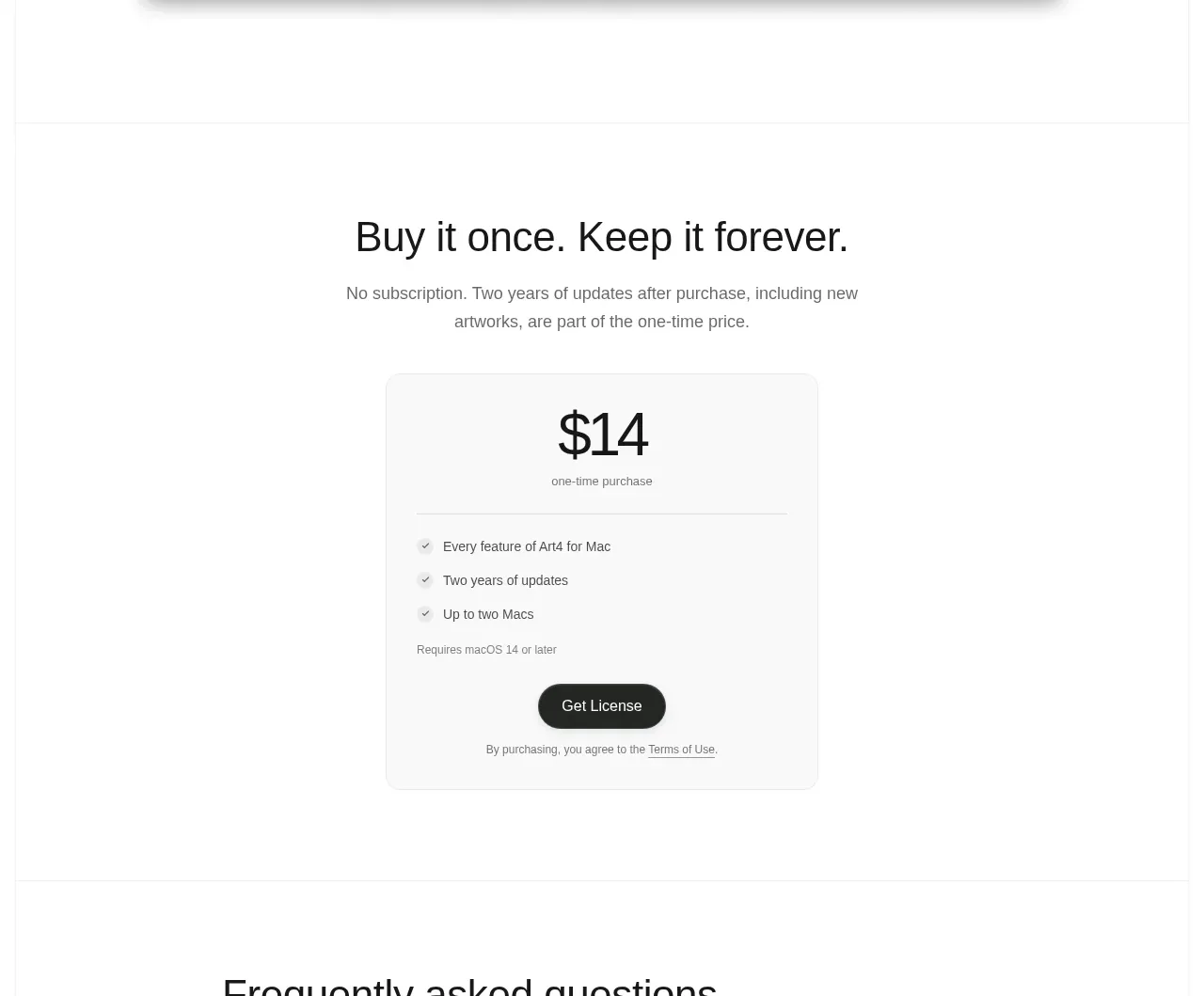
 Single purchase pricing card
Art4 · Pricing table
Single purchase pricing card
Art4 · Pricing table
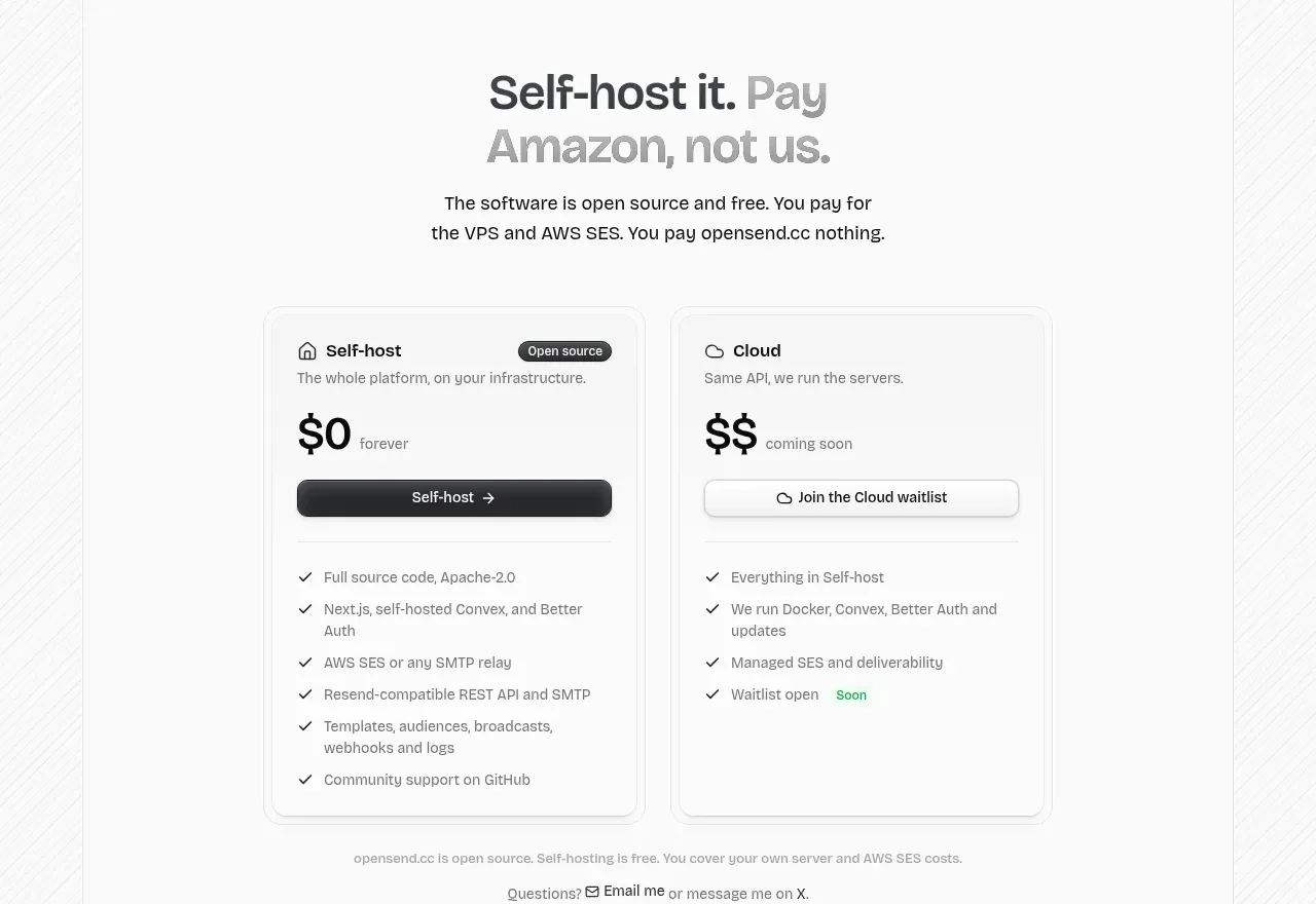
 Self-host versus cloud pricing
opensend.cc · Pricing table
Self-host versus cloud pricing
opensend.cc · Pricing table
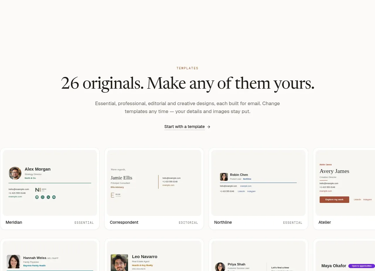
 Two-tier pricing table
esigna · Pricing table
Two-tier pricing table
esigna · Pricing table
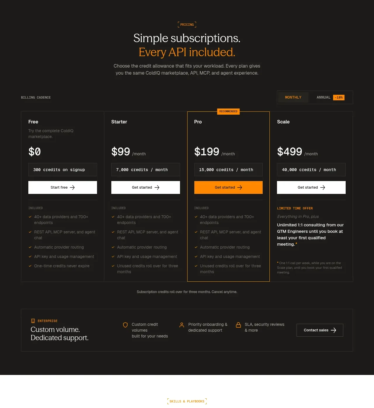
 Four-tier subscription pricing
ColdIQ x Slack · Pricing table
Four-tier subscription pricing
ColdIQ x Slack · Pricing table
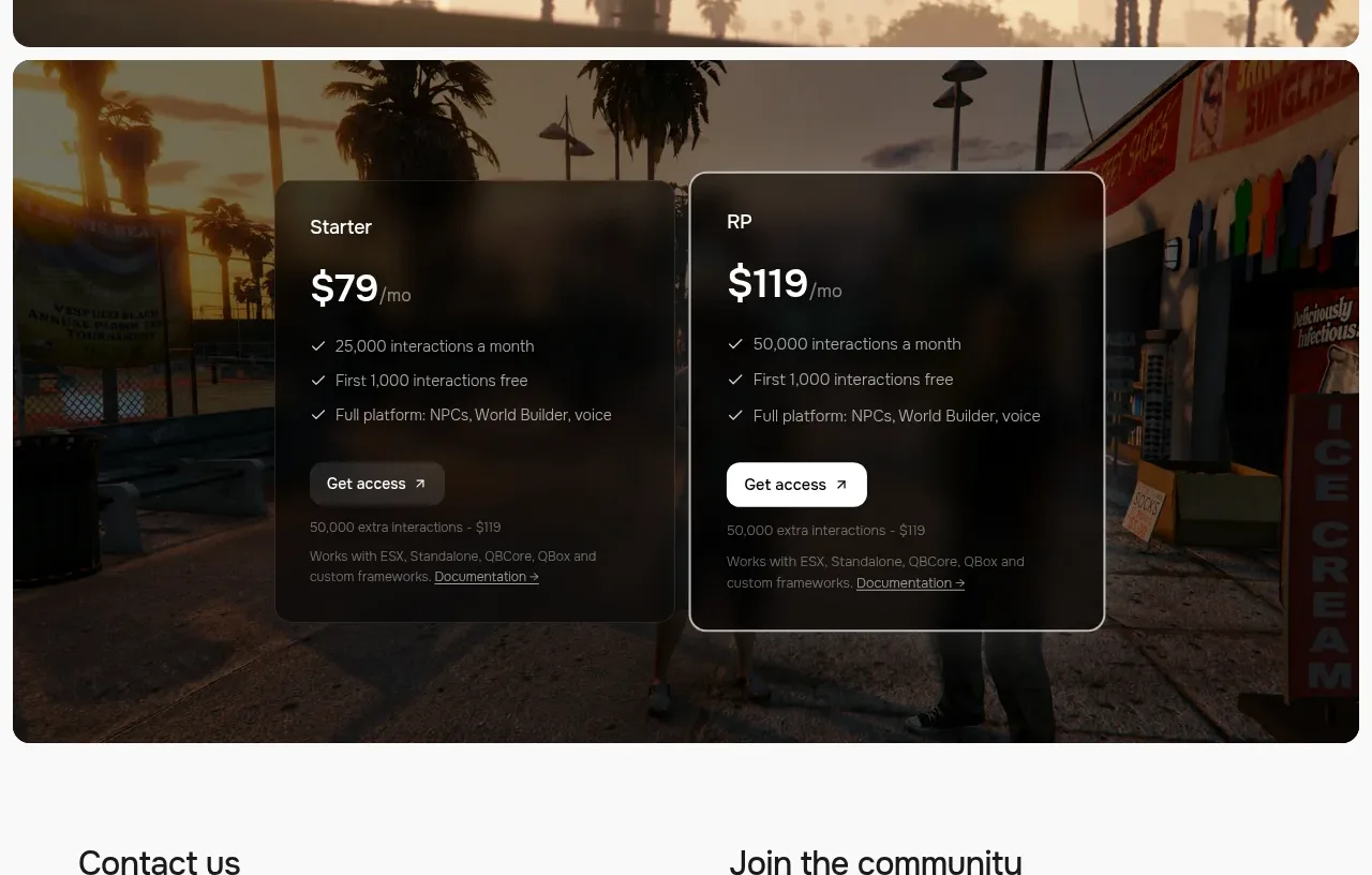
 Two-plan access pricing
Humalike x GTA RP · Pricing table
Two-plan access pricing
Humalike x GTA RP · Pricing table
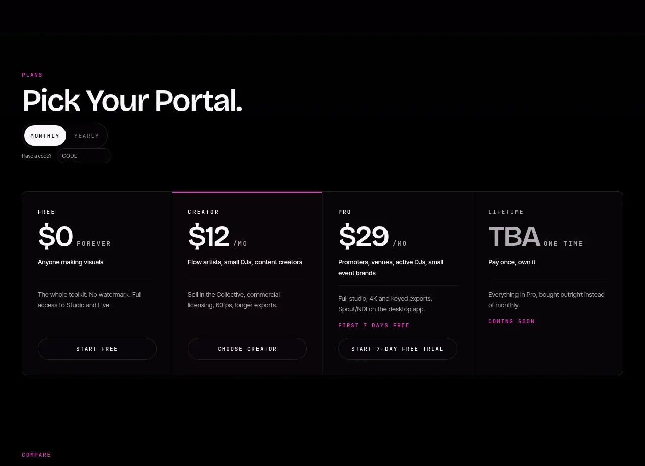
 Four-tier pricing selector
FRCTL · Pricing table
Four-tier pricing selector
FRCTL · Pricing table