 kage
plastic.audio

Design analysis
A small eyebrow and blunt oversized statement frame the pain point before the workflow explanation begins.
Prompt preview
## Reference images

Study these alongside the description below: hierarchy, rhythm, spacing, colour. Build for the product you are asked about, using this design language.

- Component: https://kage-design-assets.t3.tigrisfiles.io/components/clips-by-plastic/ad43fef6-0048-4f88-83ea-4278fc30c273-1792994535-4.webp
- Full page it was cut from: https://kage-design-assets.t3.tigrisfiles.io/screenshots/clips-by-plastic/ad43fef6-0048-4f88-83ea-4278fc30c273-1792994476004-full.webp
- Component on Kage: https://kage.design/component/clips-by-plastic-feature-grid-2

## Before you start
Ask what painful status quo the user's product addresses and what emotional register the brand should use, then apply these principles.

Build an editorial problem-introduction band with a small uppercase eyebrow, a two-line large heading, and one short supporting sentence. Keep the content left aligned within a wide but padded container, with a lot of empty black space around it. Use a stark white heading around 34–44px, compact line height, tiny tracked eyebrow text, and gray body copy. Add only a subtle separator; the power should come from typography and pacing.

Never: use logos, product names, copy, illustrations, or imagery from the reference.
More components
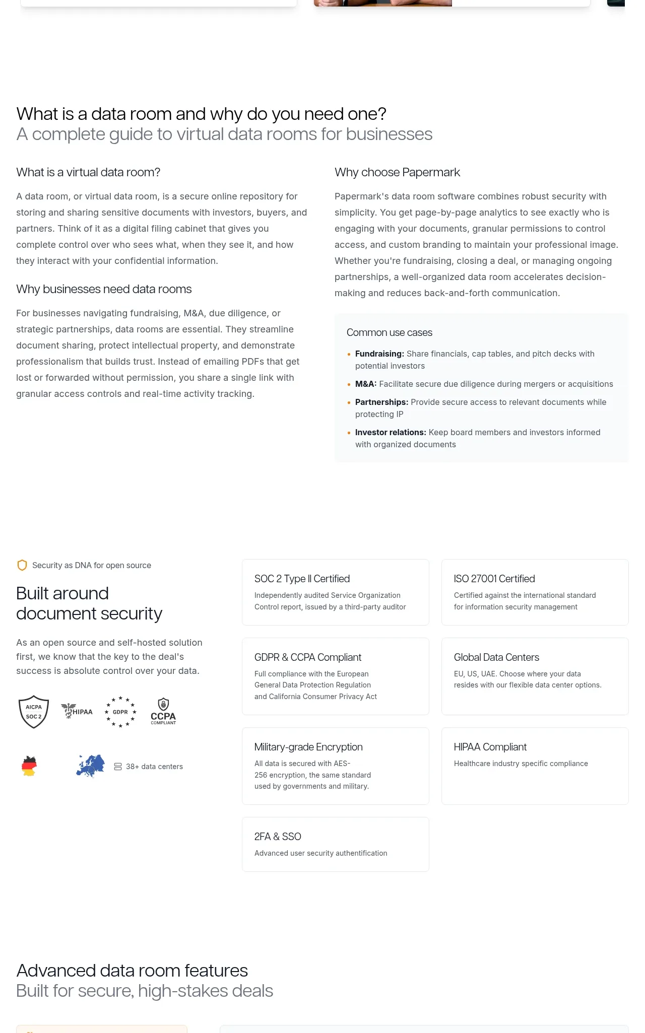
 Data-room education and security overview
Papermark Data Rooms · Feature grid
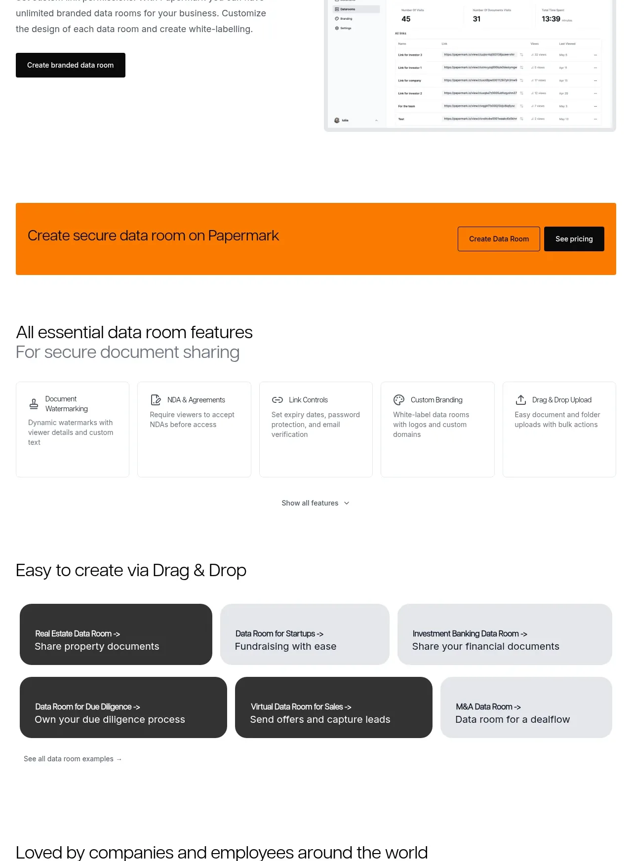 Workflow demonstrations
Papermark Data Rooms · Feature grid
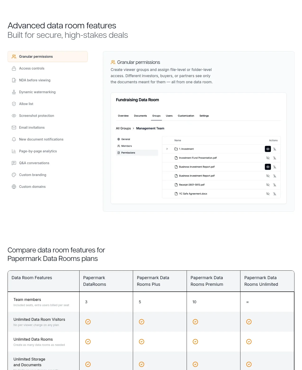 Advanced data-room features
Papermark Data Rooms · Feature grid
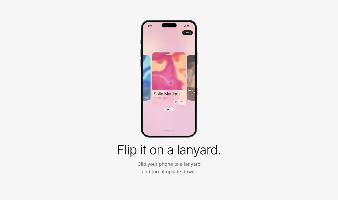
 Lanyard use-case feature
Badgey · Feature grid
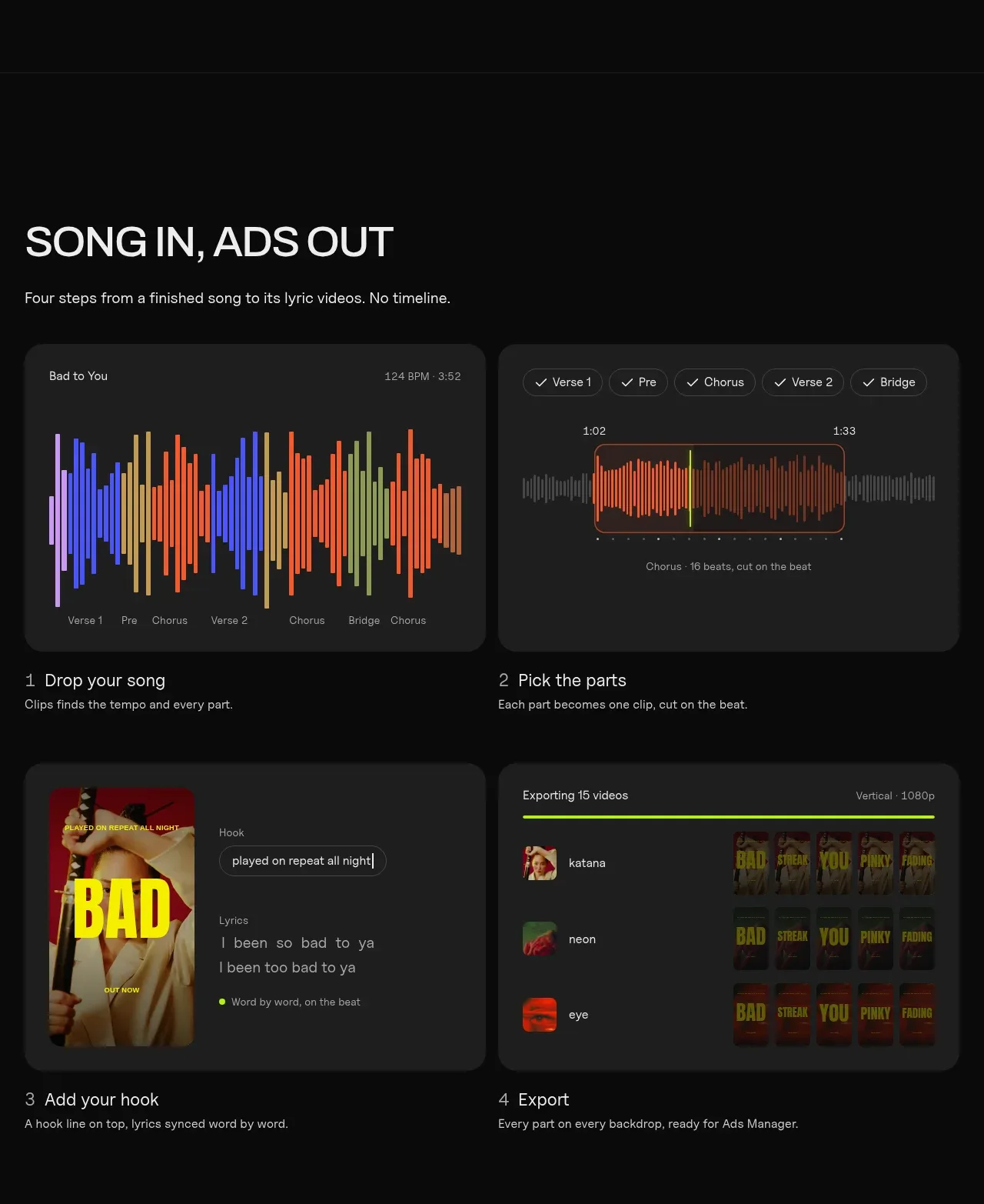
 Four-step workflow
Clips by Plastic · Feature grid
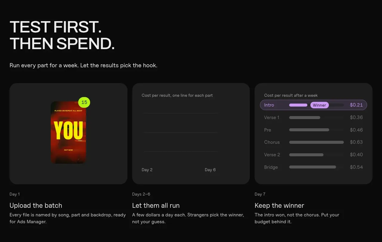 Testing workflow
Clips by Plastic · Feature grid